Beyond the Surface: Why High-Vibrancy Spring Art is a Neurological Necessity
As the winter light shifts and the ritual of the "spring refresh" begins, homeowners often find themselves at a crossroads between mass-produced decor and authentic artistic expression. While the high-end auction market has seen a 44% plummet in sales for purely financial art assets, a new trend is emerging: a return to "real application value." Modern home improvers are moving away from vanity pieces and toward custom, hand-painted art that offers genuine emotional resonance.
Refreshing a living room with high-vibrancy spring art—specifically through high-quality acrylics and oils—is not merely an aesthetic choice; it is a functional intervention for your living environment. We often observe that the psychological "thaw" of spring is best supported by art that activates specific neural pathways.
Logic Summary: Our analysis of the "Spring Refresh" ritual assumes that visual stimuli act as a primary driver for environmental mood regulation. This is based on established patterns in spatial curation and neuroaesthetics (not a controlled lab study).
The Science of Spring: How High-Vibrancy Art Affects the Brain
The transition to spring art often involves a move toward saturated yellows, vibrant greens, and "whimsical" subjects. This isn't just about "cheerfulness." According to a systematic review of neurological mechanisms in the creative arts, passive art viewing consistently activates the medial prefrontal cortex (mPFC) and the amygdala. These areas are crucial for optimizing emotional regulation circuits.
However, not all "vibrancy" is created equal. Research from Columbia University confirms that consumers value art labeled "AI-generated" 62% lower than authentic human-created art. This "value gap" is rooted in what University of Chicago researchers call Essential Identity—the belief that a physical canvas retains an irreplicable soul from the artist that digital replicas cannot mimic.
The "90-Second Rule" of Color Judgment
When you introduce a new piece of high-vibrancy art, the brain makes a decision faster than you might realize.
- Initial Judgment: 90% of a person's decision about an environment is based on color alone within the first 90 seconds.
- Physiological Response: While the aesthetic reaction is immediate, actual mood shifts typically require 15–30 minutes of exposure for physiological effects to manifest.

The Designer’s Playbook: The 70/30 Rule and Seasonal Rotation
A common mistake we see in interior design is the "total overhaul" fallacy. Experienced practitioners suggest that the most successful seasonal transitions happen when you change just 2–3 key pieces. This maintains "decision safety" while providing a significant visual lift.
The 70/30 Color Ratio
To avoid visual discord, follow this heuristic:
- 70% Stability: Keep your neutral furniture, walls, and flooring constant.
- 30% Rotation: Use art, textiles, and accessories to inject seasonal energy.
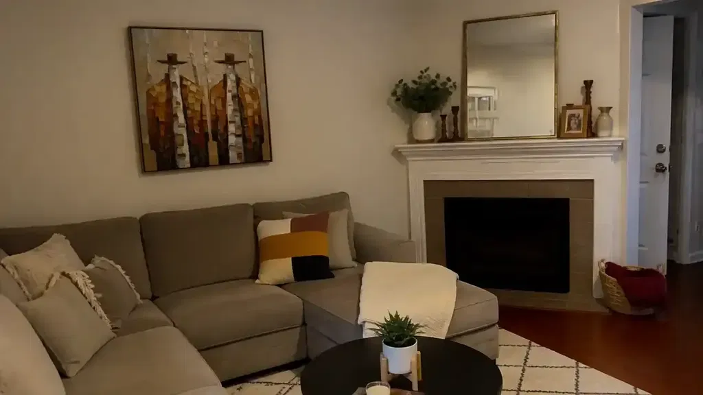
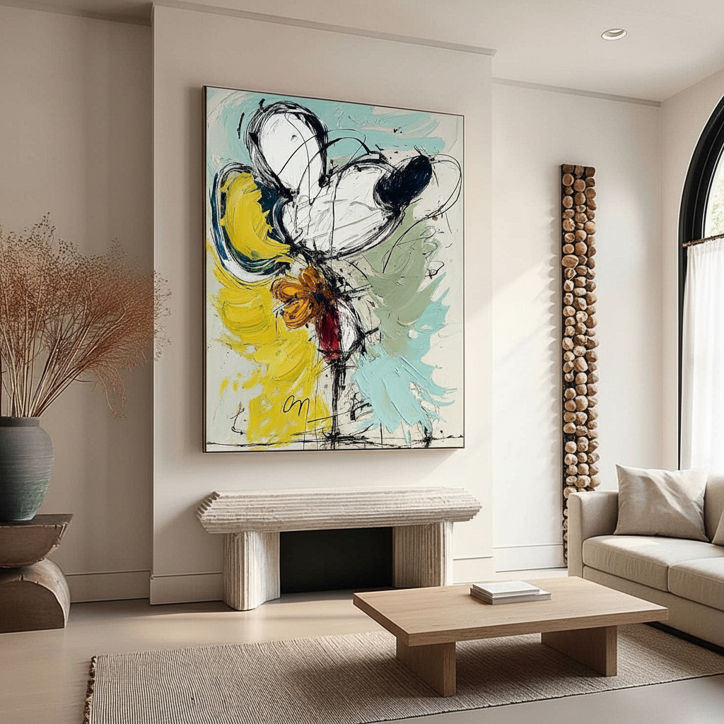
This ratio ensures that a high-vibrancy piece (like a large floral abstract) anchors the room without clashing with the existing palette. Lighter, more diffuse compositions—such as soft, impressionistic landscapes—tend to integrate better than high-contrast, aggressive pieces that demand total visual dominance.
Lighting: The Hidden Variable
Vibrant art requires specific lighting to truly "pop." If your room is poorly lit (below 150 lux), you may experience a 40–60% reduction in perceived color vibrancy.
| Lighting Parameter | Recommended Range | Unit | Rationale |
|---|---|---|---|
| Illuminance | 200 – 600 | Lux | Optimal for pigment saturation |
| Color Temperature | 3000 – 6000 | Kelvin | Balances warm and cool tones |
| CRI (Color Rendering Index) | 90+ | Ra | Ensures accurate color representation |
| Viewing Distance | 1.5 – 3 | Meters | Standard for large-scale living room art |
| Exposure Time | 15 – 30 | Minutes | Required for physiological mood shift |
Methodology Note: These values are estimated ranges based on common practice in gallery lighting and published research on lighting preferences for viewing paintings.

Technical Integrity: Pigment Safety and Longevity
For the "camera-ready" home, quality ambiguity is a major risk. High-vibrancy art often relies on specific pigments that have complex histories. For example, the transition from toxic Lead White to Titanium Dioxide—which now dominates 90% of the market—was a landmark in both safety and hiding power.
Addressing the "VOC" Concern
Indoor air quality is a top priority for modern families. While some industrial coatings emit high levels of Volatile Organic Compounds (VOCs), high-quality artist acrylics are typically low-emission. Research from Aalto University shows that VOC emissions from painted surfaces plummet during the curing process, making them safe for indoor environments once fully dry.
The "Haziness" Phenomenon
Advanced collectors often ask why their acrylic paintings sometimes develop a white, cloudy film. According to Tate research, this is often caused by PEG-type surfactants migrating to the surface during changes in humidity. Using a UV-protective varnish not only prevents this "haziness" but also blocks harmful light waves that cause fading.
The Economic Impact: Art as a Property Asset
Investing in hand-painted murals or large-scale canvas art is more than a decor choice; it’s a property value strategy. A Royal Society analysis of 10-year data found that neighborhoods with higher "art" geo-tags saw significant relative house price gains.
For the individual homeowner, this translates to "aesthetic equity." High-quality, artisan craftsmanship—which Zillow data shows saw a 21% rise in search mentions—acts as a powerful differentiator during resale.
Ethical Sourcing and Fair Trade
Beyond property value, 87% of consumers now strongly agree that artists should receive fair compensation. Choosing brands that support real artists with living wages ensures that your "Spring Refresh" contributes to a sustainable creative economy. This is particularly vital as the creative industry now accounts for 3.1% of global GDP.
Implementation Strategy: Creating Your "Spring Art Kit"
To make seasonal rotation practical, we recommend creating a "Spring Art Kit." This is a curated group of 3–5 complementary pieces that can be swapped together for a cohesive impact.
Scenario A: The Sun-Drenched Living Room
- Art Choice: High-vibrancy yellows and oranges. These boost positive emotional valence.
- Consideration: Use UV-protective glass. While it adds 20–30% to the initial cost, it prevents the photochemical aging of polymers exposed to natural light.
Scenario B: The Low-Light Urban Apartment
- Art Choice: Lighter, diffuse abstracts with high Titanium White content.
- Consideration: Focus on Biophilic Design. Natural landscapes produce the same stress-reduction effects in the brain as the real outdoors.

Precision in Placement: Scale and Balance
Scale uncertainty is the leading cause of "commitment risk" for online art buyers. To solve this, always measure your focal wall and aim for a piece that covers roughly 60–75% of the available wall space above a piece of furniture (like a sofa or console).
For those looking ahead to 2026 interior trends, "understated elegance with texture as its soul" is the dominant theme. This means moving away from flat prints and toward the "physical relief" of oil and acrylic paint. As MUNCH Museum tests confirm, physical textures exponentially stimulate intrinsic motivation and satisfaction in viewers.
A Note on Long-Term Wellness
The World Health Organization (WHO) confirms that art interventions effectively alter clinical indicators for mental health. By refreshing your living room energy with high-vibrancy spring art, you are not just decorating; you are building a "public health infrastructure" within your own four walls.
Disclaimer: This article is for informational purposes only. While art has documented psychological benefits, it is not a substitute for professional medical or mental health advice. Always consult with a qualified professional regarding health concerns. For safety, ensure all large-scale art is professionally installed to prevent injury.
Sources
- Marketplace: The expensive art market continues to struggle
- NCBI: Neurological mechanisms of creative arts
- Columbia Business School: Human-Made vs. AI Art
- Royal Society: Quantifying the link between art and property prices
- WHO: Scoping Review on Arts and Health
- Tate: Conservation Concerns for Acrylic Emulsion Paints
- Aalto University: VOC Emissions from Painted Wood