The Shift Toward Emotional Value: Why Winter Curation Matters
As the external world retreats into the muted grays and sharp whites of winter, our internal environments must work harder to provide the psychological "thaw" we crave. For years, the art market was dominated by high-end vanity pieces—purely financial assets designed for appreciation rather than application. However, recent data indicates a profound shift. High-end auction sales for pieces over $10 million plummeted 44% year-over-year in 2024, according to Marketplace.org. This retreat from speculative assets suggests that buyers are returning to "real application value"—choosing art that serves their emotional needs and completes their sanctuary.
For the modern home improver, this means moving away from mass-produced prints and toward the "essential identity" found in hand-painted oil works. In this guide, we will explore how to leverage deep-toned oil paintings to create a sense of warmth and security during the winter months, grounding our recommendations in neurological research, color science, and practical interior design heuristics.
The Neural Response to Deep Tones: Why We Seek Sanctuary
There is a biological reason why a rich, dark-toned painting feels "comfortable" in a winter setting. Passive art viewing consistently activates the medial prefrontal cortex (mPFC) and the amygdala, optimizing emotional regulation circuits, as noted in a systematic review published by NCBI. When we view deep ochres, burnt sienna, or midnight blues, our brains aren't just processing color; they are engaging in a form of environmental healing.
However, we must address a critical "gotcha" in seasonal curation. While deep tones offer comfort to many, they are not a universal panacea. For individuals susceptible to Seasonal Affective Disorder (SAD), winter imagery can sometimes reinforce negative seasonal associations. Research from the Yale Psychiatry Winter Depression Research Clinic suggests that SAD prevalence increases with reduced photoperiod, and for these viewers, an overly dark room can feel oppressive rather than cozy.
Analysis Note: Our approach to "cozy" design is a scenario-based model. We assume a standard user seeking emotional warmth, but we acknowledge that for approximately 5% of the population with clinical SAD, a high-contrast, brighter palette may be required to maintain mood stability.
Why "Human-Made" Matters: The 62% Value Premium
In an era of generative AI, the "soul" of an artwork has become a quantifiable asset. A consumer perception study by Columbia University confirmed that consumers value art labeled as "AI-generated" 62% lower than authentic human-created art. This isn't just snobbery; it’s a psychological response to what researchers at the University of Chicago call the "essential identity."
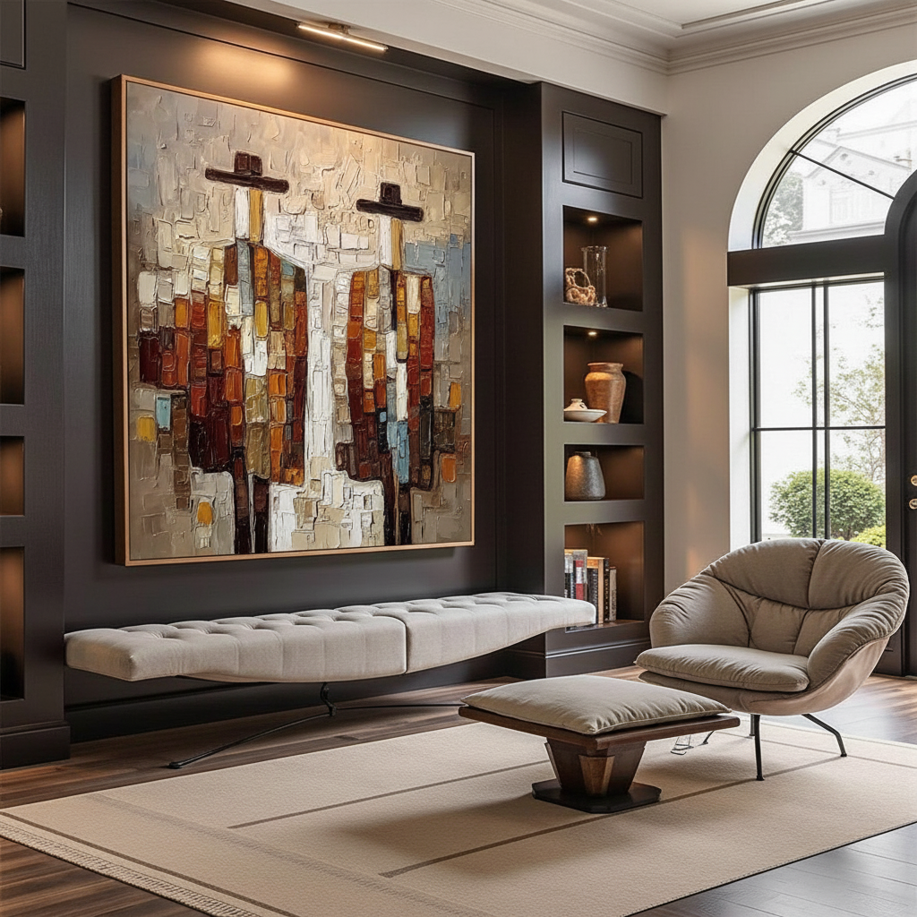
A digital print is a flat replica of a thought. A hand-painted oil painting is a physical record of human attention. Every brushstroke represents a moment of neural control and visual selection—a process that Stockton University research identifies as a sophisticated suppression of "perceptual constancy illusions." When you hang a deep-toned oil painting, you are hanging the biochemical crystallization of an artist's focus.

The Physics of Warmth: Pigments vs. Pixels
Why does a dark oil painting feel "warmer" than a dark print? The answer lies in the microtopography of the surface. Optical microprofilometry proves that the mm-scale texture of oil paintings is crucial to their aesthetic impact, according to research published in MDPI Sensors.
Unlike the flat, uniform surface of an inkjet print, hand-painted pigments create a 3D relief. This texture interacts with ambient light, creating micro-shadows and highlights that change as you move through the room. This "physical relief" exponentially stimulates intrinsic motivation and satisfaction in viewers, a phenomenon confirmed by the MUNCH Museum in their tests on audience interaction with tactile textures.
The Chemistry of the Palette
In our experience with material longevity, the choice of pigment is as important as the color itself. For example, the transition from toxic lead white to titanium dioxide was a milestone in art history. Data from NCBI shows that titanium dioxide now captures 90% of the market due to its superior hiding power and chemical inertness. When selecting deep-toned works, we prioritize modern, non-toxic formulations that ensure the air quality of your "sanctuary" remains uncompromised.
Design Heuristics: The 60-30-10 Rule for Winter
A common mistake in winter decor is over-saturating a room with dark blues or blacks without sufficient balance. This results in a "cold" gloom rather than a "cozy" warmth. To solve this, we recommend a specific design heuristic: the 60-30-10 Ratio.
| Component | Percentage | Application | Purpose |
|---|---|---|---|
| Base Colors | 60% | Walls, large rugs, neutral furniture | Provides a warm, grounded foundation |
| Dark Accents | 30% | Deep-toned oil paintings, textiles | Adds depth, drama, and focus |
| Contrast Elements | 10% | Metallics, white linens, warm lighting | Prevents visual heaviness and "gloom" |
Texture Layering for Dimensional Warmth
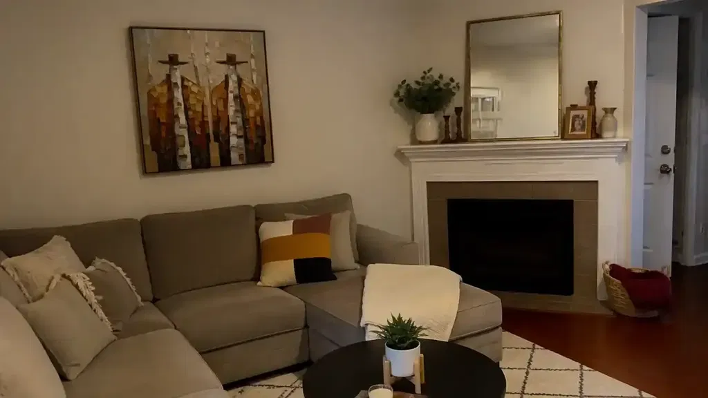
To maximize the impact of a deep-toned painting, you must pair it with tactile variety. We often observe that a matte oil painting surface gains "dimensional warmth" when placed near textured fabrics like wool throws or velvet cushions. This creates a sensory bridge between the visual depth of the art and the physical comfort of the room.

Lighting the Deep Palette: A Technical Guide
Lighting a dark painting is a high-wire act. If the light is too direct, you create "glare spots" that flatten the visual impact. If it's too dim, the rich pigments "sink" into the darkness and lose their vibrancy.
According to professional lighting standards—often cited by resources like Banno Lighting—the goal is to enhance the pigment richness without creating hot spots.
Modeling Note: Optimal Lighting Parameters
The following parameters are based on common industry heuristics for residential galleries (not a controlled lab study).
| Parameter | Recommended Value | Rationale |
|---|---|---|
| Placement Distance | 2 - 3 Feet | Prevents heat damage and provides even spread |
| Incidence Angle | 30° - 45° | Minimizes glare while highlighting impasto texture |
| Color Temperature | 2700K - 3000K | Mimics natural "golden hour" warmth |
| Color Rendering Index (CRI) | 90+ | Ensures deep reds and ochres don't look "muddy" |
| Luminous Intensity | 50 - 200 Lux | Balances visibility with long-term pigment preservation |
Safety and Sustainability: The Indoor Air Quality (IAQ) Promise
For many of our clients, especially those with young families, the primary concern isn't just how art looks, but how it affects the home's environment. The EPA warns that indoor air pollution can be significantly higher than outdoor levels.
We address this by advocating for low-VOC (Volatile Organic Compound) materials. Academic research from Aalto University proves that coatings on wood substrates emit significantly lower toxic VOCs during the curing process when moisture levels are properly managed. Furthermore, the use of walnut oil as a replacement for toxic turpentine solvents is a growing trend in eco-friendly art making, as noted by the Cincinnati Art Museum.
Avoiding the "Safety Label" Trap
It is a common misconception that an "ASTM D-4236" label means a product is non-toxic. As explained by the EPA, this label only indicates that the product's warning labels comply with regulations—it does not mean the pigments themselves are harmless. This is why we insist on working with artists who use modern, synthetic alternatives to heavy-metal pigments like cadmium or lead, which the IARC classifies as Group 1 carcinogens.
The Investment Logic: Art as a Stable Asset
While the speculative "vanity" art market struggles, the broader creative economy is a global trade driver. Global creative services exports hit a record $1.4 trillion in 2023, according to the UNCTAD Creative Economy Outlook 2024.
Investing in a hand-painted oil painting is not just a decorative choice; it is a participation in an industry that accounts for 3.1% of global GDP. More importantly, art has a direct correlation with property value. A Royal Society CAR model analysis found that neighborhoods with higher "art" geo-tags saw greater relative house price ranking gains (Royal Society). By curating your space with high-quality, authentic art, you are quite literally building equity in your environment.
Creating Your Winter Sanctuary
Curating a cozy winter mood is about more than just picking a "dark" painting. It is about understanding the intersection of human psychology, material science, and spatial design. By choosing human-made oil paintings, you are securing a piece of "essential identity" that digital prints simply cannot replicate.
When you apply the 60-30-10 rule and support it with professional-grade lighting, you transform a room from a mere living space into a sanctuary. You move from the "uncertainty" of mass-produced decor to the "certainty" of a hand-crafted environment that supports your emotional regulation and reflects your values.
In the depths of winter, the warmth of a home isn't just measured by the thermostat—it’s measured by the depth of the stories on your walls.
YMYL Disclaimer: This article is for informational purposes only and does not constitute professional medical, psychological, or financial advice. If you are experiencing symptoms of Seasonal Affective Disorder (SAD) or other mental health concerns, please consult a qualified healthcare professional. For concerns regarding indoor air quality and chemical sensitivities, consult a certified industrial hygienist or environmental health expert.
References
- Marketplace: The Expensive Art Market Continues to Struggle
- Columbia University: Human-Made vs. AI Art Study
- NCBI: Neurological Mechanisms of Creative Arts
- Yale Psychiatry: Winter Depression Research Clinic
- UNCTAD: Creative Economy Outlook 2024
- Royal Society: Quantifying the Link Between Art and Property Prices
- EPA: Indoor Air Quality and Low-VOC Paints
- Getty Conservation: Color Science and Pigment Mixture