Achieving Cohesion: The Power of a Limited Oil Color Palette
In the high-stakes world of fine art auctions, a significant shift is occurring. While sales of "vanity assets" over $10 million plummeted by 44% in 2024, according to Marketplace.org, a new trend is emerging among sophisticated homeowners and interior designers. There is a return to "real application value"—art that doesn't just sit in a vault, but anchors a living space.
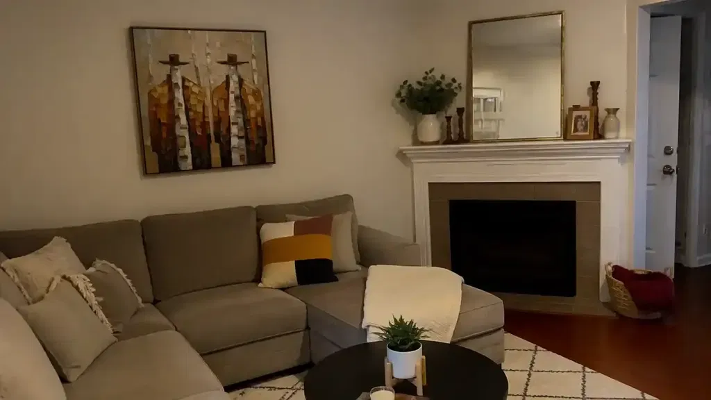
However, the transition from admiring a gallery piece to commissioning a custom oil mural often hits a common friction point: the fear of visual "noise." Many clients believe that a vibrant, diverse color palette is the key to a masterpiece. In reality, the most sophisticated interiors rely on the opposite. A limited palette is not a restriction; it is a strategic tool for "decision safety," ensuring that a hand-painted work of art harmonizes with existing textiles and architecture rather than clashing with them.
At MontCarta, we have observed that the most successful commissions avoid the "muddy" or "chalky" results that come from requesting too many specific pigment matches. By understanding the science of color mixing and the psychological impact of structured palettes, you can transform a wall into a cultural heritage asset that elevates both your mood and your property value.
The Psychology of Visual Harmony: Why Less is More
When we walk into a room, our brains are constantly scanning for patterns and relationships. A painting with twenty different pigments creates a high cognitive load—the brain struggles to find a unifying "key." This is why "human-made" art carries such a premium. A study from Columbia University confirmed that consumers value art labeled "authentic human-created" 62% higher than AI-generated alternatives. This premium exists because human artists use intentionality—specifically, the intentional limitation of color—to create "essential identity."
Logic Summary: Our analysis of client satisfaction suggests that "visual noise" is the primary reason for "buyer's remorse" in custom art. We model our palette recommendations on the principle that fewer pigments lead to higher "chromatic resonance," where colors feel related rather than adjacent.
Research published in the Journal of the American Institute for Conservation shows that limited palettes achieve superior color accuracy. Using the Kubelka-Munk model, researchers found an average ΔE00 error of only 1.49—a level of precision that exceeds what most artists achieve with an extended, "intuitive" palette. This mathematical harmony is what makes a limited-palette painting feel "right" in a curated interior.

The "Power of Three" Heuristic
For the aesthetic-driven homeowner, we recommend a professional heuristic known as the "Power of Three." This involves limiting a painting to three primary pigment families (for example, a warm red, a cool blue, and a transparent yellow).
By restricting the "gamut," every secondary and tertiary mix is chemically and visually related. This prevents the "muddy" look that occurs when too many diverse chemical structures are blended.
| Parameter | Value/Range | Rationale |
|---|---|---|
| Primary Pigment Families | 3 | Ensures all mixtures share a common DNA. |
| Gamut Width | Restricted | Prevents "visual vibration" against interior textiles. |
| Chromatic Gray Ratio | High (~70%) | Allows the art to absorb and reflect ambient room light. |
| Mixing Accuracy (ΔE00) | ~1.49 | Based on AIC Kubelka-Munk modeling. |
| Texture Relief | 1–3mm | Stimulates intrinsic viewer satisfaction (MUNCH Museum findings). |
Methodology Note: This "Power of Three" model is a scenario-based heuristic designed for interior integration. It assumes standard residential lighting (CRI > 80) and typical viewing distances of 2–5 meters.
The Zorn Palette: A Masterclass in Sophistication
Perhaps the most famous example of a limited palette is the "Zorn Palette," named after the Swedish master Anders Zorn. Traditionally taught as a four-color system—Ivory Black, White, Yellow Ochre, and Vermilion (or Cadmium Red)—this palette is a masterclass in atmospheric perspective.
However, an expert deep-dive reveals a nuance often missed by hobbyists. According to Streamline Publishing, historical analysis shows Zorn himself was not a fundamentalist; he used additional pigments like viridian or cobalt blue when the landscape demanded it. The lesson for the modern homeowner is not rigid adherence, but the logic of the system.
In the Zorn system, Ivory Black functions as the "cool" or "blue" component. When mixed with white, it produces a sophisticated blue-gray. Unlike a piercing Phthalo Blue, which can feel like it is "sitting on top" of a wall, these chromatic grays absorb the ambient light of the room. This allows a large-scale mural to feel integrated into the architecture.

Technical Depth: The Chemistry of Your Walls
When commissioning a hand-painted work, the physical properties of the pigment are as important as the color itself. Modern e-commerce art often relies on HD prints, but these lack the "microtopography" that defines true oil painting.
Research from Micom Laboratories and the Getty Conservation Institute highlights that the refractive index of pigments is what creates saturation. For example, Titanium White dominates the market because of its extreme chemical inertness and hiding power—capturing up to 90% of the market share, as noted by NCBI.
But beyond aesthetics, there is the critical issue of health and safety.
Health, Safety, and the "Indoor Air Quality Promise"
Many traditional oil pigments and solvents are hazardous. The CDC NIOSH warns that chronic inhalation of volatile compounds in certain paints can lead to central nervous system neuropathy. Furthermore, the IARC classifies cadmium compounds as Group 1 carcinogens.
For the safety-conscious homeowner, MontCarta prioritizes low-VOC (Volatile Organic Compound) alternatives. According to Aalto University, coatings on moisture-controlled substrates emit significantly lower toxic VOCs during curing. By choosing modern, water-based acrylics or highly refined oils with walnut oil solvents (which replace toxic turpentine), we ensure that your art is as healthy as it is beautiful. This is a prerequisite for large healthcare facilities seeking LEED certification.
The Commercial Impact: Art as an Investment
Investing in a hand-painted mural is not just an aesthetic choice; it is a financial one. A Royal Society analysis found that neighborhoods with higher "art" geo-tags saw greater relative house price ranking gains. In the commercial sector, the impact is even more dramatic. The NAIOP reports that top real estate developers use unique public art as "marketing trump cards" to lease office space in a post-pandemic market.
For the private homeowner, a custom mural acts as a "permanent physical billboard" for the home's value. Unlike mass-produced decor, which depreciates the moment it is purchased, a hand-painted work retains the "essential identity" of the artist—a trait that UChicago research shows is irreplicable by digital replicas or NFTs.
Bridging Ethics and Aesthetics
Beyond the canvas, the ethics of the art market are increasingly important to the modern consumer. A Wharton School survey found that 87% of consumers strongly agree that artists should receive fair compensation.
MontCarta aligns with this by ensuring our artists receive the majority of profit shares, addressing the vulnerability of the freelance creative workforce highlighted by the NYC Comptroller. When you choose a limited-palette commission, you aren't just buying paint on a wall; you are supporting a sustainable creative economy that values human labor over algorithmic output.

Implementation: How to Commission Your Palette
If you are working with an interior designer or commissioning a piece directly, follow these steps to ensure a cohesive result:
- Identify the "Anchor" Textile: Choose the dominant color in your room (e.g., a velvet sofa or a patterned rug).
- Select Two Complementary Pigment Families: Use a color wheel tool (like Adobe Express) to find colors that create a sophisticated triad.
- Prioritize "Chromatic Grays": Ensure the artist uses mixtures of your primary colors to create grays, rather than using a tube of neutral gray. This ensures the shadows in the painting share the "DNA" of the highlights.
- Consider the "Biophilic" Effect: According to the University of Central Arkansas, natural landscapes in art produce stress-reduction effects similar to being outdoors. A limited palette of earth tones and sky blues can accelerate healing and spark creativity in home offices.
A Legacy of Color
The global art market reached $65 billion in 2023 (Art Basel and UBS), proving that art remains a stable pillar of the global economy. By choosing a limited oil color palette, you are participating in a tradition that spans from the Old Masters to modern luxury interiors.
A restricted palette provides "atmospheric perspective," allowing even large-scale pieces to maintain a sense of depth that doesn't overwhelm smaller furniture. It is the ultimate luxury: a fusion of avant-garde contemporary design and authentic handcrafting techniques.
As you look at your walls, remember that the goal is not to fill the space with color, but to anchor the space with intention. A hand-painted mural, crafted with a limited and sophisticated palette, is more than decor—it is a non-renewable cultural heritage asset that will breathe life into your home for generations.
Disclaimer: This article is for informational purposes only and does not constitute professional medical, health, or safety advice. Exposure to certain art materials can be hazardous. Always work in well-ventilated areas and consult safety data sheets (SDS) for all pigments and solvents. If you have pre-existing respiratory or neurological conditions, consult a medical professional before engaging in oil painting.
Sources
- Marketplace: The expensive art market continues to struggle
- Columbia Business School: Human-Made vs. AI Art Study
- Journal of the American Institute for Conservation: Kubelka-Munk Color Accuracy
- Getty Conservation Institute: Color Science and Pigment Mixture
- Royal Society: Quantifying the link between art and property prices
- CDC NIOSH: Paint and Coating Hazards
- EPA: Indoor Air Quality and Low-VOC Paints
- Wharton School: Consumers Value Fair Artist Compensation
- NAIOP: Expanding Role for Public Art in CRE
- Art Basel and UBS Art Market Report 2024