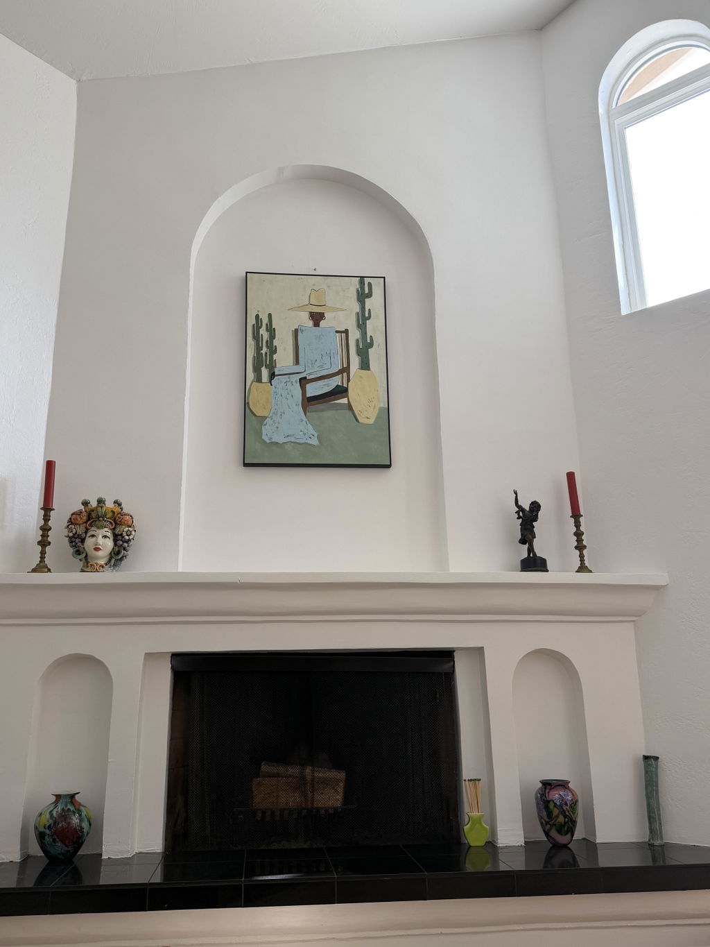
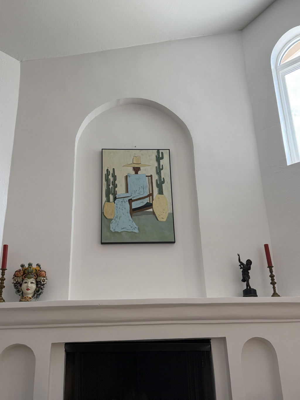
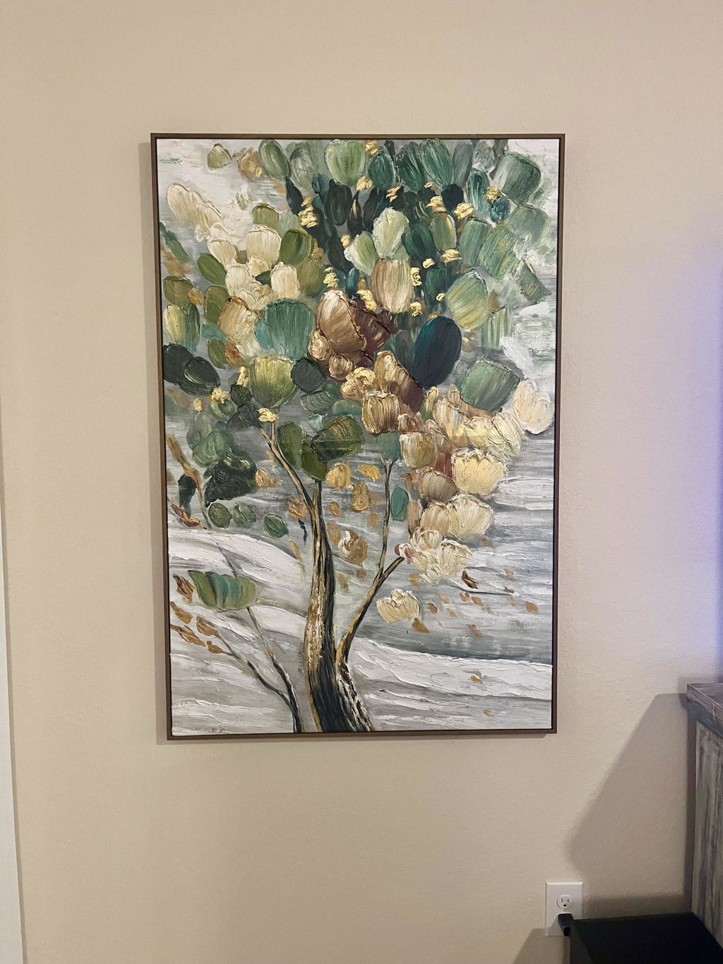
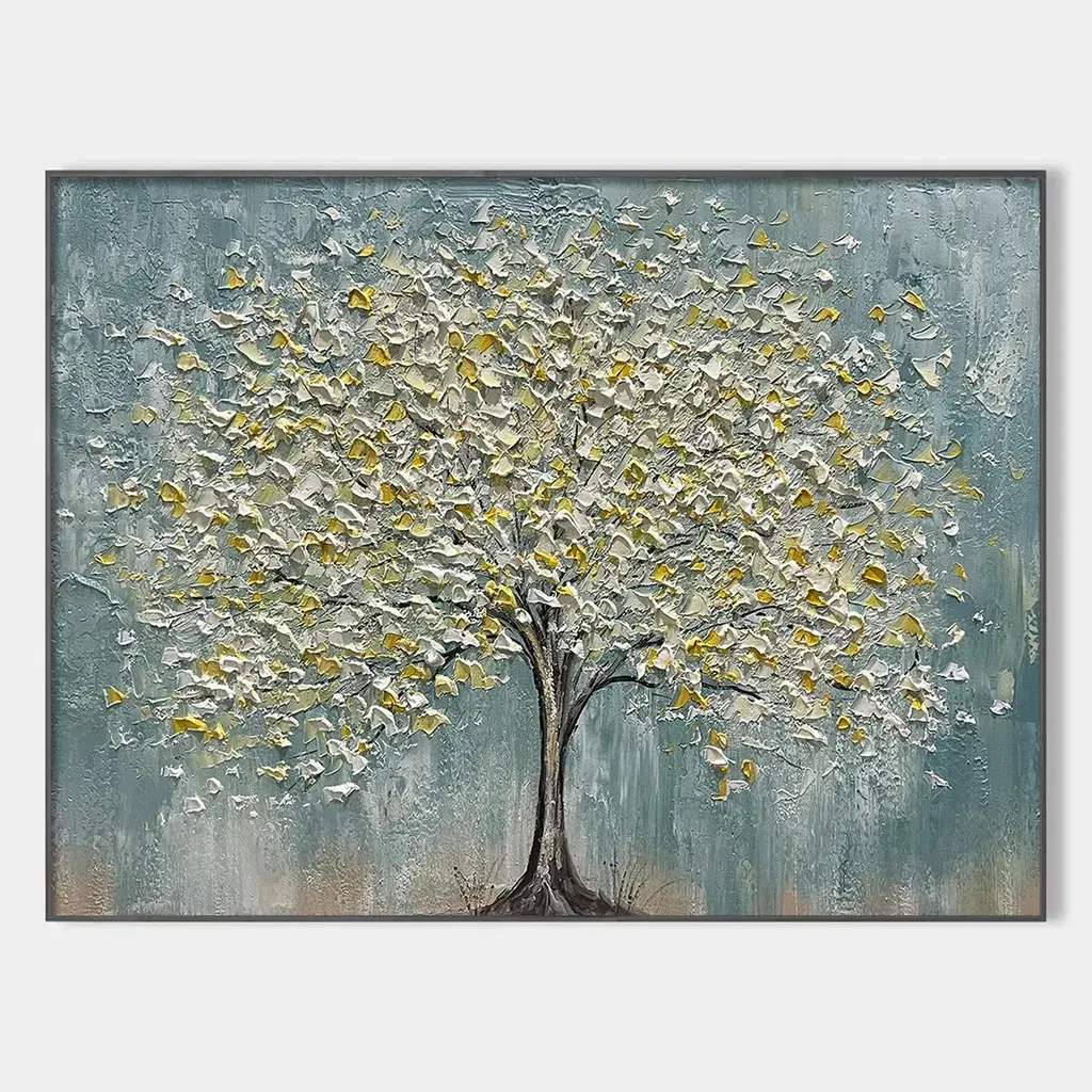
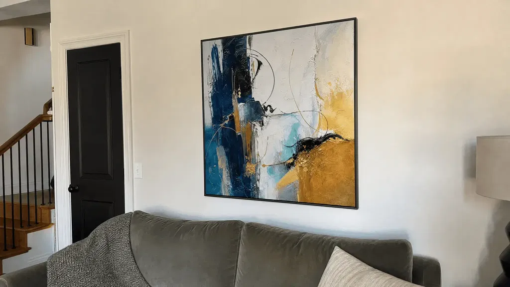
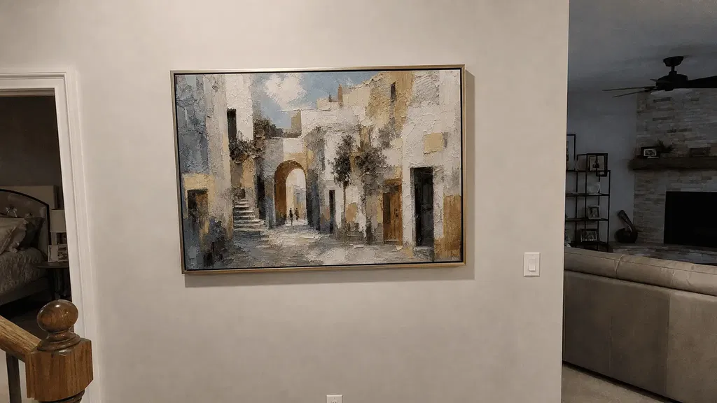
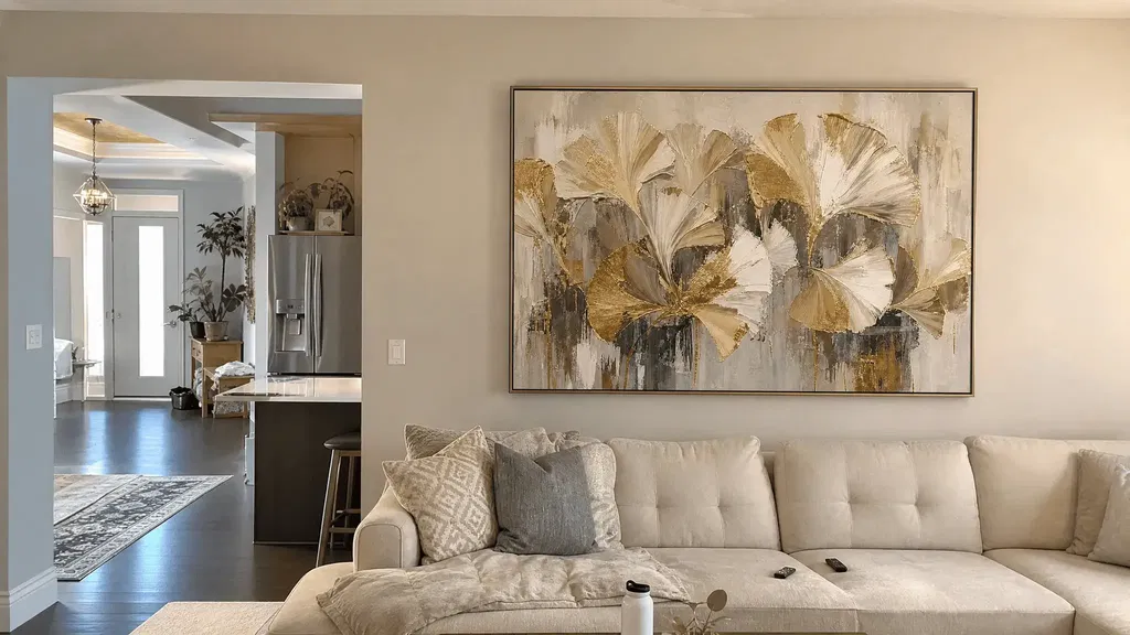
Aim your accent light so the beam skims across the textured surface instead of hitting it head-on. Start near a 30-degree angle to the canvas, then pick a warm 2700K or a more neutral 3000K bulb based on your room and the lamp's color data. Whether highlighting gold foil in a blue and green abstract or a deep navy impasto, check the result from the chair or spot where you actually view the piece before you drill a single hole.
Key Takeaways
- Grazing light traveling across raised paint and gold leaf reveals texture; straight-on light tends to flatten it.
- A roughly 30-degree angle of incidence is a tested starting point for picture lighting, but beam spread, fixture position, and your actual sightline still need separate checks.
- 2700K reads warmer and more amber; 3000K is a more neutral, general-purpose starting point. Either one needs a lamp with good color rendering and an in-person test on the artwork.
- Glare is a viewing-position problem. Adjust aim, placement, beam spread, intensity, or shielding one variable at a time rather than changing several things at once.
- Test the fixture in a temporary position before permanent mounting, and hand off wiring or drilling you are not comfortable doing.
Start by Skimming the Surface with Directional Light
Point the beam so it travels across the raised brushwork and metallic leaf rather than straight into the canvas. That grazing angle catches the peaks and valleys of the paint relief, casting small shadows that make sculptural texture read as three-dimensional instead of flat.

Straight-on light isn't a mistake in every room, but it's the wrong starting point when the goal is to show off dimension. It tends to wash out the shadow lines that give impasto brushwork its depth, and it can bounce hard off gold or metallic leaf. Because of that, treat texture visibility and glare as two separate things to check, not one. A textured wall art piece with heavy paint relief will respond differently than a canvas where the gold is mostly flat leaf, so expect to spend more time on reflection control with the latter.
Use the 30-Degree Rule as Your Starting Geometry
Roughly a 30-degree angle between the light and the wall is a documented starting point for accent-lighting artwork, not a fixed measurement you copy from a tape measure. Treat it as the angle you dial in first, then adjust once you check the result from where you actually stand or sit.
What the 30 degrees measures
The 30 degrees refers to the angle of incidence: the angle between the incoming light and the flat plane of the artwork's surface, not the distance from the wall. Lighting-design research on picture lighting finds that a 30-degree angle of incidence supports good modeling of surface texture and can help limit glare from reflections. That guidance comes from gallery and museum picture lighting, so use it as your opening geometry for a home wall rather than a guaranteed fix for every fixture and canvas.
Keep angle, spread, position, and sightline separate
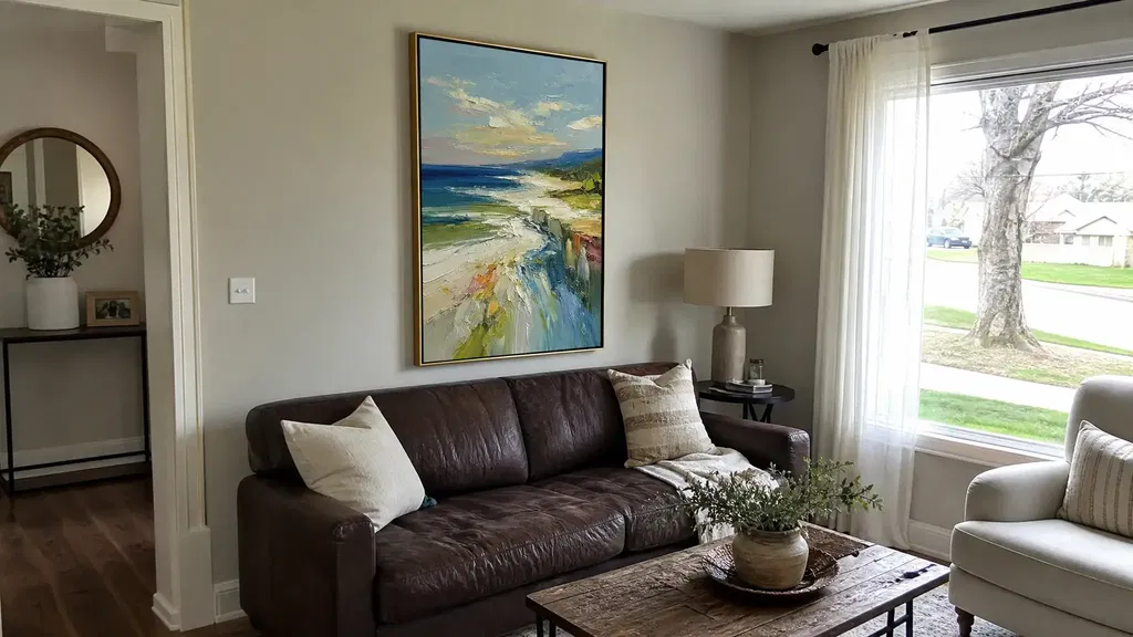
A narrow beam concentrates light on a smaller area and creates stronger contrast; a wider beam spreads the same light more evenly and softens shadows. Moving the fixture closer to the wall, farther from it, or higher on the ceiling changes how that beam meets the surface even when the nominal aiming angle stays close to 30 degrees. This separation is clear when illuminating a vibrant blue and green abstract canvas, where shifting beam spread keeps metallic accents sparkling without washing out subtle pigment gradients. None of these substitutes for checking the artwork from your actual seat or the spot where you usually stand, since a setup that looks right from a ladder can still glare when you sit down.
Choose 2700K or 3000K for the Room and the Artwork
Pick 2700K when your room already leans warm and you want the gold accents to read softer and more amber. Start with 3000K instead when your space uses more neutral-white lighting or you want a general-purpose starting point that's easier to match across the room.
2700K versus 3000K at a glance
| Color temperature | Choose it when | Likely presentation | Qualification |
|---|---|---|---|
| 2700K | Room already uses warm lamps; gold-forward look preferred | Softer, more amber gold; blue may read slightly muted | Verify the specific lamp's color data before relying on it |
| 3000K | Room uses neutral-white lighting; general-purpose starting point wanted | Less amber cast; easier to coordinate with neutral fixtures | Still requires checking rendering quality, not just the Kelvin number |
Check the lamp, not just the Kelvin number
Color temperature is a matter of warmth, not proof of accurate color. Conservation-focused lighting guidance for museums treats color temperature as a preference rather than a quality marker, and recommends selecting only lamps with good or excellent color rendering, then testing them on the actual object. If you display a multi-toned blue and green abstract painting with inlaid gold leaf, testing in-room verifies that cooler undertones stay crisp while the metallic features stay luminous. Look at the bulb's rendering specifications, not only its Kelvin rating, and view the canvas under that light in your room before committing to it.
Find and Correct Glare from the Main Viewing Position
Judge glare from your chair or the spot where you normally stand, not from directly under the fixture. If gold leaf throws a bright, mirror-like reflection back at your eyes from that spot, that's the problem to fix, separate from whether the texture itself is modeling well.
Confirm the reflection from where you sit or stand
Stand or sit in your usual viewing spot and compare the light on and off, or the fixture in its current position versus temporarily shifted. A distracting hotspot on the gold leaf is different from the small shadows the grazing angle is supposed to create on raised paint; you want to keep the second and reduce the first.

Change one lighting variable at a time
Move through aiming angle, fixture height or placement, beam distribution, intensity, and shielding as separate adjustments rather than changing several at once. Lighting guidance developed for displaying art at the Smithsonian identifies angle, distribution, intensity, and color as controllable qualities that can be adjusted independently. After each change, recheck both the reflection and how visible the blue texture and gold accents remain; a canvas with mostly flat metallic leaf will usually need more attention here than one with deep paint relief, since it has less texture to fall back on if you have to dial down intensity. If glare on a glossy surface remains stubborn after these adjustments, it may be worth comparing your canvas's finish against options built for high-glare spaces.
Test the Fixture Before Permanent Mounting
Set the fixture up somewhere temporary before you commit to holes or wiring, then work through this sequence:
- Position the light on a clamp, track head, or removable mount so you can move it freely.
- Aim it at roughly a 30-degree angle so the beam grazes the textured surface rather than hitting it flat.
- Sit or stand in your normal viewing spot and check relief visibility, gold reflections, and the blue-gold balance under your chosen 2700K or 3000K bulb.
- Adjust one variable at a time, aim, placement, spread, intensity, or shielding, and recheck from that same spot after each change.
- Once the result holds up from your normal viewing position, follow the fixture's own mounting and wiring instructions, and bring in a qualified electrician or installer for any wiring or mounting work that's beyond what you're comfortable doing yourself.
FAQs
Should mostly flat metallic artwork use the same lighting setup as heavily textured art?
Start with the same grazing angle and testing process, but shift your priority toward reflection control. A mostly flat gold leaf surface has less paint relief to model, so a bright hotspot is more likely to be the dominant issue than shadow detail, and it's worth spending more time on angle and shielding adjustments than on chasing dramatic texture shadows.
Does 3000K automatically show blue and gold more accurately?
No. Color temperature describes how warm or neutral the light looks, not how accurately it renders color. A 3000K bulb with poor color rendering can still distort blue or gold tones, so check the lamp's rendering quality and view the actual canvas under that light before assuming 3000K solves accuracy on its own.
Can I permanently install an accent fixture myself?
There's no single answer without knowing your specific fixture and wiring setup. Follow the fixture's own installation instructions, and bring in a qualified electrician or installer for any mounting or wiring work that goes beyond what you can safely complete yourself.