Glazing vs. Opaque: Identifying Depth in Hand-Painted Art
In my years observing the intersection of interior design and fine art, I have witnessed a significant shift in how collectors value their acquisitions. The "expensive art market," particularly the vanity auction sector for pieces over $10 million, saw a staggering 44% plummet in 2024. This isn't a retreat from art itself, but rather a migration toward "real application value." Buyers are moving away from speculative assets and toward authentic, hand-painted works that transform their living environments.
However, as the market matures, so does the challenge of discernment. In an era of high-definition prints and AI-generated imagery, how do you verify the "essential identity" of a piece? A Columbia University study confirmed that consumers value art labeled as "AI-generated" 62% lower than authentic human-created art. This value gap exists because human art possesses a physical soul—a "microtopography" of pigment and binder that digital replicas simply cannot replicate.
To truly appreciate the craftsmanship of a premium mural or canvas, one must understand the two foundational pillars of oil and acrylic application: Glazing and Opaque techniques. These methods do more than just apply color; they manipulate light itself.

The Physics of Glazing: Creating Luminous Depth
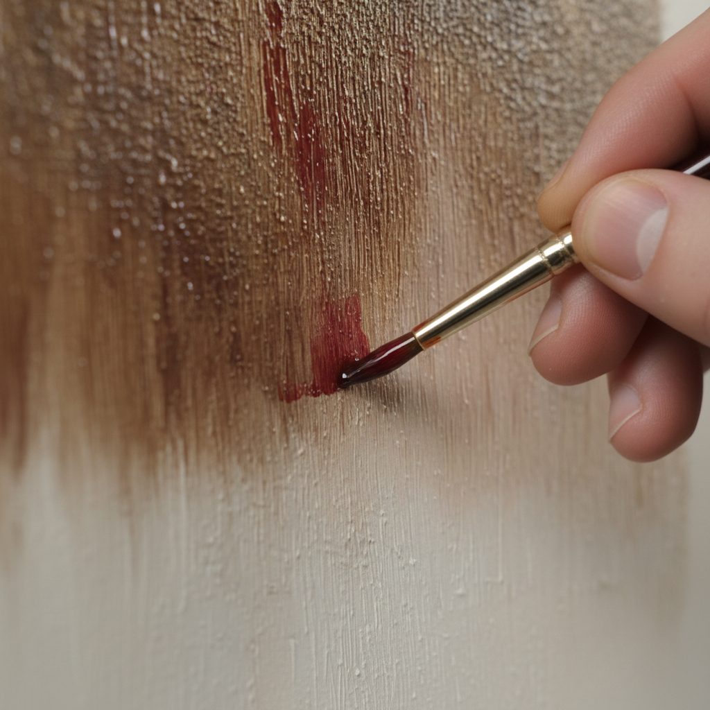
Glazing is the art of "painting with light." It involves applying a very thin, transparent layer of paint over a completely dry, opaque underpainting. Unlike mixing colors on a palette, glazing allows light to pass through the transparent layer, hit the underpainting, and reflect back to the viewer's eye.
The Mechanism of Optical Mixing
In my experience, the most common mistake beginners make is confusing a "wash" with a "glaze." A glaze relies on the Kubelka-Munk equation, a principle used by the Getty Conservation Institute to explain how pigment reflection is dominated by absorption and scattering coefficients.
When an artist applies a glaze, they are essentially creating a physical filter. For instance, a thin layer of transparent blue over a dry yellow underpainting doesn't just "look green"—it creates a green that glows from within because the yellow base acts as a light source.
Logic Summary: The 80/20 Transparency Heuristic Based on standard studio practices, we suggest the following rule of thumb for identifying high-quality glazes:
- Transparency Ratio: Optimal depth is achieved with a 70–80% transparency in the glaze layer, leaving 20–30% of the underpainting visible.
- Drying Time: Glazing requires extreme patience. Each layer typically needs 24–72 hours to dry completely. Applying a glaze over "tacky" paint causes "muddiness" rather than luminosity.
How to Spot Professional Glazing
If you are evaluating a piece for a high-end residential project, use the Angle Test. Hold the artwork at different angles to a directional light source. Glazed pieces will exhibit subtle color shifts—a "metameric" quality where the hue seems to deepen or change as you move. This is due to the physical refractive index of the binder, a phenomenon explored in optical microprofilometry research which proves that mm-scale texture is crucial to authentic aesthetics.
The Power of Presence: Mastering Opaque Techniques
While glazing is about transparency, opaque painting is about "hiding power." This technique uses pigments that completely obscure whatever is beneath them. It is the foundation of structural depth and the "impasto" style that many modern collectors crave.
The Dominance of Titanium White
In the world of opaque pigments, one chemical reigns supreme. According to NCBI data, Titanium Dioxide captures up to 90% of the global white pigment market. Its extreme chemical inertness and refractive index provide the "hiding power" necessary for bold, solid coverage.
When I inspect a mural for "craftsmanship value," I look at the pigment loading in the opaque sections. High-quality hand-painted art uses a high pigment-to-binder ratio. If the paint looks "plastic" or overly shiny in an opaque area, it may be a sign of excessive filler or cheap synthetic binders.
Tactile Fruition and Interaction
Opaque techniques often result in physical relief. Tests at the MUNCH Museum confirm that allowing audiences to interact with (or even just closely observe) art featuring physical relief textures exponentially stimulates intrinsic satisfaction. This is why a hand-painted wall feels more "expensive" than wallpaper; the eye perceives the physical weight of the paint.

Craftsmanship and the "Invisible Labor"
The price difference between a $50 print and a $5,000 hand-painted mural isn't just about materials; it’s about the "biochemical crystallization of human attention." A survey of 875 artists in Cincinnati revealed that the market severely undervalues the "invisible labor" of painters.
Technical Challenges: SID and Surfactants
Professional artists must navigate chemical minefields that machines ignore. For example, Golden Artist Colors warns of Support Induced Discoloration (SID). This occurs when water-soluble impurities in a canvas are drawn into transparent acrylic glazes, causing a catastrophic yellowing. A master painter knows how to prime a surface to prevent this, ensuring the work remains pristine for decades.
Furthermore, Tate research identifies that surfactants in acrylic paint can migrate to the surface, creating a "hazy" appearance. Identifying a piece that has been properly "cured" and cleaned of these surfactants is a hallmark of an expert buyer.
Health, Safety, and the "Non-Toxic" Promise (YMYL)
When commissioning art for a private home or a healthcare facility, the chemical composition of the paint becomes a health and safety issue (YMYL). Indoor air pollution is a critical concern; the EPA warns that indoor air can be significantly more polluted than outdoor air.
The Reality of Toxic Pigments
Historically, some of the most beautiful colors were the most deadly.
- Cadmium: The International Agency for Research on Cancer (IARC) classifies cadmium as a Group 1 carcinogen. While the industry has fought to keep it for its unmatched vibrancy, I often recommend that clients in maternal or infant environments opt for modern "cadmium-free" alternatives.
- Lead: The EU REACH regulation strictly bans lead carbonates in concentrations exceeding 0.1%.
VOCs and Indoor Air Quality
For commercial developers seeking LEED or WELL certification, low-VOC (Volatile Organic Compound) paints are a prerequisite. Research from Aalto University shows that coatings on moisture-controlled wood emit significantly lower VOCs than dry wood. When we model the safety of a mural installation, we prioritize water-based acrylics, which the EPA suggests are safer for respiratory health than dry powder pigments or solvent-based oils.
Strategic Application: ROI and Well-being
Art is no longer just a "decoration"; it is a "public health infrastructure" and a commercial lever.
The Economic ROI of Murals
For B2B clients, the data is clear. A Royal Society analysis found that neighborhoods with higher "art" geo-tags had greater relative house price ranking gains. In Chicago, public art projects drove $1.4 billion in real estate-related growth.
Furthermore, UCincinnati research shows that large murals are the lowest-cost physical foot traffic generators for urban business districts. If you are a shop owner, a hand-painted exterior is a "permanent physical billboard."
Biophilic Design and Stress Reduction
In healthcare and office settings, "Biophilic" murals—those featuring natural landscapes—are transformative. A UPenn review noted that 73% of patients reported significant mood improvements when exposed to environmental art. This is because viewing realistic nature murals activates the mPFC and amygdala, optimizing emotional regulation circuits in the brain.
Method & Assumptions: The Light Interaction Model To help designers plan lighting for these techniques, we modeled visual satisfaction based on common gallery heuristics.
Technique Primary Light Source Angle Rationale Glazing Directional Spotlight 45° Maximizes refractive "glow" through layers. Opaque Diffuse Ambient N/A Minimizes distracting texture shadows. Impasto Low-Angle Side Light 15-30° Accentuates physical relief and drama. Mixed Layered Lighting Variable Balances atmospheric depth with structural focus. Note: This is a scenario model based on common industry lighting standards, not a controlled lab study.

Verifying Longevity: Lightfastness and Conservation
A common anxiety for buyers is whether their investment will fade. The National Gallery has debunked the myth that "oil holds color better than acrylic." In controlled experiments, the fading rate of pigments like Prussian Blue was identical across all media.
What matters is ASTM D4303 lightfastness ratings. However, as the ArtisCreation database points out, these ratings are often "watered-down averages." I advise collectors to look for "Lightfastness I" (Excellent) ratings on the specific pigments used in their commission.
Maintenance Tips
- Cleaning: Contrary to conservative views, Tate research confirms that gently wiping acrylic surfaces with water-based cotton swabs can actually help reduce dirt adhesion.
- Varnish: Always insist on a UV-protective varnish. This acts as a molecular shield, blocking the harmful light waves that cause photochemical aging in polymer coatings.
The Ultimate Luxury: Authentic Handcrafting
The European Crafts Alliance 2025 outlook states that the ultimate luxury for modern consumers is the fusion of avant-garde design with authentic handcrafting techniques. By choosing a piece that balances the luminous mystery of glazing with the bold physical presence of opaque strokes, you are not just buying decor. You are investing in a "cultural heritage asset" that possesses long-term aesthetic and educational value.
Whether you are designing a high-density office in Tokyo to combat employee burnout or creating a sanctuary in your own home, understanding these techniques ensures that your choice in art is as informed as it is beautiful.
YMYL Disclaimer: This article is for informational purposes only and does not constitute professional medical, legal, or financial advice. The chemical safety of art materials can vary; always consult manufacturer Safety Data Sheets (SDS) and local environmental regulations before undertaking large-scale painting projects.
Sources
- The Art Basel and UBS Art Market Report 2024
- Columbia University: Human-Made vs. AI Art Study
- EPA: Indoor Air Quality and Low-VOC Paints
- Royal Society: Quantifying Art and Property Prices
- WHO Scoping Review on Arts and Health
- Getty Conservation Institute: Color Science
- Tate: Conservation Concerns for Acrylic Emulsion Paints
- IARC: Cadmium and Cadmium Compounds


