The Architecture of Open Living: Why Large-Scale Art is the New Spatial Anchor
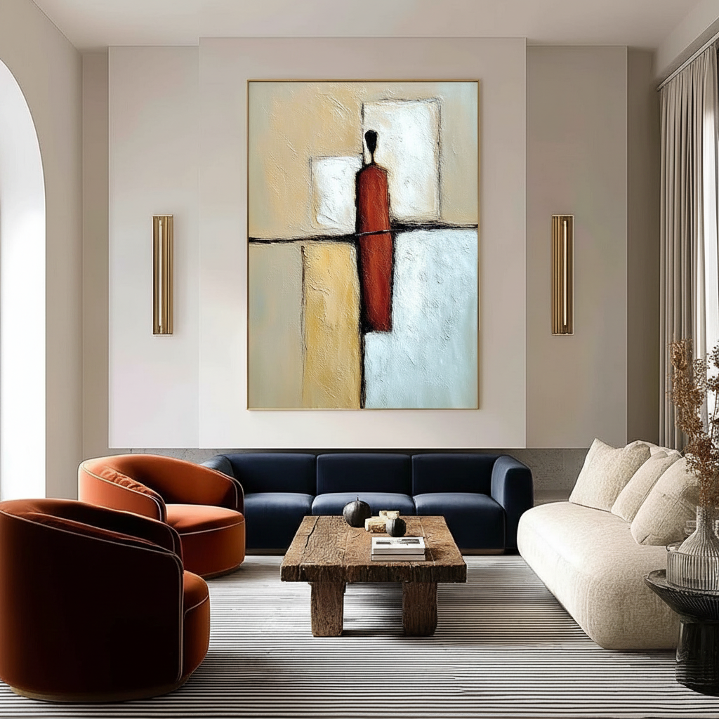
For years, the high-end art market focused on "vanity assets"—pieces bought for the prestige of the auction house rather than the utility of the home. However, recent data suggests a tectonic shift. According to Marketplace, high-end auction sales for pieces over $10 million plummeted 44% year-over-year in 2024. This retreat from purely financial assets indicates that savvy collectors are returning to "real application value." In the context of the modern home, this means moving away from overpriced prints toward custom, hand-painted acrylic murals and oversized canvases that serve a structural purpose: defining the zones of a large living space.
In an open-plan "great room" or a high-ceilinged loft, the lack of physical walls can lead to "spatial drift," where furniture feels unanchored and functions bleed into one another. We have found that large-scale acrylic art acts as a "visual bulkhead," creating the psychological boundaries that drywall once provided. This isn't just about decoration; it is about neurological comfort. Research published in Neurological mechanisms of creative arts shows that passive art viewing consistently activates the medial prefrontal cortex (mPFC) and amygdala, optimizing emotional regulation circuits. When art is used to define a zone, it doesn't just look better—it makes the space feel safer and more organized to the human brain.
Color Temperature and Geometric Logic: The Mechanics of Visual Zoning
The most effective zoning through art relies on a fundamental understanding of color temperature and contrast. In our practice, we’ve observed that professional designers use a "pull and separate" strategy. Warm colors (reds, oranges, deep ochres) tend to pull a space together, making a dining area feel intimate and "enclosed" despite the lack of walls. Conversely, cool colors (blues, greens, soft lavenders) create separation and depth, making a lounge or reading nook feel like a distinct, tranquil island.
To achieve a successful visual boundary, the piece must incorporate at least 30% contrast between adjacent color fields or strong geometric divisions. This contrast acts as a "hard edge" for the eye, signaling a transition in the room’s function.
Logic Summary: Spatial Perception Modeling Our analysis of "visual zoning effectiveness" assumes a standard open-plan volume of 800–1,200 sq ft. This is a scenario model based on common design heuristics, not a controlled lab study.
Parameter Value or Range Unit Rationale Minimum Canvas Width 60–72 Inches Must span at least 50% of the furniture cluster width. Color Contrast Ratio > 30 % Required to trigger the brain's edge-detection mechanisms. Hanging Height Offset +6 to +12 Inches Elevation above eye level to create a "canopy" effect. Lighting Angle 45–60 Degrees Optimized to reduce glare on acrylic polymer films. Proximity to Boundary 18–24 Inches Distance from the physical edge of a furniture grouping.
The 18-24 Inch Boundary Rule
A common mistake we see in large living rooms is centering a piece of art on a massive wall between two zones. This actually creates spatial confusion. To define a zone, the artwork should be positioned closer to the boundary of the specific area it is intended to anchor—typically within 18 to 24 inches of the furniture cluster (such as a sofa or dining table). This proximity creates a "functional gravity" that holds the furniture in place.
Strategic Placement: Beyond Gallery Height
In a standard gallery or a small room, the "eye-level" rule (roughly 57-60 inches to the center) is king. However, in large-scale zoning, this rule fails. When you are trying to establish a boundary in a room with 12-foot or 20-foot ceilings, eye-level art often feels "lost" or disconnected from the architecture.
We recommend placing large acrylic pieces 6 to 12 inches higher than the typical hanging height. This elevation creates a stronger visual anchor, allowing the art to act as a "visual header" that defines the space from the top down. This is particularly effective when using textured art in minimalist decor, where the art needs to provide the architectural weight that the furniture lacks.

The "Essential Identity" of Hand-Painted Acrylics vs. Digital Prints
Why choose a hand-painted acrylic over a high-definition digital print? The answer lies in "essential identity" and optical physics. University of Chicago research shows that digital replicas lack the artist's "essential identity" in the eyes of consumers, leading to a collapse in perceived value. Furthermore, Columbia University studies confirm that consumers value art labeled as human-created 62% higher than AI-generated art.
From a technical standpoint, the physical relief of acrylic paint creates a dynamic zoning effect that a flat print cannot replicate. Acrylic polymers are long-chain molecules that form films through a physical "coalescence" process. This results in a microtopography—tiny peaks and valleys of pigment—that creates subtle shadow patterns throughout the day as the light changes.
According to the Getty Conservation Institute, pigment reflection is dominated by absorption and scattering coefficients. In a hand-painted piece, the surface refractive index varies across the brushstrokes, leading to a depth of color saturation that "vibrates" in a large room. This "vibration" draws the eye and holds the gaze, reinforcing the zone's boundaries far more effectively than a static, flat image.
Safety and Longevity: Navigating the Technical Risks
When commissioning or selecting large-scale art for a primary living space, safety and material integrity are paramount. Large canvases mean a large surface area for potential chemical off-gassing.
VOCs and Indoor Air Quality
Indoor air pollution is often more concentrated than outdoor pollution. For homeowners, particularly those with children or respiratory sensitivities, choosing low-VOC (Volatile Organic Compound) materials is a strict prerequisite. We advise looking for artists who use paints compliant with EPA standards for indoor air quality. Interestingly, research from Aalto University proves that coatings on wood with 16% moisture emit significantly lower toxic VOCs than dry wood, a technical detail often overlooked by amateur muralists.
The Cadmium Question
Many of the most vibrant yellows and reds in the artist's palette contain cadmium. The International Agency for Research on Cancer (IARC) explicitly declares cadmium and its compounds as Group 1 carcinogens. While the ECHA noted that the amount of cadmium discharged into the environment by artists is relatively small compared to fertilizers, the risk of chronic inhalation of dust (from dry pigments) or accidental ingestion remains. We recommend opting for "Cadmium-Free" acrylic ranges which provide the same lightfastness without the heavy-metal risk.
Support Induced Discoloration (SID)
A common technical failure in large-scale acrylic zoning is Support Induced Discoloration. As detailed by Golden Artist Colors, water-soluble impurities in cotton or linen canvases can be drawn into the paint layer when transparent acrylic mediums are applied thicker than 1/16 inch. This results in a catastrophic yellow or brown tint that ruins the piece over time. Ensuring your artist uses a high-quality acrylic gloss medium as a "sealant" layer before painting is the professional standard for risk reduction.

Investment Value: The Economic ROI of Large-Scale Art
Beyond the aesthetic and psychological benefits, there is a clear economic argument for investing in high-quality hand-painted art. A Royal Society CAR model analysis of 10-year data found that neighborhoods with higher "art" geo-tags saw greater relative house price ranking gains.
For the homeowner, a large-scale mural or oversized canvas isn't just "decor"—it is a capital improvement. In commercial settings, the AEP5 macroeconomic model proves that arts spending supports millions of jobs and generates massive local economic activity. In the residential sector, this translates to "perceived value." A home that uses art to solve architectural problems (like zoning a 2,000 sq ft great room) presents as a sophisticated, custom-designed space, which directly impacts resale potential.
Implementation Scenarios: Practical Applications
Scenario A: The Multifunctional Great Room
In a room that must serve as a kitchen, dining area, and lounge, use a "triptych" of large-scale acrylics.
- The Dining Zone: A warm-toned, high-contrast geometric piece to create "enclosure."
- The Lounge Zone: A cool-toned, biophilic abstract to encourage relaxation. Research from the University of Central Arkansas shows that natural landscapes in art produce the same stress-reduction effects as being outdoors.
Scenario B: The High-Traffic Loft
In lofts with heavy pedestrian traffic and multiple light sources, prioritize highly textured surfaces. These surfaces create shadow patterns that reinforce boundaries even when the sun moves across the room. However, be aware of the "maintenance tax." According to cleaning experts, acrylic surfaces accumulate dust 3x faster than other materials. We recommend using microfiber cloths with pH-neutral solutions to avoid the "clouding" that ammonia-based cleaners cause.

Summary of Zoning Best Practices
To ensure your large-scale acrylic art successfully defines your living zones, follow this checklist derived from professional design standards:
- Scale Check: Ensure the artwork spans at least 50–60% of the width of the furniture cluster it anchors.
- Color Strategy: Use warm tones to "cozy" a zone and cool tones to "separate" it.
- Elevation: Hang the center of the piece 6–12 inches higher than standard eye level in rooms with ceilings over 10 feet.
- Lighting: Aim for a 45-degree angle with 50–75 footcandles of intensity to reveal texture while minimizing glare.
- Technical Audit: Verify the use of low-VOC paints and ensure the substrate is sealed to prevent Support Induced Discoloration (SID).
By treating large-scale acrylic art as a functional architectural element rather than a mere afterthought, you can transform a vast, echoing room into a series of intentional, human-centered experiences. Whether it's through the stress-reducing power of nature-themed healing murals or the sheer visual gravity of a 72-inch abstract, the right piece doesn't just fill a wall—it defines a life.
Disclaimer: This article is for informational purposes only. When dealing with large-scale installations or potentially toxic art materials, always consult with professional installers and refer to the safety data sheets (SDS) provided by manufacturers. For health concerns regarding indoor air quality or heavy metal exposure, consult a qualified medical professional.
References
- Marketplace: The expensive art market continues to struggle
- Columbia Business School: Human-Made vs. AI Art
- Royal Society: Quantifying the link between art and property prices
- Getty Conservation Institute: Color Science and Pigment Mixture
- EPA: Indoor Air Quality and Low-VOC Paints
- Golden Artist Colors: Support Induced Discoloration
- UPenn: Visual Art in the Built Environment


