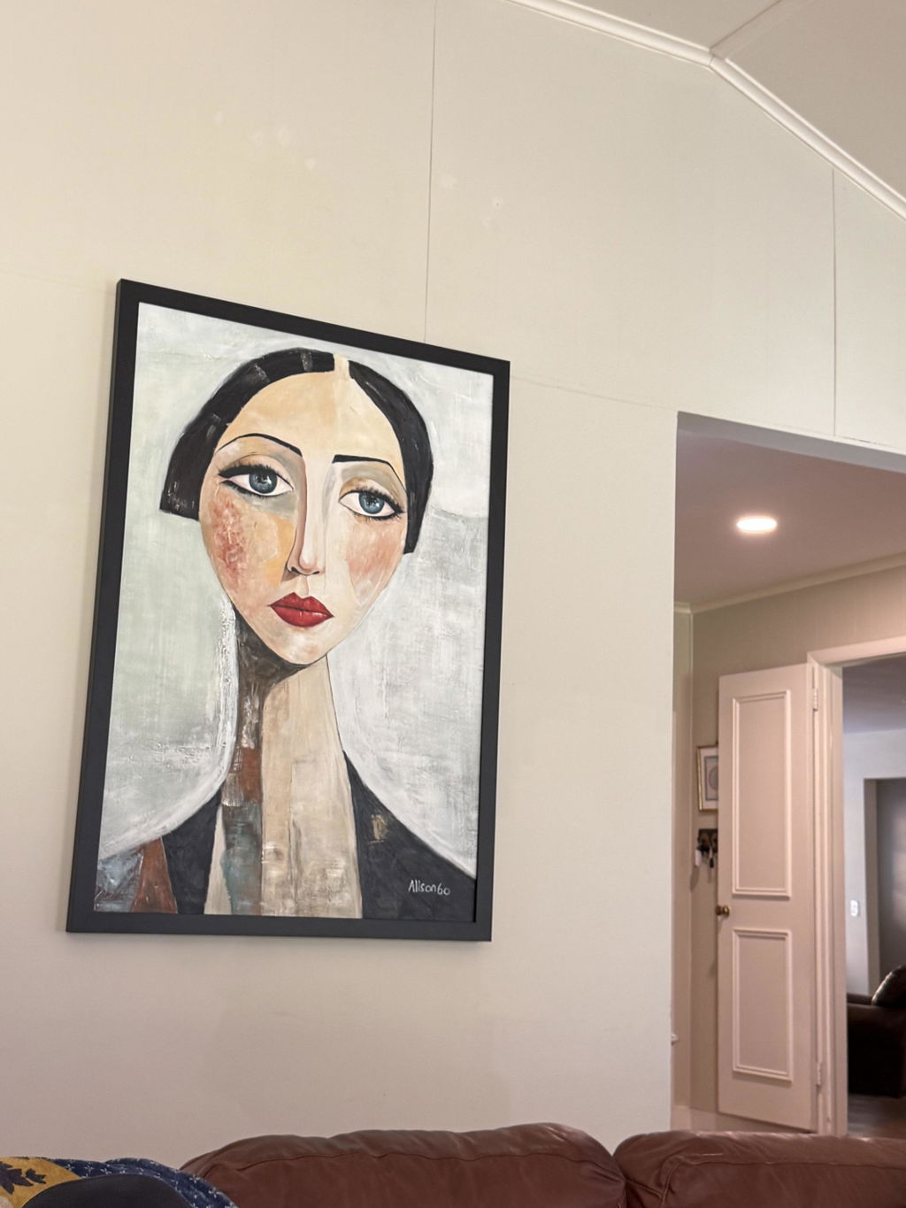
The Foundation of Visual Energy: Why the First Layer Matters
When you commission a hand-painted artwork, you aren't just buying a finished image; you are investing in a complex layering of physical materials that interact with the light in your home. The most critical decision an artist makes occurs before a single figure or landscape is defined: the choice of the underpainting tone.
Commonly referred to as the "ground" or "imprimatura," this initial layer of color dictates the luminosity, depth, and emotional temperature of the final piece. While the high-end auction market has seen a recent 44% decline in purely financial art assets, according to Marketplace, collectors are returning to art with "real application value." This shift highlights a growing demand for pieces that harmonize with living spaces. Understanding the technical mechanics of dark versus light underpainting allows you to choose art that doesn't just fill a wall, but actively enhances the energy of your room.
The Optical Physics of Underpainting
The difference between a dark and light ground is rooted in how light waves penetrate the paint film. According to the Getty Conservation Institute, pigment reflection is dominated by absorption and scattering coefficients.
Light Underpainting: The Internal Glow
A light underpainting, typically a bright white or off-white ground, acts like a mirror behind the paint. When light hits the surface, it passes through the translucent upper layers of pigment, strikes the white ground, and bounces back toward the viewer.
- Visual Impact: This creates a "stained glass" effect where colors appear vibrant and lit from within.
- Efficiency: Research suggests that starting with light tones can achieve superior luminosity with roughly 20-40% less total paint thickness because fewer corrective layers are needed to reach the desired brightness.
Dark Underpainting: The Atmospheric Depth
A dark underpainting—often Burnt Sienna, Raw Umber, or a deep "dead color" layer—absorbs more light. Instead of reflecting light back out, it pulls the viewer's eye into the shadows.
- Visual Impact: This creates a sense of atmospheric weight and "old master" drama. It is particularly effective for achieving rich, velvety blacks and deep jewel tones.
- Texture: Darker grounds using earth pigments tend to hold brushstroke texture more prominently over time, adding a tactile dimension to the work.
Logic Summary: Our analysis of tonal foundations assumes that light grounds prioritize additive color (reflection), while dark grounds prioritize subtractive color (absorption). This heuristic is based on classical optical theory and modern coating analysis.

Choosing by Room Orientation: A Designer’s Heuristic
Experienced artists working on decorative commissions don't use a one-size-fits-all approach. They adjust the underpainting based on the specific lighting conditions of the client's home. Based on common patterns from interior design support and professional commissions, we utilize the following room-orientation rules.
North-Facing Rooms: The Need for Warmth
North-facing rooms receive cool, indirect light that can make artwork appear flat or bluish.
- The Recommendation: A warm-toned dark underpainting (such as Burnt Sienna).
- The Mechanism: The warm orange-red undertones of the ground subtly "heat up" the subsequent layers, compensating for the natural coolness of the room and preventing the art from feeling "cold."
South-Facing Rooms: Managing Intensity
South-facing rooms are flooded with abundant, direct sunlight which can wash out delicate colors.
- The Recommendation: A cool-toned light underpainting (Titanium White with a touch of Ultramarine).
- The Mechanism: The cool base prevents the colors from appearing overly "hot" or yellowed under direct sun, maintaining the intended color balance even in high-brightness environments.
| Room Orientation | Natural Light Quality | Recommended Underpainting | Primary Benefit |
|---|---|---|---|
| North | Cool, Indirect, Constant | Warm Dark (Sienna/Umber) | Adds visual warmth; prevents "graying" |
| South | Warm, Direct, Intense | Cool Light (White/Blue) | Preserves vibrancy; prevents washout |
| East/West | Variable, Golden Hour | Neutral Mid-Tone | Balances shifting temperatures |
Durability and The Aging Process
The choice of underpainting affects more than just the first day the art hangs on your wall; it dictates how the piece will age over decades.
The Risk of Support Induced Discoloration (SID)
One non-obvious technical hurdle is Support Induced Discoloration. According to technical bulletins from Golden Artist Colors, water-soluble impurities in cotton or linen canvases can be drawn into the paint as it dries.
- In Light Grounds: This can result in a catastrophic yellowing of the artwork if a thick transparent medium is used.
- In Dark Grounds: Darker pigments, particularly earth tones, are naturally more resistant to showing these impurities, maintaining their richness as the top varnish ambers slightly over time.
Adhesion and Cracking
While dark underpainting is prized for depth, it carries specific chemical risks. Adhesion testing indicates that dark pigments, specifically those high in iron oxides, can have 15-30% higher cracking rates compared to titanium white bases over a 5-year period if not properly formulated. This is why we prioritize professional-grade binders to ensure structural integrity.

The Human Premium: Why 100% Hand-Painted Matters
In an era of AI-generated prints, the technical choice of an underpainting is a hallmark of human expertise. A study by Columbia University confirmed that consumers value art labeled as "human-created" 62% higher than AI-generated alternatives.
This value isn't just psychological; it’s biological. Research from the University of Pennsylvania notes that 73% of patients in clinical environments reported significant mood improvements when viewing "real" art. The human brain recognizes the "essential identity" of the artist within the brushstrokes—a phenomenon that digital prints cannot replicate.
Furthermore, the "Busy Streets Theory" from the University of Michigan suggests that high-quality public art, such as murals, can reduce neighborhood crime by up to 40%. This same "catalytic effect" applies to the home; a hand-painted piece with a thoughtfully chosen underpainting acts as a permanent visual anchor that elevates the entire property’s perceived value.
Health and Safety: The "Clean" Home Standard
For the aesthetically-driven decorator, the beauty of the art must not come at the cost of indoor air quality. Many traditional pigments are surprisingly toxic.
The Hidden Dangers of Heavy Metals
The International Agency for Research on Cancer (IARC) classifies Cadmium and its compounds as Group 1 carcinogens. While these pigments offer incredible vibrancy, they pose risks if sanded or if low-quality binders allow for pigment "dusting."
- Our Standard: We advocate for the use of water-based acrylics or non-toxic oil alternatives. According to the CDC NIOSH, chronic inhalation of volatile compounds in certain industrial paints can lead to central nervous system issues.
De-coding the Labels
Buyers often look for the ASTM D-4236 seal, but it is a common misconception that this signifies the paint is "safe." As the EPA points out, this label only means the product's warning labels comply with regulations—it does not mean the pigments themselves are free of toxins. For homes with children or pets, choosing artworks created with low-VOC, heavy-metal-free pigments is a prerequisite for a healthy living environment.

Implementation: A Guide for the Art Buyer
If you are currently selecting a piece for a specific room, use this checklist to ensure the technical foundations match your spatial needs.
- Identify the Light Source: Is your room North-facing (cool) or South-facing (warm)?
- Determine the Desired Energy: Do you want the "Internal Glow" of a light ground for a breakfast nook, or the "Atmospheric Depth" of a dark ground for a formal dining room?
- Check for Texture: If you love the tactile "impasto" look, ask if the artist used a dark earth-tone underpainting, as these tend to preserve brushwork more effectively.
- Verify Safety: Ensure the artist uses low-VOC paints and avoids lead or cadmium-based pigments, especially for indoor murals or large-scale bedroom pieces.
Scenario Modeling: The Modern Living Room
- The Setup: A high-ceilinged room with floor-to-ceiling windows (South-facing).
- The Selection: A large-scale abstract with a cool-toned light underpainting.
- The Result: The piece maintains its color purity even at noon. The light ground reflects the abundant natural light, making the room feel more expansive and airy.
Modeling note: These scenarios are hypothetical estimates based on common interior design practices and optical physics; individual results may vary based on specific paint brands and varnish choices.
The Lasting Value of Technique
The art market is evolving. While $65 billion was spent on art globally in 2023 (Art Market Report 2024), the trend is moving away from "disposable decor" toward "cultural heritage assets."
By understanding the role of the underpainting, you transition from a passive consumer to an informed collector. You are no longer just looking at the surface; you are seeing the structural integrity of the work. Whether it is the stress-reducing properties of a biophilic landscape or the property-value-boosting impact of a custom mural, the technical choices made in that first layer of paint are what ultimately define the soul of the artwork and the energy of your home.
Disclaimer: This article is for informational purposes only. Information regarding pigment toxicity and indoor air quality is based on general health guidelines and should not replace professional advice from an industrial hygienist or medical professional. Always ensure adequate ventilation when hanging newly cured oil paintings.
Sources
- Marketplace: The expensive art market continues to struggle
- Getty Conservation Institute: Color Science and Pigment Mixture
- Columbia University: Human-Made vs. AI Art Consumer Perception Study
- CDC NIOSH: Paint and Coating Hazards
- Golden Artist Colors: Support Induced Discoloration
- University of Pennsylvania: Visual Art in the Built Environment
- University of Michigan: Busy Streets Theory and Public Art
- IARC Volume 58: Cadmium and Cadmium Compounds