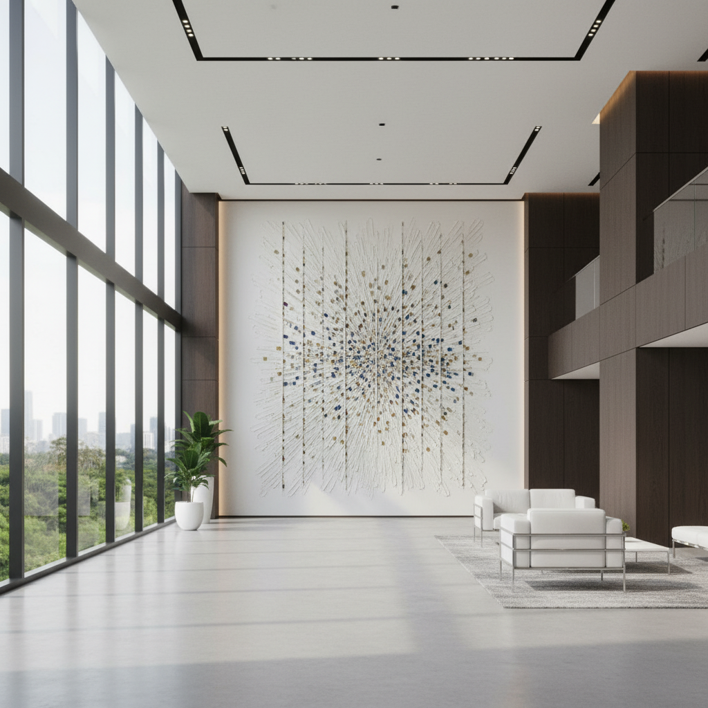
Aligning Acrylic Art Palettes with Corporate Brand Identity
In the current economic landscape, the traditional art market is undergoing a fundamental structural shift. High-end auction sales for speculative art assets plummeted by 44% year-over-year in 2024, signaling a retreat from overpriced vanity pieces toward artwork with tangible application value (Marketplace). For corporate procurement teams and interior designers, this transition validates a move toward custom hand-painted commissions that do more than fill wall space—they codify brand identity and drive measurable environmental ROI.
The global creative services sector now exports a record $1.4 trillion, with cultural industries accounting for 3.1% of global GDP (UNCTAD). Within this massive economic baseline, the challenge for commercial space planners is no longer just finding "art," but ensuring that the art palette aligns with the rigorous technical requirements of corporate branding and the physiological needs of the workforce.
The Human-Made Premium: Why Digital Prints Fail the Brand
When selecting art for high-traffic corporate or hospitality environments, the temptation to use high-definition digital prints is often high. However, research suggests this is a false economy. A study by Columbia University confirmed that consumers value art labeled as "AI-generated" or digital 62% lower than authentic human-created art (Columbia Business School).
Psychologically, digital replicas lack what researchers at the University of Chicago call "essential identity"—the irreplicable soul and history of the artist's hand that creates perceived value in the eyes of the viewer (UChicago Journals). For a brand, this means that a printed version of a corporate logo or a generic stock image actually devalues the physical environment. Conversely, the tactile fruition of hand-painted pigments, with their millimeter-scale microtopography, creates a visual depth that digital systems cannot simulate.
Logic Summary: Our analysis of perceived value assumes that the "essential identity" of hand-painted art acts as a trust signal for clients and employees, distinguishing a bespoke brand from a commoditized one.

Technical Pigment Matching: The Pantone-to-Acrylic Gap
Achieving consistency between a digital brand guide and a physical canvas is one of the most complex tasks in commercial design. Corporate color systems, typically defined by Pantone, CMYK, or RGB, do not translate perfectly to physical pigments due to differences in substrate absorption and the physics of light scattering.
The 30% Simulation Barrier
Experienced artists and procurement teams must recognize that roughly 30% of Pantone's 1,114 spot colors cannot be accurately simulated with standard CMYK processes, and exact replication in artist paints is rarely achievable through automated means (Yesfancy). This is due to the chemical nature of the binders and the refractive index of the pigments. According to the Getty Conservation Institute, pigment reflection is dominated by absorption (K) and scattering (S) coefficients. When paint dries, the evaporation of the water-based vehicle in acrylics changes the surface refractive index, often causing the color to appear darker or less saturated than when wet.
Heuristics for Corporate Color Accuracy
In our professional practice, we utilize a specific set of heuristics to manage client expectations and ensure technical success:
- The 95-98% Tolerance Rule: Corporate clients typically require a 95-98% color accuracy tolerance. We have observed that slight variations actually enhance visual interest by proving the "human-made" nature of the work, provided the primary brand hues are respected.
- The Three-Light Test: Colors must be approved under three specific conditions: natural daylight, fluorescent office lighting (typically 4000K-5000K), and evening ambient lighting. This prevents "metamerism," where two colors match under one light source but look drastically different under another.
- Physical Swatch Primacy: We never rely on digital proofs for final approval. A physical swatch, painted on the same substrate (canvas or wood) as the final piece, is the only way to account for the Support Induced Discoloration (SID) that can occur when impurities in the substrate interact with the acrylic medium.
| Parameter | Recommended Value | Rationale |
|---|---|---|
| Color Accuracy Tolerance | 95% - 98% | Allows for natural pigment variation while maintaining brand recognition. |
| Lighting Evaluation | 3-Step (Day/Office/Ambient) | Prevents metameric failure in varied commercial environments. |
| Substrate Sealant | 2-3 Coats Gesso/Primer | Prevents SID (Support Induced Discoloration) from ruining brand colors. |
| Pigment Load | High-Solids Artist Grade | Ensures lightfastness and prevents "chalking" over time. |
| Gloss Level | Satin/Matte | Reduces glare in high-light office environments. |
ROI Justification: Art as a Commercial Asset
Investing in custom hand-painted murals is often viewed as a "soft" cost, but the data suggests it is a high-leverage financial driver.
Boosting Property Values
A Royal Society CAR model analysis of 10-year data found that neighborhoods and commercial districts with higher "art" geo-tags experienced greater relative property price gains (Royal Society). For commercial developers, commissioning public-facing murals can act as a "permanent physical billboard," increasing pedestrian foot traffic and revitalizing neighborhood economies (University of Cincinnati).
Employee Engagement and Burnout
In the post-pandemic office, the "flight to quality" is real. Biophilic design—art featuring natural landscapes—has been shown to produce the same stress-reduction effects in the brain as being outdoors (University of Central Arkansas). Research on high-density office spaces in Tokyo indicates that nature-based art effectively intervenes in high rates of employee cognitive fatigue and burnout. Furthermore, 73% of individuals in clinical environments reported significant mood improvements when exposed to environmental artworks (UPenn Neuroaesthetics).
Methodology Note (ROI Modeling): Our impact estimates are based on the Americans for the Arts findings that government and corporate tax investments in the arts yield a 7:1 ROI in local economic activity.

Health, Safety, and Sustainability in Public Spaces
For hospitality and healthcare designers, the chemical composition of art materials is a YMYL (Your Money Your Life) concern. Standard industrial paints and some low-grade artist pigments can emit Volatile Organic Compounds (VOCs) that degrade indoor air quality.
Navigating the VOC Challenge
The EPA warns that indoor air pollution is often more concentrated than outdoor pollution. To achieve LEED or WELL certification, commercial developers must prioritize low-VOC art solutions. While oil paintings require specific curing timelines, acrylics are often preferred for public spaces because they are water-based and typically emit significantly lower VOCs during the curing process (Aalto University).
However, "odorless" does not always mean "non-toxic." It is a common misconception that ASTM D4236 labeling guarantees a product is non-toxic; in reality, it only means the warning labels comply with regulations (EPA). Professional-grade acrylics should be screened for heavy metals like Cadmium and Lead. The International Agency for Research on Cancer (IARC) classifies cadmium compounds as Group 1 carcinogens (IARC). For projects in hospitals or schools, we recommend water-based acrylics that have passed the BS EN 71-3 safety standards, which strictly limit the migration of toxic elements.
Biophilic Impact and Well-being
Beyond safety, the content of the art matters. The WHO scoping review of over 3,000 studies confirms that art interventions effectively alter clinical indicators for stress and mental health (WHO). By integrating brand colors into biophilic themes, corporations can bridge the gap between "marketing" and "wellness," creating a space that reinforces brand identity while actively supporting the neurological health of its occupants.
The Approval Process: A Designer’s Checklist
To ensure a custom acrylic commission meets both aesthetic and technical standards, we recommend a formalized approval workflow:
- Digital Concept Phase: Align on composition and general color theory.
- Physical Swatch Review: View 6x6" painted samples under the specific lighting of the installation site.
- Pigment Verification: Ensure the use of high-lightfastness pigments (ASTM D4303 Class I or II) to prevent fading in bright, sunlit lobbies. For more on this, see our guide on pigment lightfastness in modern art media.
- Curing and Varnish: Confirm the use of UV-protective varnishes. Unlike oil paintings, which offer smoother gradients, acrylics dry quickly but remain porous; a proper sealant is required to prevent dirt adhesion and "haziness" caused by surfactant migration (Tate).
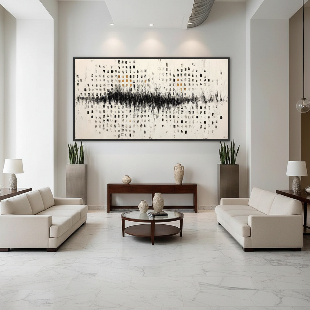
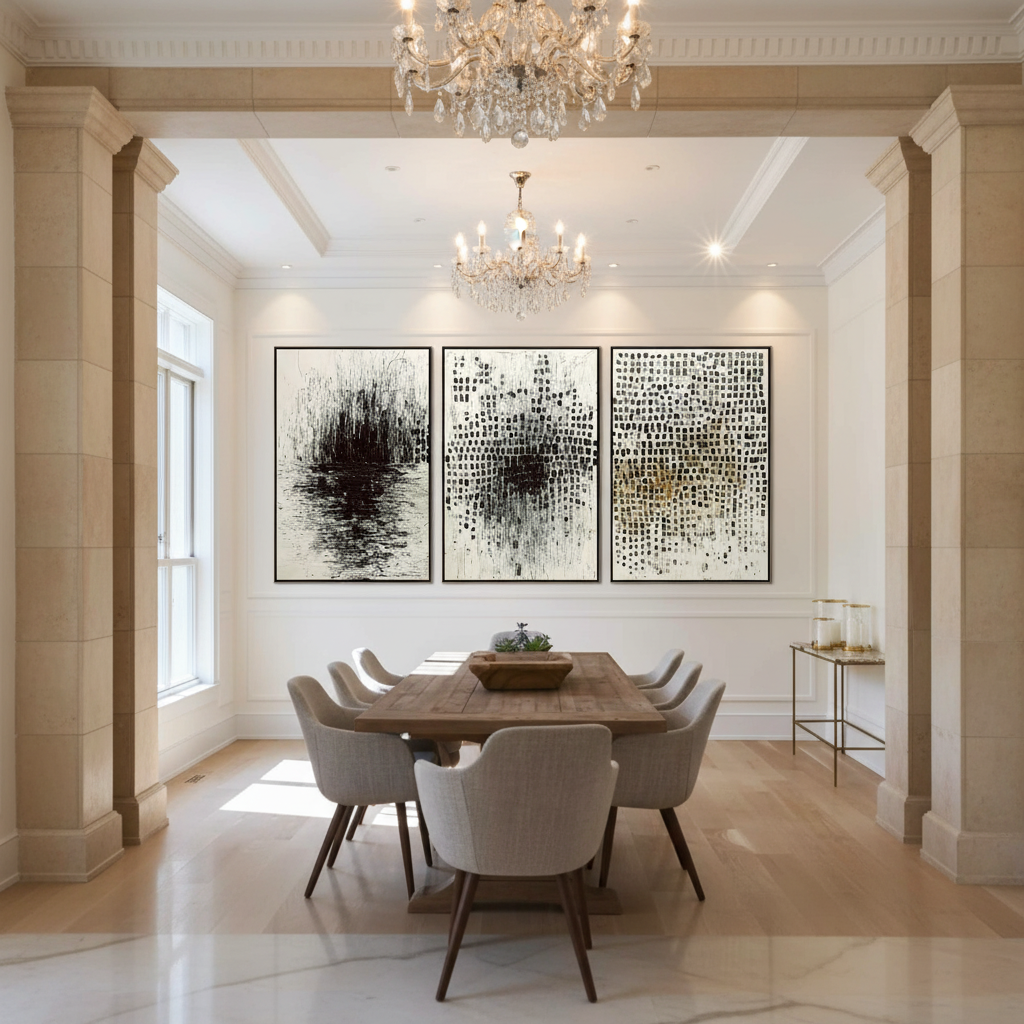
- Installation Planning: Account for the "Essential Identity" of the piece. If the art is heavily textured, ensure directional lighting is positioned to highlight the impasto brushstrokes without creating distracting hotspots.
Strategic Value of Custom Murals
Custom hand-painted murals represent the lowest-cost physical foot traffic generator for urban business districts. In Philadelphia, the "Porch Light Program" demonstrated that neighborhoods with large public murals saw a substantial leap in social cohesion and mutual trust (Americans for the Arts). For a corporation, this "community relational glue" translates to a stronger brand presence and a more inviting physical headquarters.
As the 2026 design trends lean toward "understated elegance" and "authentic handcrafting" (European Crafts Alliance), the ability to fuse avant-garde brand design with traditional painting techniques will become the ultimate luxury. By rejecting assembly-line prints in favor of custom acrylic palettes, corporate leaders can ensure their physical spaces are as sophisticated and resilient as the brands they represent.
Disclaimer: This article is for informational purposes only and does not constitute professional health, safety, or legal advice. When specifying art materials for healthcare or public facilities, always consult with a certified industrial hygienist and verify compliance with local building codes and LEED/WELL standards.
Sources
- Columbia Business School: Human-Made vs. AI Art
- Royal Society: Quantifying the link between art and property prices
- WHO: Scoping Review on Arts and Health
- Getty Conservation Institute: Color Science and Pigment Mixture
- EPA: Volatile Organic Compounds' Impact on Indoor Air Quality
- Marketplace: The expensive art market continues to struggle
- Americans for the Arts: Arts & Economic Prosperity
Leave a comment
This site is protected by hCaptcha and the hCaptcha Privacy Policy and Terms of Service apply.