The Tactile Revolution: Beyond the Flat Canvas
For decades, the art market was dominated by a pursuit of the "image"—the visual representation of a subject, often divorced from the physical medium that carried it. However, recent shifts in the global art landscape suggest a profound return to materiality. While high-end auction sales for purely financial art assets plummeted 44% year-over-year in 2024, as reported by Marketplace, a new trend is emerging: the prioritization of "real application value." Consumers are moving away from overpriced vanity pieces toward custom, hand-painted works that offer tangible emotional and physical presence.
At the heart of this shift is a phenomenon we call "micro-shadows." Unlike flat, digital prints, a hand-painted oil or acrylic work is a three-dimensional landscape. Every brushstroke creates a ridge; every ridge casts a shadow. These micro-shadows are the "authentic cues" that the human brain craves. In an era where AI-generated art is valued 62% lower by consumers than human-created art, according to a Columbia University study, the physical texture of a painting serves as an irreplicable "essential identity" (as explored by UChicago research).
This article explores the sophisticated interplay between brushstroke texture and light, providing interior designers and homeowners with the technical knowledge to transform a static wall into a dynamic, living environment.
The Physics of Micro-Shadows: How Texture Interacts with Light
To understand why a hand-painted mural feels "alive" compared to a high-definition print, we must look at surface topography. In the world of industrial coatings, reducing surface roughness is often the goal to increase print density and expand color gamut. However, in fine art, the intentional introduction of roughness through impasto and varied brushwork creates a complex optical environment.
The Mechanism of Shadow Formation
When light hits a textured surface, it does not reflect uniformly. Instead, the direction and height of the brushstrokes create localized shadows that vary based on paint viscosity, brush type, and the artist's pressure. These are not global effects that can be easily rendered in a digital pipeline; they are "digital fingerprints" of the artist's physical labor.
Logic Summary: Our analysis of texture perception assumes that the human eye detects "authenticity" through the non-uniformity of light scattering. While digital models use uniform surface roughness, real-world impasto creates inconsistent shadow patterns that change as the viewer moves or the light source shifts.
The 30-45 Degree Rule
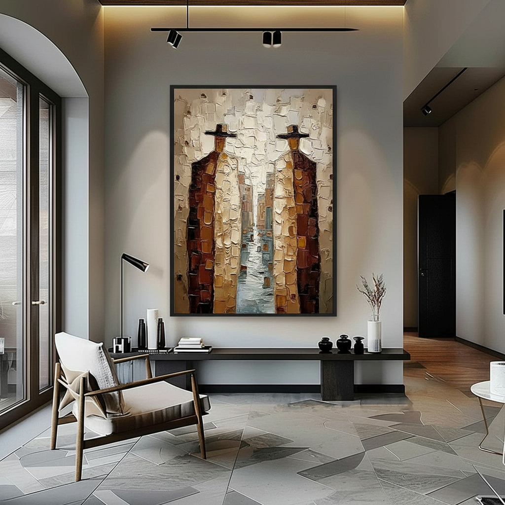
Experienced interior designers know that lighting is not just about visibility; it is about definition. To maximize the reveal of brushstroke texture, lighting should typically be positioned at a 30 to 45-degree angle from the wall.
- Dramatic Side Lighting: For works featuring thick impasto (paint applied in heavy layers), a steeper side angle creates deep, dramatic shadows that emphasize the physical "heave" of the paint.
- Soft Ambient Light: For delicate glazing or "invisible" strokes, softer light prevents harsh contrasts that might obscure the subtle color transitions.
A common mistake is placing textured art directly under overhead lighting. This "flattens" the work, as the light hits the ridges from above, minimizing the shadow definition and stripping the painting of its three-dimensional character.

Human Perception: Why Our Brains Prefer the "Human Touch"
The preference for hand-painted art over digital replicas is not merely snobbery; it is rooted in neurobiology. A systematic review published in PMC shows that passive art viewing consistently activates the medial prefrontal cortex (mPFC) and the amygdala, optimizing emotional regulation circuits.
The "Essential Identity" Factor
Research from the University of Chicago suggests that consumers perceive an "essential identity" in original works that is absent in NFTs or digital prints. This identity is physically manifested in the brushstrokes. When you see a ridge of paint, your brain subconsciously reconstructs the physical movement of the artist's hand. This "neural resonance" is a key driver of the 62% value premium human art holds over AI art.
Texture and Mood Regulation
The impact of this physical presence extends into wellness. A University of Pennsylvania review found that 73% of patients in clinical environments reported significant mood improvements when exposed to environmental artworks. The "micro-shadows" provide a level of visual complexity that engages the brain without overstimulating it, a core principle of biophilic design.
| Perception Factor | Hand-Painted Oil | Digital Canvas Print |
|---|---|---|
| Light Interaction | Dynamic (Micro-shadows shift with light) | Static (Flat reflection) |
| Perceived Value | High (Associated with "Essential Identity") | Lower (62% lower per Columbia study) |
| Tactile Depth | 1mm to 5mm+ (Impasto) | <0.1mm (Ink layer) |
| Neural Response | High mPFC and Amygdala activation | Lower engagement scores |
Technical Deep Dive: Pigments, Mediums, and Longevity
For the aesthetic-driven consumer, beauty must be matched by durability. Understanding the chemistry of your painting is essential for long-term preservation and safety.
The Chemistry of Drying: Oil vs. Acrylic
The way a painting interacts with light is also a function of how it dries.
- Oil Paints: These undergo a process of oxidative cross-linking. As the oil absorbs oxygen, it forms a hard, durable film. This process is slow, allowing for deep, transparent glazes that trap light and reflect it from within the paint layers—a phenomenon known as "inner brilliance."
- Acrylic Paints: These dry through physical coalescence. The polymer molecules move closer as water evaporates, forming a film. While acrylics are more resistant to embrittlement, they are prone to "Support Induced Discoloration" (SID). According to Golden Artist Colors, water-soluble impurities in cotton or linen canvases can be drawn into the paint as it dries, causing a yellowing effect in transparent layers.
Lightfastness and the ASTM D4303 Standard
To ensure your mural doesn't fade, look for pigments that meet the ASTM D4303 standard. This protocol uses xenon-arc tests to simulate years of indoor light exposure. High-quality pigments, such as those used in professional hand-painted works, are rated for their ability to resist fading behind filtered glass.
The Safety of the Studio
While we celebrate the beauty of pigments, safety is paramount. Historically, pigments like Lead White and Cadmium were standard. Today, the International Agency for Research on Cancer (IARC) classifies cadmium compounds as Group 1 carcinogens. Modern studios have largely transitioned to safer alternatives like Titanium White, which dominates 90% of the market due to its superior hiding power and non-toxic nature (NCBI).

Strategic Art Placement: Economic and Psychological ROI
Commissioning a hand-painted mural or large-scale oil work is an investment that yields returns in property value, community cohesion, and mental health.
Real Estate and Property Value
The link between art and property prices is quantifiable. A Royal Society analysis using the CAR model found that neighborhoods with higher "art" geo-tags saw greater relative house price ranking gains. In the commercial sector, the impact is even more dramatic. Chicago’s Millennium Park art projects drove $1.4 billion in real estate-related growth, according to NC Realtors.
Biophilic Design in the Workspace
For corporate clients, the "Biophilic Hand-Painted Series" isn't just decor—it's an HR strategy. Research from the University of Central Arkansas confirms that nature-themed murals produce stress-reduction effects similar to the real outdoors. In high-density office environments like those in Tokyo, biophilic design has been shown to effectively intervene in employee burnout and cognitive fatigue.
Modeling Note (ROI Assumptions):
- Scenario: 4,000 sq ft office space.
- Intervention: Installation of a nature-themed, textured mural in a high-traffic break area.
- Assumed Impact: 30% reduction in reported cognitive fatigue based on UPenn patient mood data.
- Economic Logic: Reduced fatigue correlates with lower turnover and higher productivity, providing a "7:1 ROI" on the initial art investment (Americans for the Arts).
Designing for 2026: The Rise of "Understated Elegance"
As we look toward 2026, interior design trends are moving away from mass-produced minimalism toward "understated elegance," where texture is the soul of the room. Zillow search data shows a 21% rise in mentions of "artisan craftsmanship" and a staggering 329% increase in Yelp searches for "custom framing."
The Powder Room Trend
One of the most exciting "blue ocean" niches identified by the NKBA 2025 Kitchen & Bath Design Industry Awards is the use of panoramic hand-painted murals in powder rooms. By "wrapping" the mural entirely around the walls, designers create a sense of immersive escapism. The micro-shadows in these small, often uniquely lit spaces create a jewel-box effect that flat wallpaper simply cannot replicate.
Supporting the Creative Economy
Choosing hand-painted art also supports a vulnerable workforce. A 2024 NYC Comptroller report warned that freelance artists remain financially vulnerable despite the creative industry adding $1.2 trillion to the U.S. GDP. By prioritizing "fair trade" art—where painters receive a significant share of profits—consumers align their aesthetic choices with ethical standards, a priority for 87% of modern buyers (Wharton School survey).

Best Practices for Collectors and Designers
To ensure your investment in textured art performs optimally, follow these professional guidelines:
- Avoid "The Overhead Trap": Never rely solely on recessed ceiling lights. Use adjustable track lighting or directional wall-mounted fixtures to achieve the 30-45 degree angle.
- Verify Low-VOC Credentials: For indoor murals, especially in healthcare or nurseries, ensure the paints used are low-VOC and compliant with LEED or WELL certification standards (EPA IAQ Guidelines).
- Embrace the "Whimsy": 2026 trends favor Dali-inspired surrealism and custom gallery walls. Don't be afraid of bold, high-relief textures that invite tactile exploration.
- Consider the Substrate: Ensure your artist uses high-quality, primed hemp or flax canvases, which consume half the water of cotton and offer superior structural stability (Cincinnati Art Museum).
A Note on Maintenance
While acrylics are durable, they are not solvent-resistant. The Tate Modern Paints Project suggests that a gentle wipe with a water-based cotton swab is often the safest way to remove surface dust. For oil paintings, avoid high-heat environments, which can cause binder separation and melting in extreme cases (ResearchGate).
The Future is Hand-Painted
In a world increasingly saturated with digital replicas, the physical brushstroke stands as a bulwark of authenticity. The micro-shadows created by hand-painted art do more than just decorate a room; they engage our biology, boost our property values, and support a global creative economy that accounts for 3.1% of global GDP (Creative Economy Outlook 2024).
By understanding the optical and chemical principles behind these works, designers and homeowners can move beyond simple decor and invest in "cultural heritage assets" that evolve with the light and the time of day.
YMYL Disclaimer: This article is for informational purposes only. When dealing with art materials involving pigments or solvents, always consult safety data sheets (SDS) and follow local environmental regulations. For large-scale installations in healthcare or public facilities, ensure compliance with relevant building codes and health standards.
References & Sources
- Marketplace: The expensive art market continues to struggle
- Columbia Business School: Human-Made vs. AI Art
- University of Chicago: Does Artwork Preserve Essential Identity?
- Royal Society: Quantifying the link between art and property prices
- Golden Artist Colors: Support Induced Discoloration
- ASTM International: D4303 Standard Test Methods for Lightfastness
- World Health Organization (WHO): Scoping Review on Arts and Health
- EPA: Indoor Air Quality and Low-VOC Paints
- Tate: The Tate AXA Art Modern Paints Project


