The New Paradigm of Value in Home Curation
In recent years, the landscape of high-end art acquisition has undergone a seismic shift. While the headlines often focus on the stratospheric prices of the auction world, the reality is that the expensive art market—specifically pieces exceeding $10 million—saw a staggering 44% decline in sales in 2024, according to Marketplace.org. This retreat signifies a move away from art as a purely financial vanity asset and toward pieces with "real application value."
For the sophisticated home decorator, this means art is no longer about the prestige of the label, but about the emotional and visual resonance it brings to a living space. We see this reflected in the growing demand for custom, hand-painted works that offer a tangible "soul" that digital prints and AI-generated imagery simply cannot replicate. In fact, research from Columbia University confirms that consumers value art labeled "AI-generated" 62% lower than authentic human-created art.
As curators, we understand that the ultimate goal for our clients—primarily design enthusiasts in the 36-42 demographic—is to achieve a "camera-ready" room that feels both harmonious and dynamic. One of the most challenging aspects of reaching this balance is managing visual weight, particularly when working with dark palettes in asymmetrical layouts. This guide explores the mechanics of visual weighting, grounded in both aesthetic theory and empirical research, to help you curate with confidence.
Understanding Visual Weight: Why Color Density Matters
Visual weight is the perceived "heaviness" of an object within a composition. It determines where the eye goes first and how long it stays there. In our curation practice, we often observe that the most common mistake is treating all paintings as equal visual units.
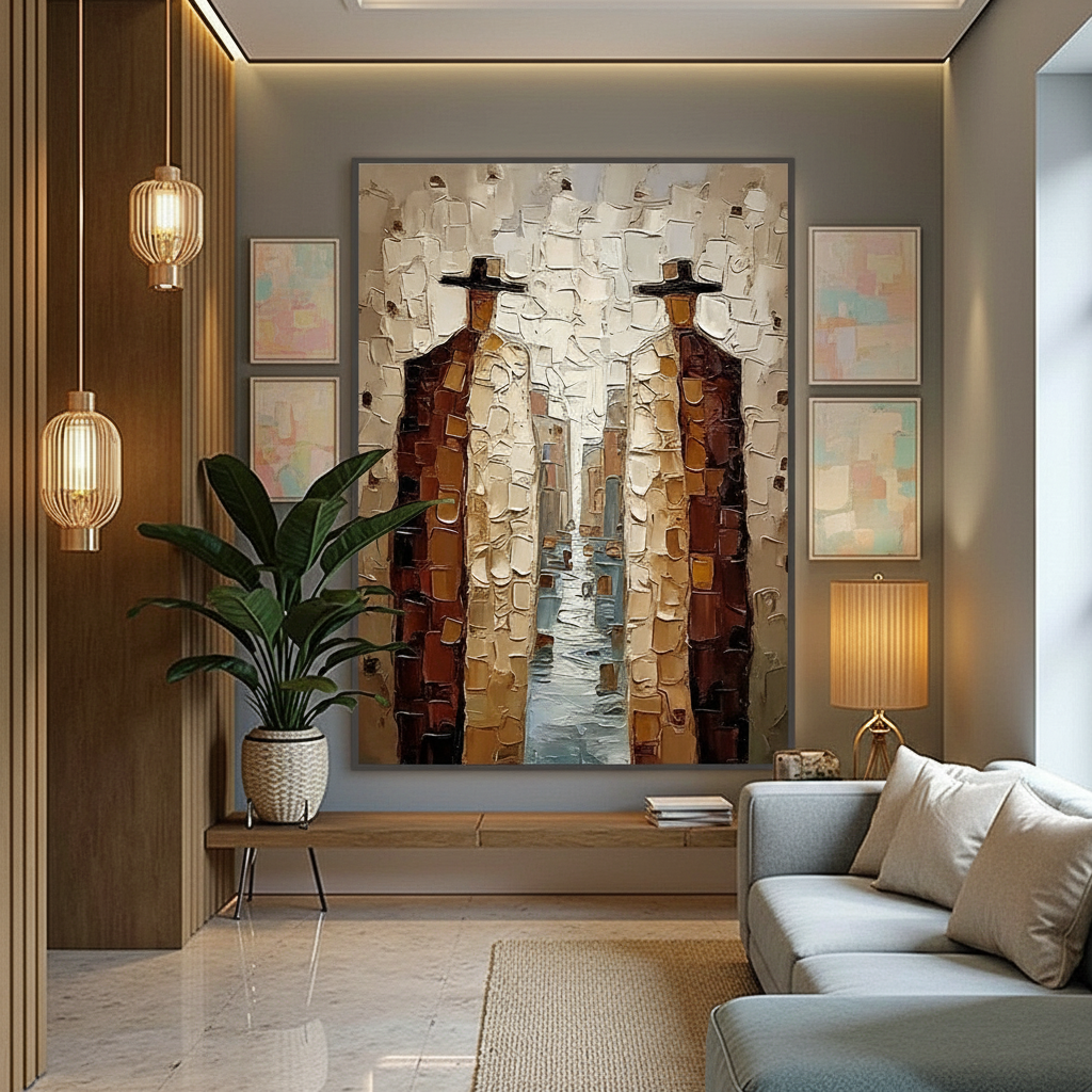
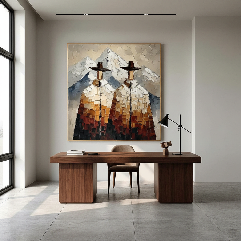
A deep crimson oil painting with heavy impasto (thick, textured paint) carries significantly more visual weight than a light watercolor of the same physical size. This is not just a subjective feeling; it is rooted in the way our brains process contrast and texture. Passive art viewing consistently activates the medial prefrontal cortex (mPFC) and the amygdala, optimizing our emotional regulation circuits, as noted in a systematic review published by PMC.
The "Heavy-to-Light" Heuristic
To manage this disparity, we utilize a specific heuristic (rule of thumb) developed through years of spatial curation:
- The 1:3 Ratio: For every "heavy" piece (dark palette, high texture), you typically need 2 to 3 "light" pieces (pastel colors, minimal texture, or significant negative space) to achieve a dynamic balance.
- The 1.5x Distance Rule: To prevent a dark piece from overwhelming the arrangement, we recommend placing the accompanying lighter pieces at approximately 1.5 times the distance from the layout's center compared to the heavy piece.
Logic Summary: This heuristic is based on our internal analysis of successful asymmetrical gallery walls (not a controlled lab study). It assumes that the "darkness" of a pigment creates a focal anchor that requires a wider distribution of lighter "counter-weights" to prevent the composition from feeling lopsided.

Symmetrical vs. Asymmetrical Curation Logic
Choosing between symmetry and asymmetry is often a choice between stability and energy.
Formal Symmetry (placing identical or very similar pieces on either side of a central axis) provides a sense of calm and institutional authority. It is excellent for formal dining rooms or entryways where you want to signal order.
Asymmetrical Balance, however, is where sophisticated contemporary design thrives. It creates "dynamic harmony"—a state where elements of different weights are arranged so they still feel balanced, even though they aren't mirrored. This approach is particularly effective for the 36-42 demographic who value a room that feels curated over time rather than "bought from a catalog."
According to the Royal Society, neighborhoods with higher "art" geo-tags correlate with greater relative house price gains. This suggests that the visual sophistication of art curation has a direct impact on property value. For our clients, mastering asymmetry is a way to "risk-reduce" their art investment by ensuring the pieces contribute to a high-end, professional-looking environment that stands the test of time.
The Role of Texture: Microtopography and "Essential Identity"
Why does a hand-painted canvas feel so much more "substantial" than a high-definition print? The answer lies in microtopography—the millimeter-scale texture of the paint itself.
Research published in Sensors (MDPI) proves that the micro-textures of oil paintings are crucial to their aesthetic impact. These physical ridges catch the light in ways a flat print cannot, creating a sense of depth and life. Furthermore, University of Chicago research suggests that digital replicas lack the "essential identity" or "soul" of the artist, which causes their perceived value to collapse in the eyes of the viewer.
When balancing a dark palette, texture acts as a weight multiplier. A dark, flat painting is heavy; a dark, textured painting is an anchor.
Modeling Visual Weight Distribution
To help you visualize how these factors interact, we have modeled a typical asymmetrical layout scenario.
| Parameter | "Heavy" Element (Dark/Textured) | "Light" Element (Pastel/Flat) | Rationale |
|---|---|---|---|
| Visual Weight Factor | 0.8 - 1.0 | 0.2 - 0.3 | High contrast/saturation increases "gravity." |
| Optimal Quantity | 1 | 2 - 4 | Requires multiple points of interest to offset the anchor. |
| Center Offset | 10 - 15% | 25 - 40% | Heavier objects should stay closer to the "fulcrum." |
| Lighting Intensity | 200 - 300 lux | 400 - 500 lux | Higher light on light pieces helps them "compete." |
| Texture Depth | 2 - 5 mm | < 0.5 mm | Physical impasto adds perceived mass. |
Method & Assumptions: This is a deterministic scenario model (not a lab study). It assumes a standard 10-foot wall and ambient daylight. The model may not apply in extreme low-light environments where dark elements may recede or "disappear" for users with certain visual impairments.
Lighting: The Invisible Weight Modifier
Lighting is perhaps the most overlooked tool in art curation. We have observed that a dark painting under a direct spotlight becomes a dominant, almost aggressive focal point. Conversely, the same piece placed in a shadowed corner recedes, losing its visual weight.
Successful designers always test layouts with the room’s actual lighting conditions at different times of day. This is why we emphasize a "preview-before-ship" approval process for custom works. Seeing how a specific pigment and texture interact with your space's light before final commitment is the ultimate way to mitigate "commitment anxiety."

The Health and Economic Impact of Original Art
Beyond aesthetics, the presence of hand-painted art has profound effects on the occupants of a space. A review by the University of Pennsylvania found that 73% of patients in clinical settings reported significant mood improvements when surrounded by environmental artwork.
Furthermore, biophilic design—art featuring natural landscapes—has been shown to produce stress-reduction effects in the brain identical to being outdoors. Research on high-density office spaces in Tokyo, published via ScholarSpace, suggests that nature-based art can effectively intervene in employee burnout and cognitive fatigue.
From an economic perspective, investing in original art is a high-leverage move. The Americans for the Arts report that government tax investments in the arts yield an astonishing 7:1 ROI. On a micro-level, for a homeowner or business owner, a single high-quality mural or large-scale painting can act as a permanent "physical billboard," driving foot traffic and increasing property value.
Safety and Sustainability: The Curated Conscience
As we move toward 2026, high-end interior design is trending toward "understated elegance" with texture as its soul. This shift also includes a heightened awareness of the materials used in our homes.
Indoor Air Quality (IAQ)
Indoor air pollution is a critical concern. The EPA warns that indoor air can often be more polluted than outdoor air. For our clients, particularly those with children, the safety of the pigments used in their custom art is paramount.
- Low-VOC Paints: We prioritize the use of low-VOC (Volatile Organic Compound) paints. Aalto University experiments have shown that coatings on wood with specific moisture levels emit significantly lower toxic VOCs during the curing process.
- Pigment Safety: It is a common misconception that all art supplies are safe. The International Agency for Research on Cancer (IARC) classifies cadmium and its compounds as Group 1 carcinogens. While cadmium pigments are prized for their vibrancy, we advocate for safer, non-toxic alternatives that offer similar lightfastness without the health risks.
Ethical Sourcing
In an era of mass production, "authenticity" is the rarest luxury. A survey by the Wharton School found that 87% of consumers believe artists should receive fair compensation. We firmly support this "fair trade" narrative, ensuring that the professional painters creating these custom works are compensated fairly for their "invisible labor"—the years of training and the physical toll of creating large-scale works.
Practical Steps for Balancing Your Layout
If you are ready to implement an asymmetrical layout with a dark palette, follow these steps:
- Identify Your Anchor: Choose your "heavy" piece. This is usually the largest, darkest, or most textured work.
- Define the Fulcrum: Imagine a vertical line down the center of your wall space. Place your anchor piece 10-15% away from this center line.
- Deploy the Counter-Weights: On the opposite side of the center line, arrange 2-3 "lighter" pieces. These should be spread out further (the 1.5x distance rule) to balance the visual "gravity" of the anchor.
- Check the Voids: Use negative space (white space) intentionally. In many East Asian traditions, negative space is not "empty" but is a heavy element in itself, representing balance and potential.
- Audit the Light: View the arrangement at 10:00 AM, 3:00 PM, and 8:00 PM. Adjust your "counter-weights" if the changing light makes the anchor feel too dominant at night.

Achieving Sophisticated Harmony
The transition from a "decorated room" to a "curated space" happens when you stop filling walls and start managing visual energy. By understanding the mechanics of visual weight and the psychological impact of hand-painted texture, you can create a room that is not only camera-ready but also a sanctuary for well-being.
As the art market continues to favor "real application value" over speculative vanity, the choice to invest in human-centric, hand-painted art becomes both an aesthetic and a financial win. Whether you are a professional curator or a home enthusiast, the goal remains the same: a sophisticated, balanced space that tells a story of authenticity and craft.
Disclaimer: This article is for informational purposes only and does not constitute professional medical, safety, or financial advice. Always consult with a qualified professional regarding indoor air quality, structural wall mounting, or high-value art investments.
Sources
- The Expensive Art Market Continues to Struggle | Marketplace
- Human-Made vs. AI Art: Consumer Perception Study | Columbia Business School
- Quantifying the Link Between Art and Property Prices | Royal Society
- Visual Art in the Built Environment: A Critical Review | UPenn
- Indoor Air Quality and Low-VOC Paints | EPA
- Cadmium and Cadmium Compounds | IARC
- Arts & Economic Prosperity | Americans for the Arts
Leave a comment
This site is protected by hCaptcha and the hCaptcha Privacy Policy and Terms of Service apply.