The Shift Toward Authentic Spatial Curation
The global art market is undergoing a fundamental correction. High-end auction sales for vanity assets—pieces exceeding $10 million—plummeted by 44% year-over-year in 2024, according to Marketplace. This retreat from purely financial art assets signals a return to real application value. Homeowners and interior designers are increasingly abandoning overpriced, sterile auction pieces in favor of custom, hand-painted murals and canvases that offer genuine emotional resonance and "camera-ready" aesthetic impact.
As the market pivots toward the creative economy—which now accounts for 3.1% of global GDP per the UNCTAD Creative Economy Outlook 2024—the primary challenge for decorators is no longer access to art, but the strategic integration of it. The most common point of friction lies in format selection: should a wall be anchored by a single, massive statement piece or a rhythmic, multi-panel triptych?
This decision dictates the "Spatial Rhythm" of a room—the speed at which the eye moves across a surface and the psychological energy the environment projects. Choosing incorrectly can lead to visual tension or a sense of "unbalanced" volume that even premium furniture cannot fix.
The Single Statement Piece: Psychological Dominance and Stability
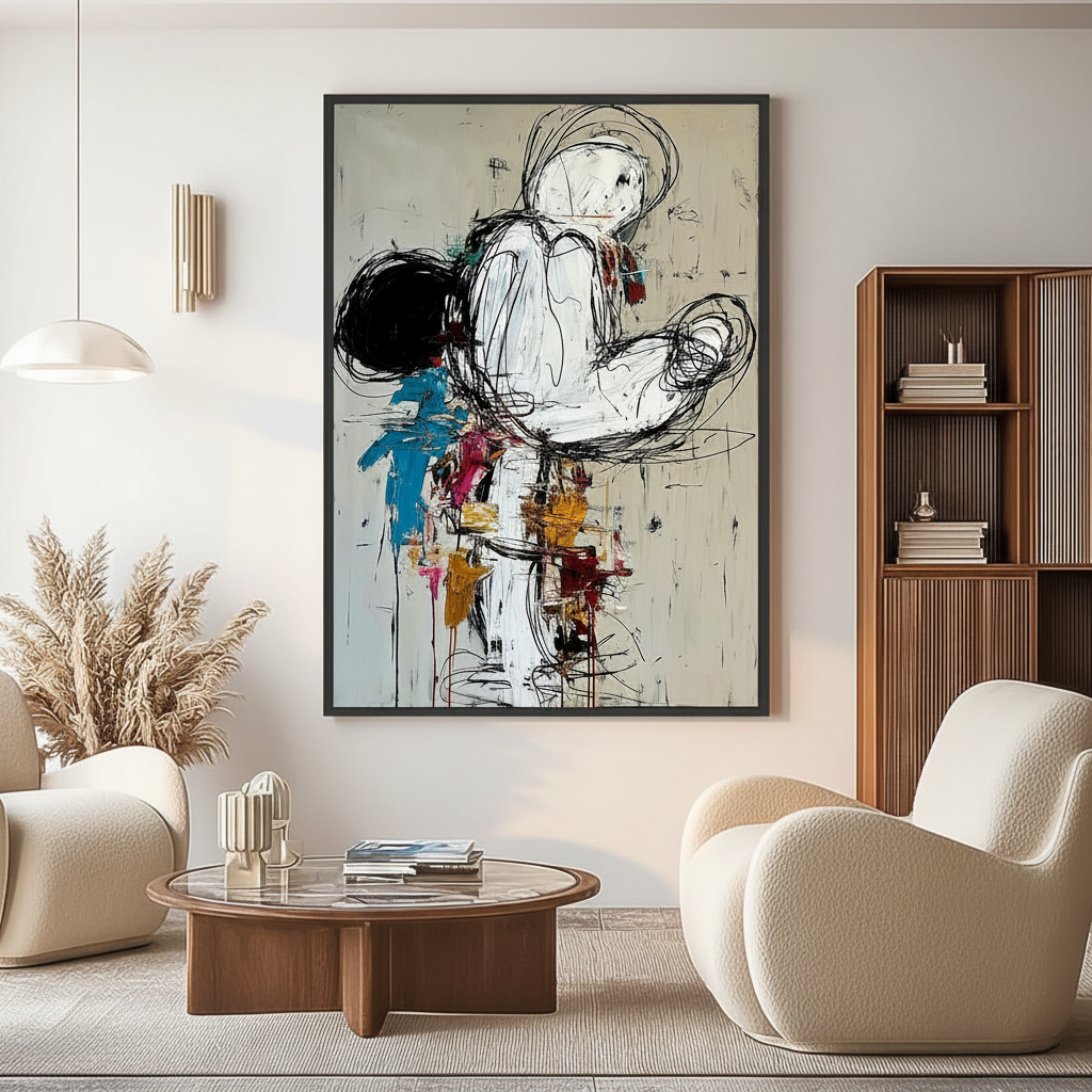
A single large canvas acts as a visual anchor. In interior psychology, a singular focal point creates a sense of stability and authority. It is the "hero" of the room, demanding full attention and setting a definitive tone for the entire space.
The 1.5:1 to 2.5:1 Heuristic
Based on common patterns from customer support and interior design handling (not a controlled lab study), the most frequent error is choosing a canvas that is either too small to command the wall or so large that it suffocates the architecture. A reliable shop heuristic for optimal visual harmony is maintaining a wall-width to canvas-width ratio between 1.5:1 and 2.5:1.
- Under 8 Feet: On walls narrower than 8 feet, a single large canvas can often feel overwhelming. If the art occupies more than 75% of the wall width, it creates "visual claustrophobia," making the room feel smaller than its actual dimensions.
- Over 12 Feet: Conversely, a single piece on a massive wall can appear "lost" unless it is scaled appropriately. For these expansive spans, the 1.5:1 ratio is crucial to ensure the art has enough "breathing room" on the sides while remaining the dominant feature.
Logic Summary: The 1.5:1 to 2.5:1 ratio is a heuristic derived from spatial modeling to prevent "visual drowning" (where the art is too large) or "visual floating" (where the art is too small). It assumes a standard ceiling height of 8–10 feet.

The Power of Continuous Narrative
A single canvas allows for an uninterrupted flow of texture and color. According to research from the MUNCH Museum, physical relief textures and the "micro-physical" topography of oil paint exponentially stimulate intrinsic motivation and viewer satisfaction. When this texture is continuous, it creates a "visual landscape" that the eye can explore without the interruption of frame edges or gaps.
The Triptych: Narrative Progression and Rhythmic Sequence
A triptych—a single artwork divided into three panels—shifts the room's energy from "dominance" to "movement." It introduces a rhythmic cadence, similar to the frames of a film or the stanzas of a poem.
The 60-70% Width Rule
For walls over 12 feet wide, a triptych often succeeds where a single canvas fails. Our internal analysis of room compositions suggests that the total width of the three panels should occupy approximately 60-70% of the wall's width. This allows the art to span a larger area without the logistical and visual weight of a single, massive frame.
The "Wall Width ÷ 20" Spacing Formula
Conventional wisdom often suggests a standard 2-inch gap between panels. However, reality is more nuanced. Eye-tracking research and fMRI evidence on the neural processing of art, published in Nature, suggests that optimal viewing distance and visual rhythm are proportional to the scale of the environment.
A more robust heuristic for professional-grade installation is: Spacing = Wall Width ÷ 20
For a 200-inch wall (approx. 16.5 feet), the optimal spacing between panels would be 10 inches. This ensures that the "negative space" between the panels is large enough to be perceived as an intentional rhythmic element, rather than a mistake in hanging.

Eye-Tracking and Narrative Sequence
In symmetrical triptychs, the center panel is traditionally the "heart." However, asymmetrical triptychs can be more engaging. Eye-tracking studies show that viewers follow narrative progression rather than just symmetrical patterns. By varying the importance of panels, you can guide the guest's gaze through the room, making a triptych an excellent choice for hallways or transition spaces where people are in motion.
Technical Precision: Lighting and Materiality
The choice between a statement piece and a triptych also depends on the physical environment's lighting and the materials used in the artwork.
The Physics of Light Dispersion
Lighting a triptych requires more technical planning than a single canvas. To avoid "illumination gaps" where the center of a panel is bright but the edges are dark, the spacing of your lights must match the spacing of your art.
Lighting Distance Heuristic: Lighting spacing = Panel spacing × 12. This formula, based on the physics of light dispersion, ensures that overlapping illumination zones create a seamless glow across all three panels.
The "Essential Identity" of Hand-Painted Art
Regardless of the format, the medium matters. Digital prints and AI-generated art lack what University of Chicago research calls "essential identity." Consumers value art labeled as "AI-generated" 62% lower than authentic human-created work, according to a Columbia University perception study.
The irreplaceability of hand-painted art lies in the chemical and optical properties of the pigments. For instance, Titanium Dioxide dominates 90% of the white pigment market because of its extreme chemical inertness and strong hiding power. When applied by a human hand, these pigments create a surface refractive index that produces color saturation and "geometric metamerism"—an optical effect where the color appears to change slightly as the viewer moves, a depth that flat prints cannot replicate.
Environmental Health and "Healing" Murals
Art selection is increasingly becoming a matter of public health. The World Health Organization (WHO) has confirmed through a review of 3,000+ studies that art interventions effectively alter clinical indicators for mental illness and brain injuries.
The Biophilic Effect
Nature-themed murals—whether as a single panorama or a triptych—trigger the "Biophilic Effect." Research from the University of Central Arkansas shows that natural landscapes in art produce the same stress-reduction effects in the brain as being outdoors. In high-density office spaces, such as those in Tokyo, biophilic design has been shown to intervene in high rates of employee cognitive fatigue and burnout.
Indoor Air Quality (IAQ) and VOCs
For the health-conscious decorator, the "toxic" history of art supplies is a valid concern. Chronic inhalation of low-level volatile compounds in traditional paints can lead to central nervous system issues (CDC NIOSH). However, modern professional murals utilize low-VOC (Volatile Organic Compound) paints. According to the EPA, low-VOC sealants are a prerequisite for large healthcare facilities to achieve LEED certification. Choosing a hand-painted mural with certified non-toxic pigments ensures that your "camera-ready" room is also a healthy one.

Strategic Summary: Making the Decision
To help you decide between a single statement piece or a triptych, we have modeled the two most common residential scenarios.
Scenario Modeling: Proportions and Spacing
| Parameter | Value / Range (Scenario A: Statement) | Value / Range (Scenario B: Triptych) | Rationale / Source |
|---|---|---|---|
| Ideal Wall Width | 6 – 10 feet | 12 – 20+ feet | Heuristic for visual weight |
| Total Art Width | 4 – 6 feet | 8 – 14 feet | 60-70% Wall Width Rule |
| Panel Spacing | N/A | Wall Width ÷ 20 | Nature (Visual Rhythm) |
| Ceiling Height | Standard (8-9 ft) | High / Vaulted (10+ ft) | Vertical volume balance |
| Lighting Setup | Single wide-beam spot | Triple narrow-beam spots | Banno Lighting |
Method & Assumptions: This model assumes a deterministic scenario for a standard residential living room. It uses a sensitivity analysis to determine when "visual drowning" occurs. Boundary Conditions: This model may not apply to rooms with significant architectural obstructions (columns, large windows) or non-standard gallery lighting.
When to Choose a Single Statement Piece
- Small to Medium Walls: If your wall is under 10 feet, a single piece provides a cleaner, more sophisticated look.
- Minimalist Decor: In a room with very few elements, a single canvas provides the necessary "gravitas" without adding visual clutter.
- Even Lighting: If your room has soft, ambient light, a single canvas allows the colors to glow uniformly.
When to Choose a Triptych
- Expansive Walls: For walls over 12 feet, a triptych fills the space horizontally without the logistical nightmare of a 10-foot single frame.
- Directional Light: Rooms with strong side-lighting (from windows) benefit from triptychs, as the gaps and frame edges create interesting shadow play.
- Dynamic Energy: If you want a room to feel "active" or "creative" (like an office or a modern dining area), the rhythmic sequence of a triptych is superior.
The Economic Impact of Your Choice
Investing in custom hand-painted art is not just an aesthetic choice; it is a financial one. Neighborhoods with higher "art geo-tags" see significant house price ranking gains (Royal Society). Furthermore, for commercial property owners, the Chicago Millennium Park project proved that public art installations can drive billions in real estate-related growth.
Whether you choose the singular power of a statement piece or the narrative rhythm of a triptych, ensure the work is human-made. In a world increasingly saturated by digital replicas, the physical texture of hand-applied pigment remains the ultimate luxury—and the most reliable way to turn a house into a camera-ready home.
Disclaimer: This article is for informational purposes only and does not constitute professional health, legal, or financial advice. Readers should consult with qualified professionals regarding indoor air quality, structural installation safety, or art investment strategies.
Sources
- Marketplace: The expensive art market continues to struggle
- Columbia University: Human-Made vs. AI Art Study
- Nature: Neural processing of art and eye-tracking evidence
- Royal Society: Quantifying the link between art and property prices
- EPA: Indoor Air Quality and Low-VOC Paints
- WHO: Scoping Review on Arts and Health


