The Science of Scale: Why Segmented Art Demands a New Formula
In the realm of high-end interior curation, the most frequent point of failure isn't the choice of subject matter, but the miscalculation of visual weight. We frequently observe homeowners selecting art that, while beautiful, suffers from the "postage stamp" effect—appearing isolated and undersized against substantial furniture. This is particularly prevalent with the standard 84-inch sofa, a staple of modern living rooms that serves as a dominant horizontal anchor.
As the Marketplace report on the expensive art market indicates, there is a significant shift away from overpriced vanity auction pieces (which saw a 44% drop in sales) toward art with real application value. Today’s aesthetic-driven improver seeks authenticity and proportional harmony. When transitioning from a single large canvas to segmented art—such as diptychs or triptychs—the traditional "2/3 rule" requires a technical recalibration to account for the "dead space" created by gaps between panels.
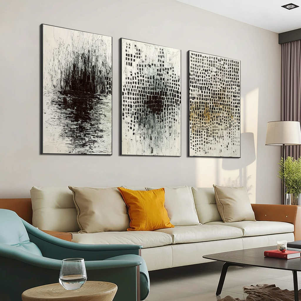
The Mathematics of Proportions for 84-Inch Sofas
The foundational heuristic in interior design is the 2/3 rule: artwork should span approximately 60% to 75% of the furniture's width to create a cohesive visual unit. For an 84-inch sofa, this suggests a target width of 56 to 63 inches. However, segmented art introduces complexity. If you hang three panels that total 56 inches without accounting for gaps, the entire arrangement may still feel visually "thin" because the eye perceives the gaps as part of the overall composition.
The Segmented Adjustment Formula
To ensure your multi-panel arrangement commands the room, we utilize a modified formula derived from spatial planning heuristics:
Total Visual Width = (Sofa Width × 0.67) + (Number of Gaps × Gap Width)
For a standard 84-inch sofa using a triptych (3 panels) with 2-inch gaps, the calculation follows:
- Baseline (2/3): 84" × 0.67 = ~56"
- Gap Compensation: 2 gaps × 2" = 4"
- Optimal Total Span: 60 inches.
In this scenario, each of the three panels should be approximately 18 to 19 inches wide. This ensures that the "image coverage" remains substantial while the gaps provide the necessary rhythmic breathing room.
Logic Summary: This model assumes a standard ceiling height of 8 to 9 feet and a sofa back height of 32 to 36 inches. The 0.67 multiplier (2/3) is the conservative baseline; for contemporary spaces, designers often push this to 0.70 (70% width) to increase room dominance.

Diptych vs. Triptych Dynamics: Spacing and Physiology
The spacing between segments is not merely an aesthetic choice; it has a physiological basis in how the brain processes "visual continuity." According to research on multi-panel art spacing, the brain bridges gaps of 2 to 3 inches without perceiving the image as fragmented. Once gaps exceed 4 inches, the brain triggers "cognitive recognition" of separate objects, undermining the unified effect of the artwork.
Configuration-Specific Heuristics
- Diptychs (2 Panels): These require the widest gaps, typically 3 to 4 inches. Because there are only two segments, the central gap acts as a powerful vertical axis. A wider gap prevents the panels from feeling "crowded" while maintaining a strong thematic link.
- Triptychs (3 Panels): The optimal gap is 2 to 3 inches. The presence of a center panel provides a stable anchor, allowing the side panels to sit closer without overwhelming the viewer.
- Grid Layouts (4+ Panels): As fragmentation risk increases, gaps should tighten to 1.5 to 2 inches to preserve the "collective identity" of the set.
| Configuration | Recommended Gap Width | Sofa Coverage Ratio | Visual Effect |
|---|---|---|---|
| Diptych (2-panel) | 3.0" – 4.0" | 65% | Balanced, Architectural |
| Triptych (3-panel) | 2.0" – 3.0" | 70% | Anchored, Expansive |
| Quad (4-panel) | 1.5" – 2.0" | 75% | Rhythmic, Gallery-style |
The "Essential Identity" of Hand-Painted Surfaces
The rise of AI-generated prints has created a "visual fatigue" among discerning homeowners. A study by Columbia University confirmed that consumers value art labeled "AI-generated" 62% lower than authentic human-created art. This is largely due to what UChicago research calls "essential identity"—the psychological belief that a physical canvas retains the artist's soul and intention, something digital replicas cannot simulate.
From a technical standpoint, the superiority of hand-painted segmented art lies in its microtopography. Optical microprofilometry proves that the mm-scale texture of oil and acrylic pigments is crucial to how light interacts with the surface. According to the Getty Conservation Institute, pigment reflection is dominated by absorption and scattering coefficients (the Kubelka-Munk equation). Hand-painted works feature varying surface refractive indices that create depth and saturation that flat prints simply cannot replicate.

Color Continuity and Vertical Placement
For segmented art to work harmoniously, color continuity is critical. In professional practice, each panel in a set should share 3 to 4 core hues. This "chromatic bridge" allows the eye to travel across the gaps seamlessly. If one panel is significantly darker or uses a disparate palette, it breaks the "unified window" effect.
The Vertical Eye-Level Rule
While horizontal scaling prevents the "postage stamp" error, vertical placement prevents the "floating art" mistake.
- The 8-12 Inch Rule: The bottom of the segmented art should sit 8 to 12 inches above the top of the sofa back.
- The Logic: This height ensures the art is at a comfortable eye level for both standing viewers and those seated. Hanging art too high (the "gallery reach") disconnects the art from the furniture, making the room feel disjointed.
Beyond Decor: The Macro Impact of Spatial Art
Choosing the right scale for your art isn't just about "looking good"—it’s an investment in your environment's psychological and economic value. The UPenn Center for Neuroaesthetics notes that 73% of individuals report significant mood improvements when exposed to high-quality environmental artwork. Furthermore, passive art viewing consistently activates the medial prefrontal cortex (mPFC), optimizing emotional regulation.
For those considering the long-term value of their property, the Royal Society found a direct correlation between "art-dense" environments and relative house price ranking gains. By selecting hand-painted murals or segmented works that are properly scaled, you are effectively "masking" architectural flaws and elevating the perceived market value of the space.
Methodology and Modeling Note
The recommendations provided in this article are based on a deterministic spatial model designed to optimize visual balance in residential environments.
- Model Type: Scenario-based geometric analysis.
- Assumptions: Standard viewing distance of 10-12 feet; neutral wall color (reflectance ~70-80%).
| Parameter | Value Range | Rationale |
|---|---|---|
| Sofa Width | 84 inches | Standard 3-seater anchor |
| Target Art Width | 56" – 63" | 2/3 to 3/4 Golden Ratio |
| Hanging Height | 57" – 60" | Center point at standard eye level |
| Gap Variance | ± 0.5 inches | Tolerance for manual installation |
| Panel Weight | < 15 lbs | Standard drywall anchor limit |
Material Integrity and Indoor Safety
When commissioning large-scale segmented works, material safety is paramount. High-quality hand-painted art should utilize low-VOC (Volatile Organic Compound) pigments. The EPA warns that indoor air pollution can be significantly higher than outdoor levels; thus, ensuring your art passes strict air quality tests is essential for a healthy home.
Professional artists often use titanium dioxide-based whites, which NCBI data shows captures 90% of the market due to its chemical inertness and superior hiding power, having replaced toxic lead-based whites decades ago. When selecting art, verify that the materials comply with ASTM D-4236 standards for chronic health hazard labeling, ensuring the beauty of your 84-inch sofa centerpiece doesn't come at the cost of your well-being.

Achieving Decision Safety in Art Selection
Scaling segmented art for an 84-inch sofa requires moving beyond guesswork and embracing a technical, proportional approach. By applying the Segmented Adjustment Formula, maintaining Visual Continuity through precise gap widths, and prioritizing Human-Made Authenticity, you transform a simple wall into a curated focal point.
Art is no longer a vanity asset; it is a "spatial solution" that bridges the gap between architecture and emotion. Whether you are aiming for the stress-reducing benefits of biophilic design or the economic "catalytic effect" of a well-placed mural, the math of proportions remains your most reliable guide.
YMYL Disclaimer: This article is for informational purposes only. While we discuss material safety and psychological benefits, this does not constitute professional medical, financial, or architectural advice. Always consult with a qualified professional regarding structural installations or chemical sensitivities.


