Large textured art for modern offices works best when you size it to the wall, the furniture below it, and the way people actually view the room. With large wall art for office spaces, the right piece can feel grounded in one room and overpower another if the wall is too narrow, the center point is too high, or the texture feels busy next to screens and task lighting. The goal is not just to fill space. It is to make the art read as intentional from a seated or standing view.
What Makes Office Art Read Correctly
In an office, scale does more than decorate a wall. It helps the room feel grounded, balanced, and easy to read at a glance. That is why office wall art scale should start with wall width, negative space, and viewing distance, not just the size printed on the listing. A large piece can still feel small if the wall is long or the furniture below it is wide.
Texture changes that equation. A flat print usually reads close to its physical size, but textured surfaces carry more visual weight because shadows and surface relief add presence. That makes large wall art for office layouts a stronger statement choice in modern spaces that already rely on clean lines and open space.

For a professional setting, the best test is simple: the artwork should hold the wall without crowding it. If it looks like an afterthought, the scale is probably too modest. If it dominates the room before anyone sits down, the room may need either a smaller piece or a different wall.
A useful way to think about large wall art for office spaces is by what the room asks of it. Reception wants presence. Private offices want calm. Conference rooms need a focal point that does not fight the meeting. Open work areas need enough scale to organize the wall without adding noise.
Choose the Right Size for Each Office Zone
A good starting point is to size the art to the furniture or wall segment it anchors, then adjust for distance and room function. When art hangs above a desk, credenza, or reception counter, a common starting gap is about 6 to 10 inches above the surface, which helps the piece feel connected instead of floating too high. From there, the width of the art should usually sit in a proportion that feels deliberate rather than leftover.
Private Office Above a Desk
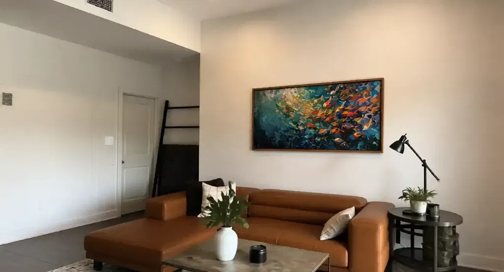
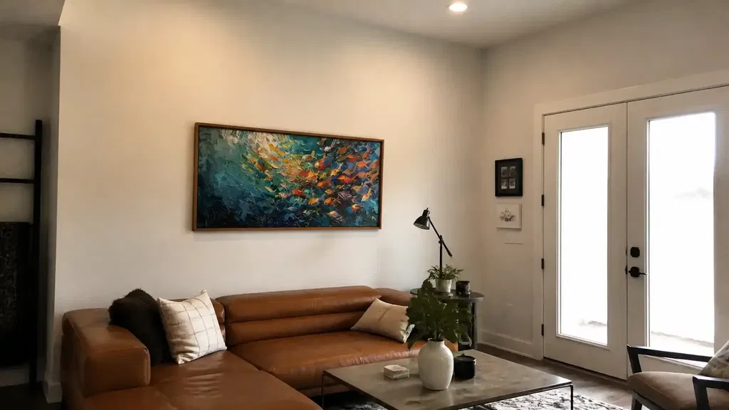
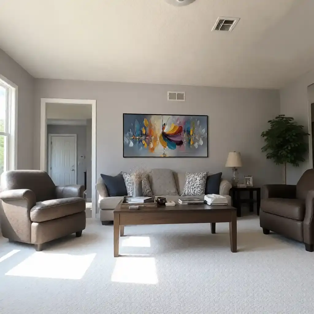
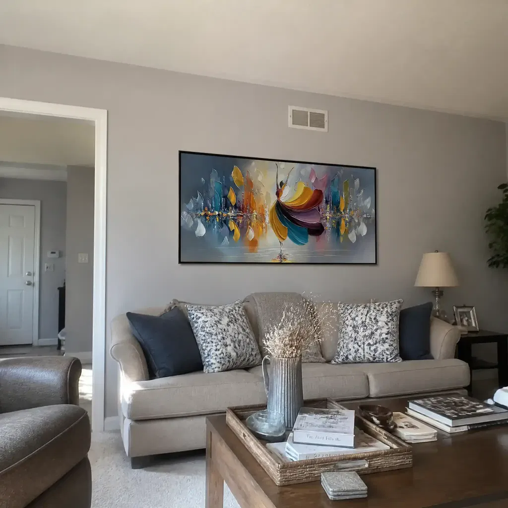
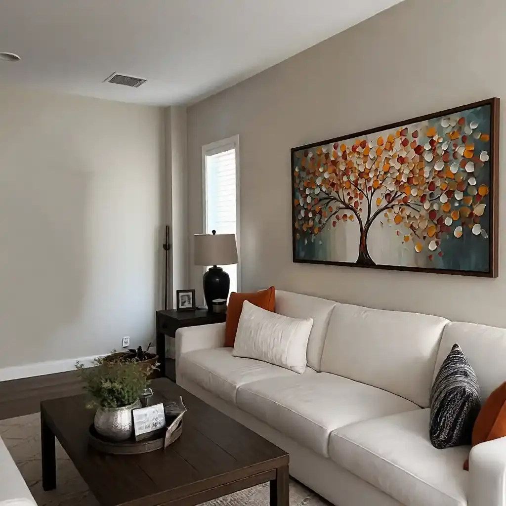
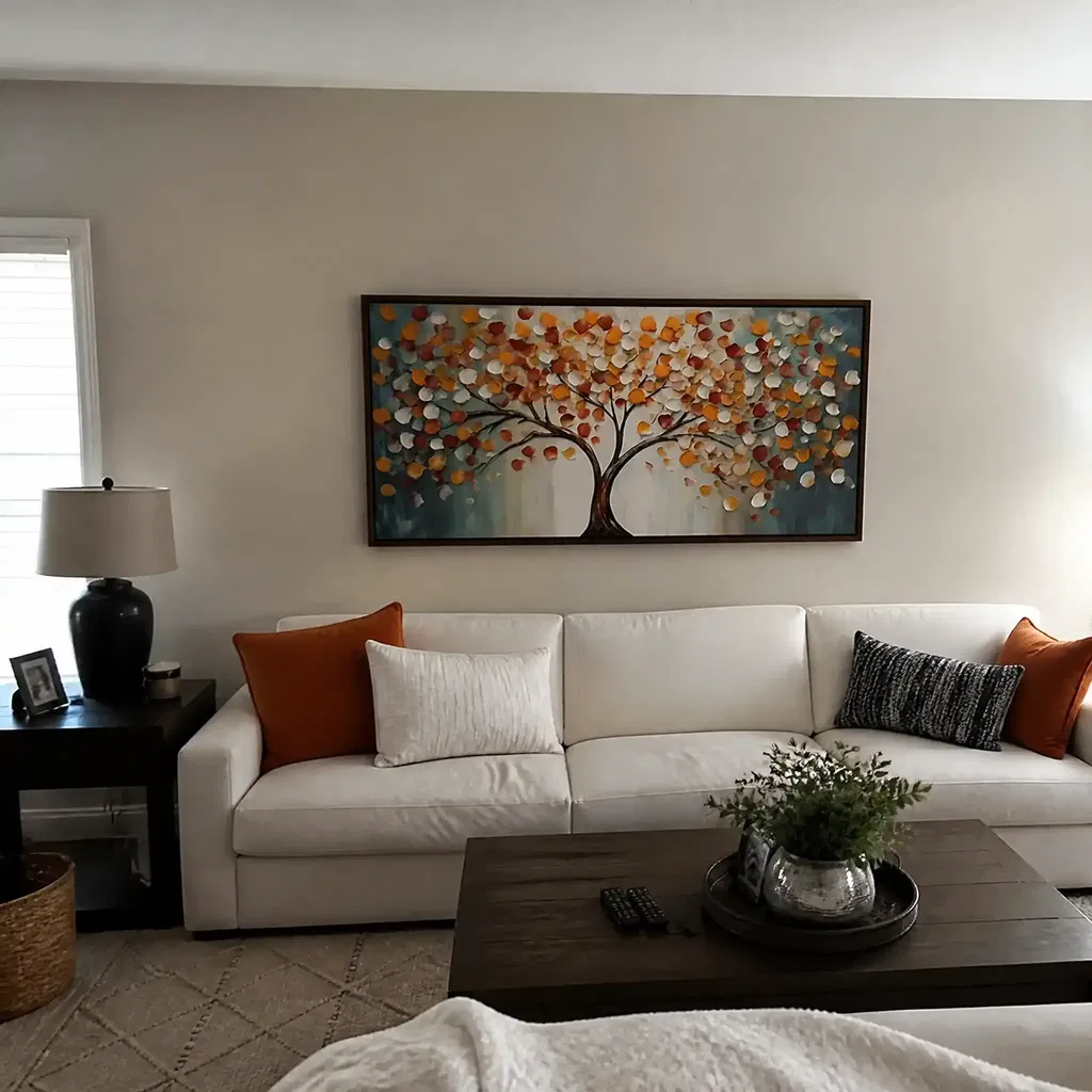
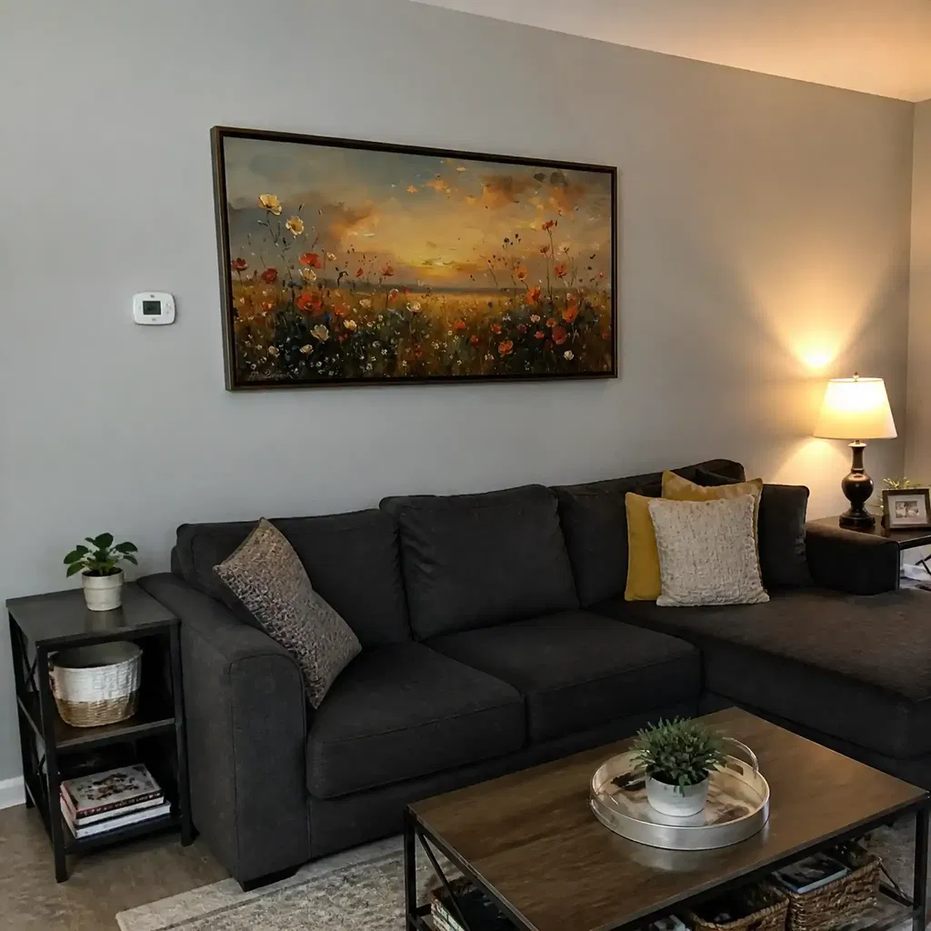
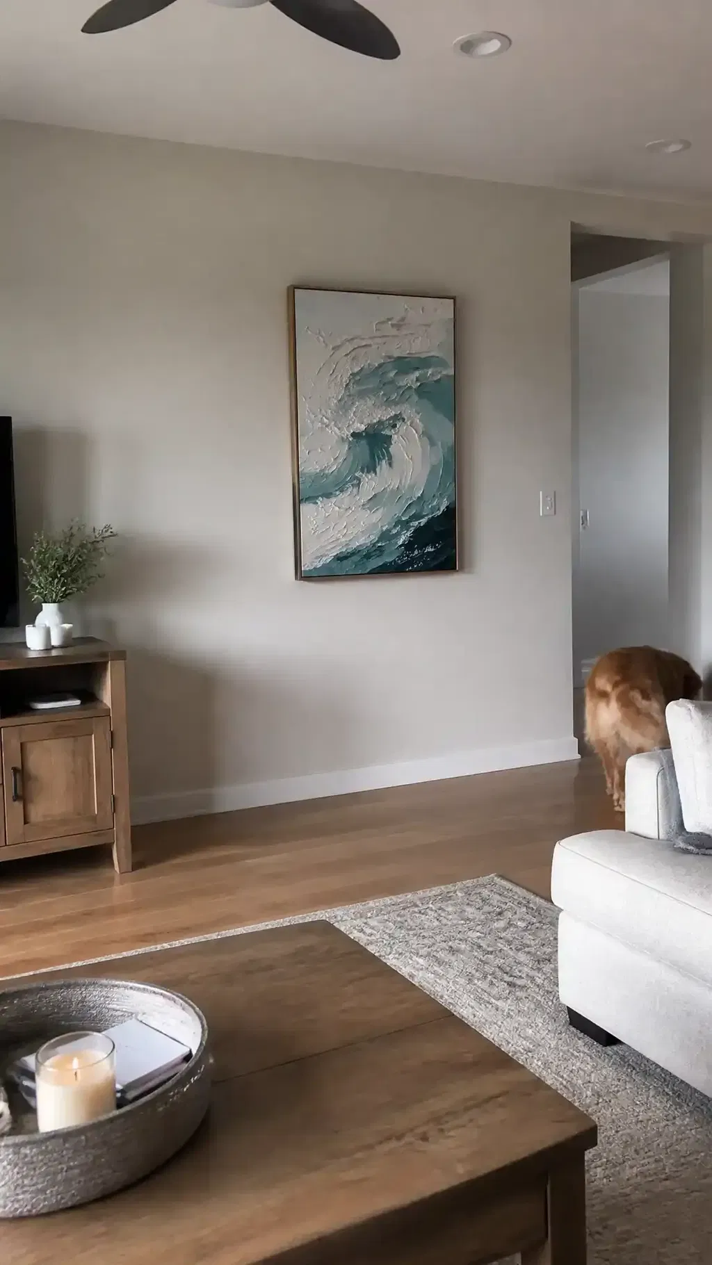
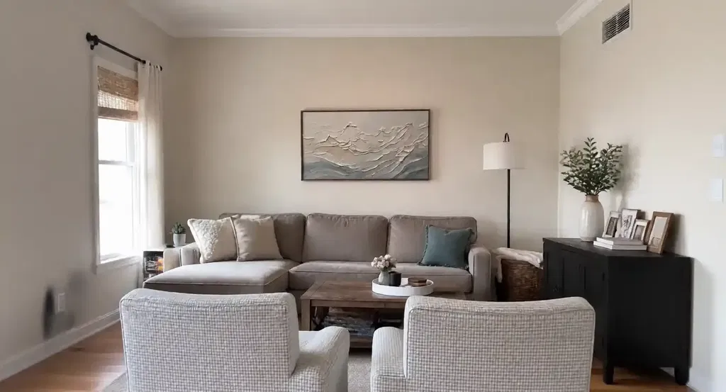
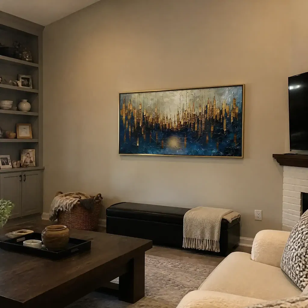
In a private office, the desk is usually the anchor. If the artwork is too narrow, the wall can swallow it, especially once a monitor, lamp, or chair enters the view. A piece that spans roughly two-thirds to three-quarters of the desk or credenza width is a practical starting point, then you can go larger if the wall is broad and the ceiling height gives the piece room to breathe.
Seated viewing matters here. If the center lands too high, the art will feel disconnected from the working position. A slightly lower placement often reads more comfortably in private offices because people experience the wall from a chair, not just while standing.

Reception Walls and Entry Points
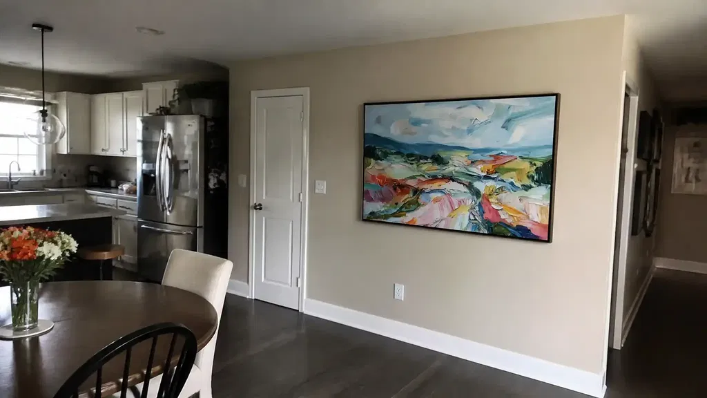
Reception walls usually need the strongest visual mass because people see them from farther away. This is one place where oversized office wall art modern styling tends to work well, as long as the composition stays centered and the wall still has breathing room around it. A piece that looks fine at arm's length can disappear in a lobby or front desk area.
If the wall is long, avoid choosing something that feels almost right. Reception art should look intentional from the first glance. A too-small piece often makes the entire area feel temporary, even when the furniture and finishes are high end.
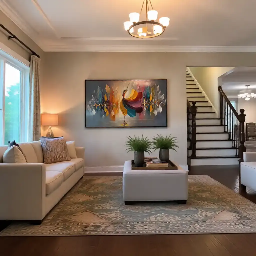
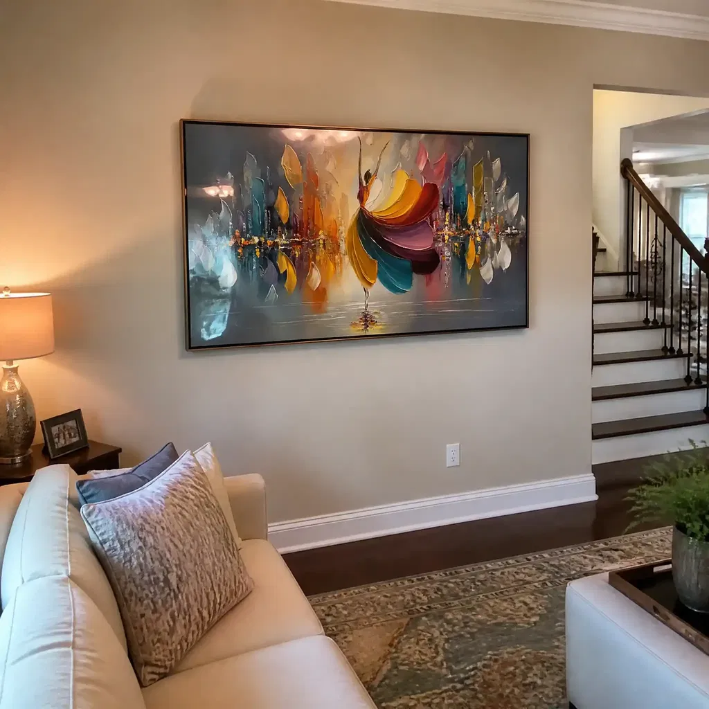
Conference Rooms and Client-Facing Spaces
Conference rooms are usually the most sensitive to overstatement. The art sits in a room that already contains screens, chairs, tables, and often branded materials, so size has to work with the rest of the visual load. One calm large piece usually works better than several smaller pieces that break attention.
For a boardroom or client-facing room, think about the view from the table first. If the art feels too high from seated positions or too busy next to the display wall, it can distract instead of supporting the room. In this setting, the best size is often the one that feels steady from every seat.
Open-Plan Workspaces and Shared Walls
Open-plan areas need discipline. A large piece can help define a zone, but too many small pieces can make the wall feel fragmented. If the goal is to support focus, one larger work often does more than a scatter of smaller images because it gives the eye a single place to rest.
This is also where negative space in layouts matters. Open work areas already carry visual activity from people, monitors, and circulation paths. The art should organize that activity, not add another layer of noise. If the wall is next to a busy work path, keep the composition simple and the texture controlled.
| Office Zone | Good Starting Signal | Placement Cue | When to Go Bigger |
|---|---|---|---|
| Private office above a desk | Art spans about 2/3 to 3/4 of the desk or credenza width | Keep it centered over the furniture and readable from a chair | When the wall is wide and the desk is visually small |
| Reception wall | Stronger visual mass that reads from across the room | Center the piece so the entry view feels stable | When the desk area is long, tall, or lightly furnished |
| Conference room | One calm focal point with restrained visual clutter | Keep the sightline comfortable from seated positions | When screens and branding are minimal |
| Open-plan wall | One large piece or a disciplined grouping | Use it to anchor a zone, not interrupt circulation | When the wall feels unfinished without a focal point |
Place Texture Where It Supports Focus
Textured art works best when people can see it without having to study it up close. In a modern office, that usually means placing it where the wall is part of the room's first impression, not where it competes with the most active work area. The 57-inch museum rule is a solid standing-viewer baseline, but it should not be treated as a universal office rule.
For seated offices and conference rooms, a lower center point can feel more natural because the view comes from a chair. That is why office hanging guidance for seated rooms often makes sense when the wall is meant to support long viewing rather than a quick walk-by glance. If the piece is above a desk or credenza, the furniture relationship usually matters more than the gallery rule.
Lighting is the next check. Texture can cast shadows that add depth, but the same surface can also catch glare if it sits directly under strong task lights or camera-facing fixtures. If the wall is used for video calls, place the artwork where the surface will not sparkle under overhead lighting.
A centered layout often feels calmer in office settings because it reads as planned rather than improvised. That does not mean every wall has to be symmetrical, but the artwork should feel aligned with the room's main line of sight. If someone sees it first on the way in, that wall is usually a strong candidate.
Avoid the Most Common Scale Mistakes
-
Do not undersize the piece. On a large office wall, small art can disappear fast. The room may still look furnished, but it will not look finished. This is one reason oversized office wall art modern buyers often do better with one strong piece than with a timid size that gets lost between a desk and a blank wall.
-
Do not hang it too high. A piece that sits too high feels detached from the furniture and can make the wall look accidental. In seated rooms, that disconnect is even more obvious because viewers spend more time looking from below.
-
Do not ignore the room's visual load. Busy texture, bold contrast, or strong color can work beautifully in the right room, but near screens, whiteboards, or branded surfaces it can become too much. When the office already has a lot going on, the art should calm the wall rather than compete with it.
-
Do not treat mounting as an afterthought. Heavier textured pieces in high-traffic areas deserve extra care in how they are secured. In office environments, safety and stability are part of the decision, not a separate step to consider later. If a wall cannot support the piece securely, choose another location or a lighter-format work.
A simple rule is to match the art to the wall's job. If the wall needs presence, choose a bigger piece. If the wall already carries screens, signage, or other focal points, choose a calmer composition and avoid adding more visual weight than the room can support.
Use a Simple Decision Check Before Buying
| Office Question | What to Check First | What Usually Wins | When to Rethink |
|---|---|---|---|
| Private office, reception, or conference room? | How the room is viewed most often | Private offices can sit lower and more restrained; reception needs more presence | If the art only works from one angle |
| How wide is the wall or furniture below it? | The desk, counter, or wall segment width | A proportion that feels anchored, not tiny | If the art takes up only a narrow slice of the wall |
| How far away will people view it? | Standing distance and seated sightline | Larger scale for farther viewing | If the texture disappears at normal viewing distance |
| Is the room visually busy already? | Screens, branding, lighting, and furniture count | Simpler composition and controlled texture | If the wall already feels crowded |
| Is the piece textured or flat? | Visual weight and lighting behavior | Texture when you want presence and depth | If glare or cleaning concern outweighs the style gain |
That check usually tells you whether you should buy larger, hang lower, or simplify the composition. If you are torn between two sizes, the larger option is often safer for reception walls and open areas, while the more restrained option tends to work better in conference rooms and private offices where the viewer sits closer.
For a faster next step, compare oversized wall art options if your wall needs strong presence, or browse modern abstract wall art if you want a cleaner fit for a professional interior. If you are planning multiple workspaces, the broader office wall art scale path is a practical place to start.
FAQs
What size art works in an office?
The right size depends on the wall, the furniture below it, and how far away people view it. In a private office, a medium-to-large piece often works best above a desk. In reception or shared areas, the same wall may need a stronger visual mass so the art does not disappear at a distance.
How big should statement art be above a desk?
A good starting point is a piece that feels anchored to the desk rather than floating above it. The width usually needs to feel substantial compared with the furniture below, and the lower edge should leave enough clearance that the art reads as part of the workstation, not a separate strip on the wall.
Where should textured wall art be placed in a modern office?
Place it where people can take it in without straining their view, usually on a wall that supports the room's first impression. Centered placement often feels calmer, especially in reception areas and conference rooms. If the wall faces a monitor or strong overhead light, check glare before you commit.
Can oversized art work in a conference room?
Yes, as long as it does not fight with the screens, table, or brand elements already in the room. Conference rooms usually benefit from one calm focal point instead of several competing pieces. The best size is the one that looks balanced from the table, not just from the doorway.
Why does textured art sometimes feel larger than flat art?
Texture adds shadow, depth, and surface movement, so the piece can read as more present than a flat print of the same dimensions. That is helpful when you want a stronger office focal point, but it also means the art needs a more careful check for lighting, glare, and visual clutter.
What should I verify before ordering?
Check the wall width, the furniture below it, the normal viewing distance, and how much visual activity is already in the room. If the space is busy or the wall is long, a larger and simpler piece usually fits better than something that only seems large on paper.