Beyond the Digital Print: The Return to Tactile Authenticity
The global art market is undergoing a quiet but profound correction. While high-end auction sales for vanity pieces—those exceeding $10 million—plummeted by 44% year-over-year in 2024, the demand for art with "real application value" in residential spaces has proven remarkably resilient. According to Marketplace, buyers are retreating from purely financial art assets and returning to pieces that offer emotional and sensory value within the home.
For the modern homeowner and interior designer, this shift marks the end of the "flat" era. Digital prints and AI-generated canvases, once heralded for their convenience, are facing a "value collapse." Research from Columbia University confirms that consumers value art labeled as human-created 62% higher than AI-generated alternatives. This isn't just sentimentality; it is rooted in what University of Chicago researchers call "essential identity"—the irreplicable soul of the artist’s hand that a digital replica simply cannot capture.
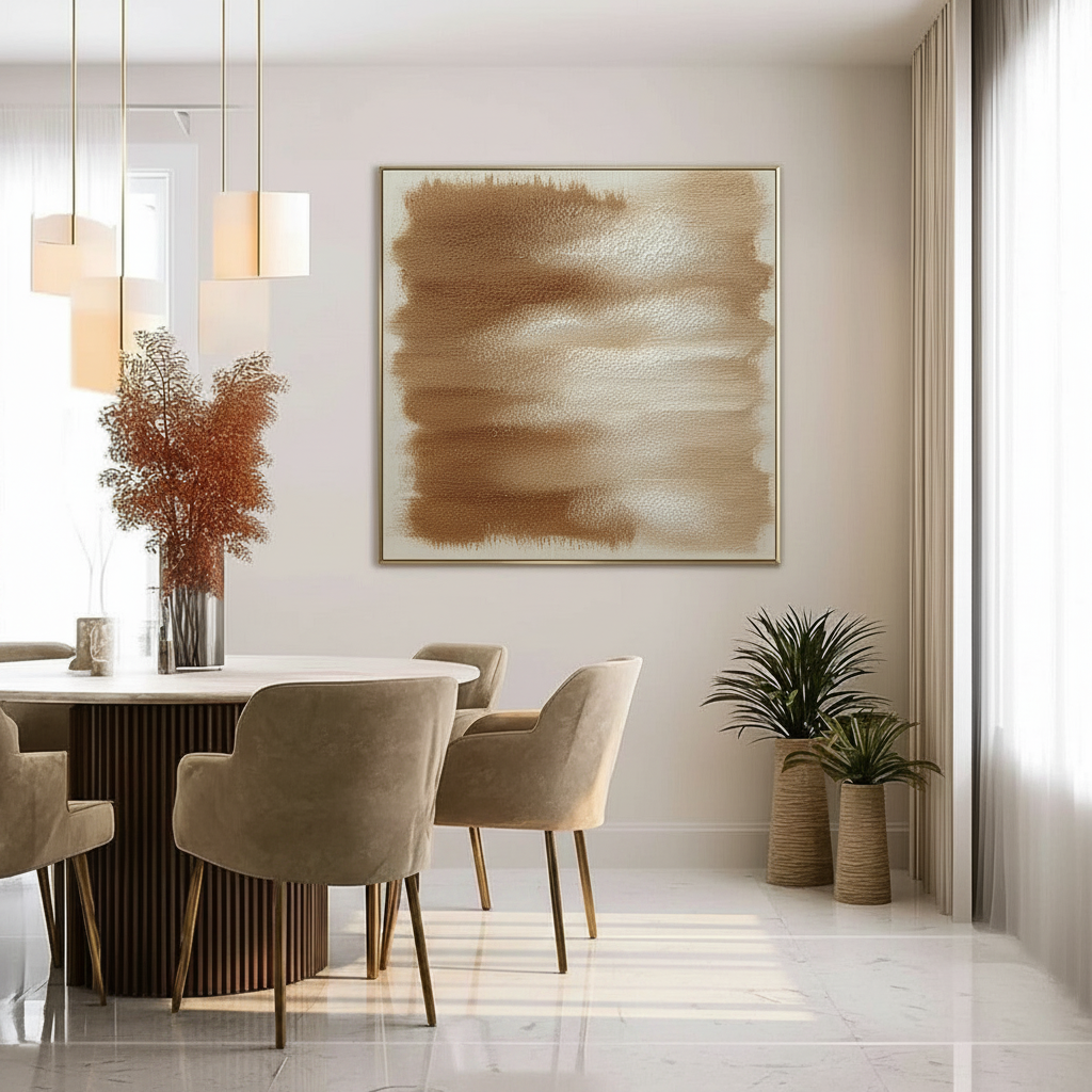
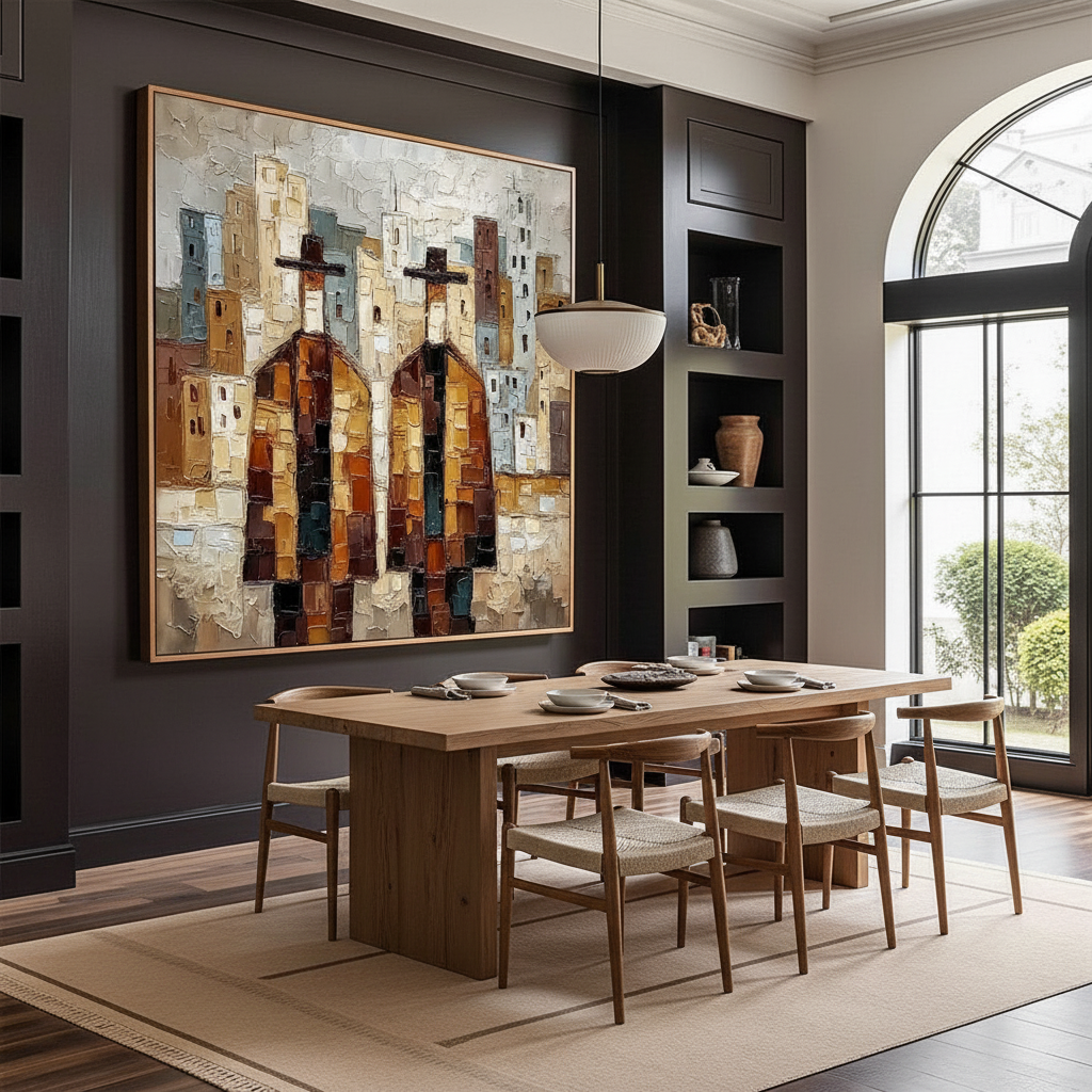
In the context of a dining room—a space defined by the sensory experiences of taste, smell, and conversation—the physical texture of art plays a decisive role in how we perceive the environment. This is where the impasto technique, characterized by thick, visible brushstrokes and palette knife marks, transforms a wall from a background into a participant in the dining experience.
The Physics of Light: Why Impasto Changes Color Perception
In a dining room, lighting is rarely uniform. Chandeliers, sconces, and candlelight create a dynamic interplay of light and shadow. Unlike a flat print, which reflects light evenly, an impasto painting interacts with the room's illumination through its microtopography.
Micro-Shadows and Geometric Metamerism
The "peaks" and "valleys" of thick oil or acrylic paint create micro-shadows. According to color science research from the Getty Conservation Institute, pigment reflection is dominated by absorption and scattering coefficients. On a textured surface, the refractive index varies across the canvas, leading to "geometric metamerism"—where the color appears to shift in depth and saturation as the viewer moves or the light changes.
While smooth surfaces can technically increase color saturation by 20-30% due to uniform reflection, they often feel "plastic" in high-end settings. Impasto’s micro-shadows may reduce overall vibrancy by ~15% (estimated based on typical light scattering models), but they compensate by providing "perceived depth." This depth makes colors feel more "nourishing" and grounded, an effect that is particularly potent under the warm, focused light of a dining chandelier.
Logic Summary: Our analysis of light interaction assumes a standard 2700K-3000K dining light source. The 15% vibrancy trade-off is a heuristic based on the scattering properties of pigment suspensions as defined by classical optical theory.
| Lighting Type | Interaction with Impasto | Perceived Color Effect |
|---|---|---|
| Point Source (Chandelier) | High Contrast | Accentuated texture; deep, dramatic shadows. |
| Diffuse (Natural Daylight) | Soft Shadows | Even, rich saturation; emphasizes pigment "glow." |
| Linear (Wall Sconce) | Side-lit Grazing | Maximum texture visibility; creates a 3D sculptural feel. |
| Warm Candlelight | Low Kelvin Glow | Enhances warm pigments (reds/golds); softens edges. |

Texture and Taste: The Cross-Modal Connection
There is a growing body of evidence suggesting that our environment directly influences our appetite and social behavior. While conventional wisdom suggests that visual texture in art translates directly to food texture expectations, the reality is more nuanced.
The "Nourishing" Surface
Passive art viewing has been shown to consistently activate the medial prefrontal cortex (mPFC) and the amygdala, areas of the brain responsible for emotional regulation and reward. A systematic review of 85 records published in PMC indicates that high-quality visual art optimizes these neural circuits. In a dining environment, a hand-painted impasto piece provides a "tactile fruition" that digital media lacks.
Interior designers often observe that warm-toned impasto pieces with visible brushstrokes stimulate longer dining durations. This is likely due to the "biophilic" effect—the human brain’s affinity for natural, non-repeating patterns found in handcrafted work. Research from the University of Central Arkansas notes that these natural landscapes (even abstract ones) produce stress-reduction effects similar to being outdoors, which in turn facilitates better digestion and more animated conversation.
The 6-12 Inch Rule: A Placement Heuristic
To maximize the impact of textured art in a dining space, placement is as critical as the palette. Based on common patterns from interior design practice, we utilize the following heuristic for hanging art above a dining table or console:
- The Bottom Clearance: The bottom of the artwork should typically hang 6 to 12 inches above the table surface or sideboard.
- The Rationale: This height ensures that seated guests can appreciate the impasto texture at eye level without the artwork being obscured by table settings or centerpieces.
- The Parallax Factor: If hung too high, the micro-shadows created by overhead lighting can become "muddied," losing the definition of the brushwork.
The Technical Integrity of Premium Pigments
For the quality-conscious consumer, the "why" behind the price of hand-painted art often lies in the chemistry of the materials. Unlike mass-produced prints that use fugitive dyes, professional-grade impasto works rely on high-load pigments and stable binders.
Beyond the ASTM Label
Many consumers see the ASTM D-4236 label on art supplies and assume it means the product is "non-toxic." However, the EPA clarifies that this label only means the warning labels comply with regulations, not that the pigments themselves are inert. Premium hand-painted art for the home should prioritize low-VOC (Volatile Organic Compound) materials.
Aalto University research has shown that coatings on wood and canvas with appropriate moisture levels emit significantly lower VOCs during the curing process than industrial alternatives. This is a critical consideration for dining spaces, where air quality directly impacts the olfactory experience of a meal. Using water-based acrylics or walnut-oil-based paints can eliminate the need for toxic solvents like turpentine, which Princeton University guidelines warn can cause narcosis and long-term brain damage with chronic exposure.
The Lightfastness Lifeline
In bright dining rooms with large windows, lightfastness is the "lifeline" of an artwork's longevity. Professional paints are tested using ASTM D4303 protocols, which involve xenon-arc tests to simulate years of sun exposure. High-end pigments, such as Titanium White, have replaced historical (and highly toxic) Lead White because of their superior chemical inertness and hiding power, capturing 90% of the global white pigment market.

Modeling the Investment: Art as a Property Asset
Beyond the sensory and health benefits, commissioning hand-painted murals or purchasing original impasto works is a sound economic decision. The "Busy Streets Theory" and various urban studies have quantified the link between art and property value.
The 7:1 ROI of Cultural Capital
While it may seem abstract, the economic impact of the arts is staggering. Americans for the Arts has found that government and private investments in the arts can yield a 7:1 ROI in terms of local economic activity. On a more granular level, a Royal Society analysis found that neighborhoods with higher "art" geo-tags saw greater relative house price ranking gains.
For the homeowner, a custom-painted wall or a large-scale impasto canvas acts as a "permanent physical billboard" of quality. Unlike furniture, which depreciates, original art is often viewed as a non-renewable cultural heritage asset.
Methodology Note (Economic Modeling): This ROI estimate is based on macroeconomic models from nonprofit arts organizations and 10-year property tracking data. It assumes a "catalytic effect" where high-quality art attracts further private investment and increases social cohesion.
| Asset Type | Value Retention | Sensory Impact | Maintenance |
|---|---|---|---|
| Digital Print | Low (Depreciates) | Flat, non-interactive | High (Fades quickly) |
| Original Impasto | High (Appreciates) | Tactile, light-responsive | Low (UV-stable pigments) |
| Custom Mural | Very High (Property) | Immersive, structural | Moderate (Requires sealant) |
Avoiding the "Gotchas": Common Pitfalls in Textured Art
Even with premium art, there are technical "gotchas" that can ruin the aesthetic if not addressed. One of the most common issues we see in large-scale acrylic works is Support Induced Discoloration (SID).
As explained by Golden Artist Colors, water-soluble impurities in cotton or linen canvases can be drawn out when thick layers of transparent medium are applied. This can cause a white or cream-colored painting to develop a mysterious yellow or brown tint as it dries. To prevent this, professional artists must "size" the canvas with multiple layers of high-quality gesso or specialized sealants.
Another issue is the "haziness" or "turbidity" that can occur in acrylic films. Research at the Tate Modern found that surfactants (PEG-type molecules) can migrate to the surface of the paint film during humidity changes, forming water-soluble crystals that cloud the color. Understanding these molecular mechanisms is what separates a gallery-grade piece from a hobbyist's project.
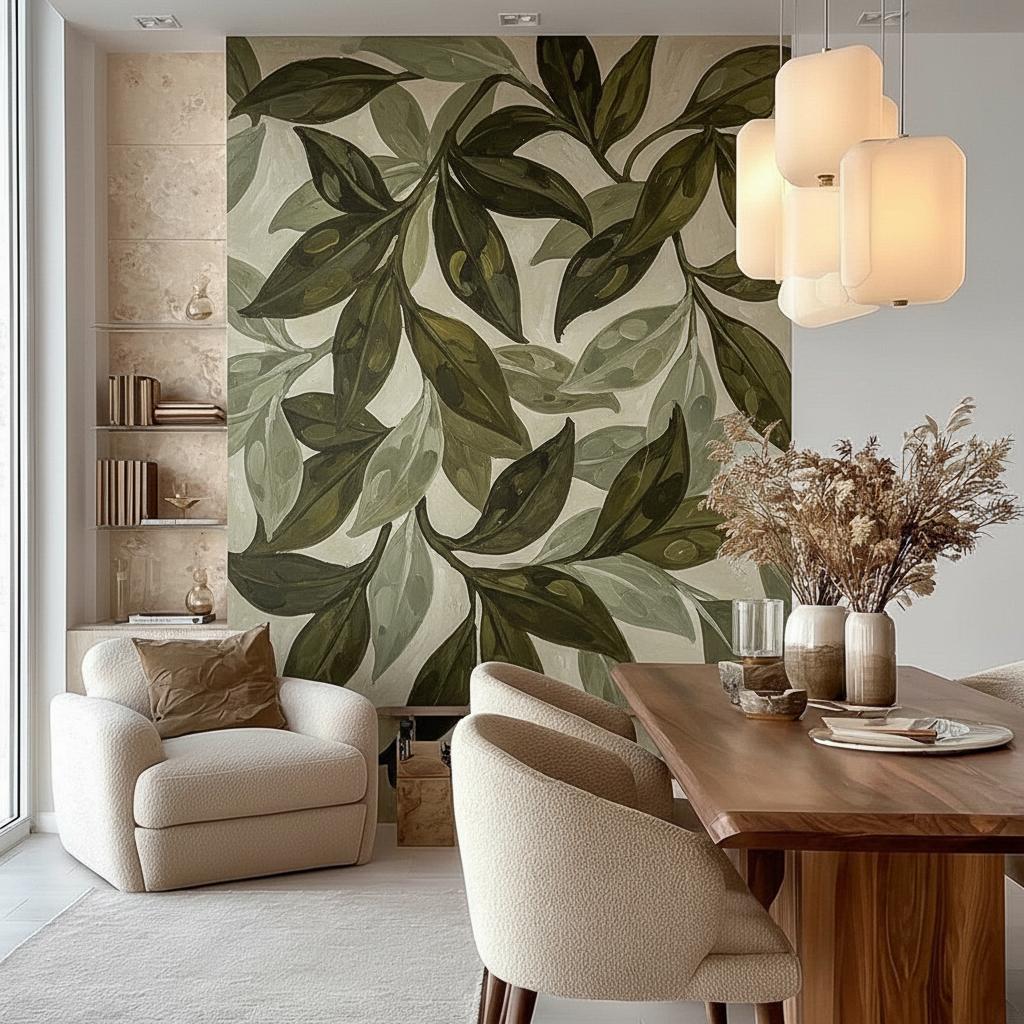
The Future of the Dining Space: Immersive Escapism
As we look toward 2026, the trends in high-end interior design are moving toward "understated elegance" with texture as its soul. The NKBA 2025 Kitchen & Bath Design Awards highlighted a dominant trend: wrapping spaces in immersive, hand-painted murals to create a sense of "escapism."
Whether it’s a panoramic landscape in a powder room or a bold, abstract impasto piece in the dining room, the goal is the same: to reject the assembly-line aesthetic in favor of something that feels human. In an age of digital saturation, the "micro-physical texture" of a brushstroke is the ultimate luxury. It is a reminder of the artist's visual attention mechanisms—the brain's ability to suppress perceptual illusions and capture a moment in physical form.
By choosing hand-painted art, you are not just decorating a wall; you are investing in a healthier, more vibrant, and more valuable social environment.
YMYL Disclaimer: This article is for informational purposes only. The technical data regarding paint toxicity, VOC emissions, and health impacts are based on available research from the EPA, CDC, and academic institutions. Always consult with a professional conservator or environmental health specialist when installing large-scale art in residential or medical environments, especially if you have pre-existing respiratory conditions or sensitivities.
Sources & References
- Marketplace: High-End Art Market Struggles (2025)
- Columbia Business School: Human vs. AI Art Perception Study
- University of Chicago: Essential Identity in Artwork
- Royal Society: Quantifying the Link Between Art and Property Prices
- UPenn: Visual Art in the Built Environment and Stress Reduction
- EPA: Indoor Air Quality and Low-VOC Paints
- Golden Artist Colors: Support Induced Discoloration (SID) Technical Bulletin
- Getty Conservation Institute: Color Science and Pigment Mixture
Leave a comment
This site is protected by hCaptcha and the hCaptcha Privacy Policy and Terms of Service apply.