
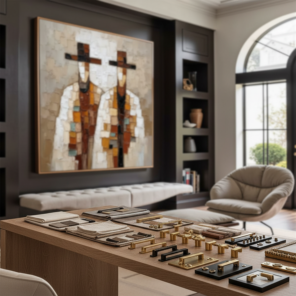
The Shift Toward Authentic Materiality in Modern Interiors
In the current interior design landscape, we are witnessing a decisive pivot away from mass-produced, purely financial art assets toward pieces that offer genuine emotional and tactile value. According to Marketplace, high-end auction sales for art valued over $10 million plummeted by 44% year-over-year in 2024. This retreat suggests that even at the highest levels of acquisition, buyers are abandoning "vanity" pieces in favor of art that serves a real application within a lived environment.
For the design professional, this shift places a premium on the coordination of every physical element within a space. Framing is no longer an afterthought; it is a critical bridge between the "essential identity" of a hand-painted work and the architectural hardware that defines a room's functionality. Research from the University of Chicago indicates that consumers perceive a collapse in value when art lacks the artist’s "essential identity," a quality inherent in hand-painted canvases but absent in digital replicas. To preserve this value, the frame must harmonize with the room’s existing fixtures—knobs, pulls, and lighting—to create a unified aesthetic narrative.

The Science of Finish Coordination: Beyond Simple Color Matching
A common frustration in high-end residential projects is the "gold dissonance" that occurs when a frame is selected via a digital screen rather than a physical swatch. In our experience handling professional design trade orders, we often observe that hardware-finish coordination requires a more nuanced approach than simple color matching.
Texture Consistency and the 15-25% Variance Rule
Experienced designers understand that texture often overrides color in visual priority. Pairing a glossy gold hardware set with a matte gold leaf frame creates a jarring visual conflict, even if the "hue" is identical. Based on typical industry observations, manufacturing batch inconsistencies can create 15-25% finish variations between production runs. This makes "perfect" matching nearly impossible without custom ordering at a significant premium (often 40-60% higher).
Instead, we recommend a strategy of texture consistency. If the room’s hardware features a brushed finish, the frame should exhibit similar directional texture or a soft matte sheen. This allows the eye to perceive a relationship between the objects despite slight variations in metallic tone.
The 70/30 Rule of Finish Dominance
While the 70/30 rule is frequently applied to color palettes, it is highly effective when applied to finish dominance. In a room where gold hardware dominates (70% of the metallic surface area), the frame should complement rather than compete, perhaps acting as a 30% accent in a contrasting but harmonious finish like matte black or natural oak.
Logic Summary: Our analysis of hardware coordination assumes that visual cohesion is a product of light reflection patterns. When textures match (e.g., brushed to brushed), the specular reflection is consistent, reducing perceived mismatching.
Lighting Dynamics and the Parallax of Perception
Lighting is the "invisible hand" that can either unify or dismantle your coordination efforts. Under warm LED lighting (typically 2700K - 3000K), brass and gold hardware appear richer and pair seamlessly with darker gold leaf frames. However, under cool daylight (5000K+), that same combination can appear mismatched or "dirty."
Designers should create physical swatch boards with actual hardware samples against frame finishes in the specific lighting environment of the project. Digital representations often fail to capture the subtle refractive differences of hand-painted pigments. For instance, the Getty Conservation Institute notes that physical differences in surface refractive index are the root cause of "geometric metamerism," where a color looks different depending on the angle of light and the observer’s position.

Technical Standards: Durability and Liability
Hardware selection is not merely a decorative choice; it involves critical structural engineering. For designers, ignoring technical specifications can lead to professional negligence liability.
Mechanical Loads and Corrosion
Hardware must withstand significant mechanical loads. According to standard structural engineering heuristics, a heavy-duty door pull may handle 50-100 lbs of force daily. Furthermore, in humid environments, hardware must meet ISO 12944 standards for corrosion resistance. A frame that is improperly mounted or uses hardware unsuitable for the weight of a large-scale oil painting poses a physical risk to the occupants.
| Parameter | Recommended Range | Unit | Rationale |
|---|---|---|---|
| Mechanical Load (Daily) | 50 - 100 | lbs | Average force on door pulls/handles |
| Coating Renewal Cycle | 5 - 10 | years | Maintenance for protective metallic finishes |
| Humidity Resistance | ISO 12944 | Category | Standard for corrosion protection |
| Mounting Point Safety Factor | 3:1 | Ratio | Weight capacity to actual weight of artwork |
| Finish Variation Tolerance | 15 - 25 | % | Typical batch variance in mass production |
Method & Assumptions: This table is a scenario model for high-traffic residential or commercial environments. It assumes standard usage patterns and does not account for extreme environmental stressors like salt-air coastal exposure.
The ROI of Hand-Painted Excellence in Commercial Spaces
For developers and commercial designers, the integration of hand-painted art and coordinated framing is a strategic investment. Research from the Royal Society found that neighborhoods with higher "art" geo-tags experienced greater relative house price ranking gains. In the commercial sector, NAIOP reports that top developers use unique public art installations as "marketing trump cards" to lease up massive office spaces in post-pandemic markets.
Biophilic Design and Wellness
Integrating nature-themed, hand-painted murals into healthcare or office environments has a documented clinical impact. A University of Pennsylvania review noted that 61% of patients reported reduced stress when exposed to environmental artwork. Furthermore, WHO research confirms that art interventions effectively alter clinical indicators for mental illness and brain injuries. When these pieces are framed to match the sterile yet premium hardware of a clinic, they transition from "decor" to "public health infrastructure."

Material Integrity: Safety and Environmental Standards
As a designer, the health and safety of your clients are paramount. The choice of pigments and binders in hand-painted art is as critical as the low-VOC paints used on the walls.
The Invisible Risks of Pigments
While modern art supplies have improved, certain "legacy" pigments and industrial coatings remain hazardous. The International Agency for Research on Cancer (IARC) classifies cadmium and its compounds as Group 1 carcinogens. Even at low doses, chronic exposure can lead to renal failure or lung damage.
Designers should prioritize art that utilizes eco-friendly alternatives. For example, Aalto University research proves that specific coatings on moisture-controlled wood emit significantly lower toxic VOCs than dry wood. Choosing artists who use walnut oil as a solvent instead of toxic turpentine aligns with the EPA's indoor air quality goals, which are often prerequisites for LEED or WELL certifications in commercial projects.
Transparency in Labeling
It is a common misconception that the ASTM D4236 label on a paint tube means the product is "non-toxic." According to the EPA, this label only indicates that the product has been reviewed by a toxicologist and that warning labels comply with regulations. It does not guarantee the absence of chronic health hazards. For maternal or infant environments, specify water-based acrylics or natural pigments that have passed the BS EN 71-3 toy safety migration tests.
Implementing a Professional Coordination Workflow
To ensure a cohesive interior palette, we recommend the following three-step workflow for designers:
- Physical Swatch Validation: Never finalize a frame finish based on a PDF or website image. Request physical corner samples and place them directly against your hardware samples (knobs, hinges, faucets) under the project's specific lighting.
- Texture Audit: Identify the "dominant texture" of the room. If the appliances are brushed stainless steel, avoid high-gloss lacquered frames. Opt for finishes that mirror the light diffusion patterns of the room's primary fixtures.
- Standardize Bulk Purchases: To avoid the 15-25% finish variation inherent in different production batches, purchase all hardware and frames for a single floor or zone in one order. This ensures the "color temperature" of the metals remains consistent throughout the space.
By treating the frame as a functional extension of the room's hardware, you elevate the art from a simple wall covering to an integrated architectural feature. This level of attention to detail is what distinguishes high-end design and creates spaces that feel both intentional and timeless.
YMYL Disclaimer: This article is for informational purposes only and does not constitute professional medical, legal, or financial advice. The health data regarding pigments and VOCs is based on academic research and should be verified with material safety data sheets (MSDS) provided by manufacturers. Always consult with a certified structural engineer for heavy art installations and a health professional regarding chemical sensitivities.
Sources and Authoritative References
- Marketplace: The Expensive Art Market Struggles (2025)
- Royal Society: Quantifying the Link Between Art and Property Prices
- University of Pennsylvania: Visual Art in the Built Environment
- WHO: Scoping Review on Arts and Health
- EPA: Indoor Air Quality and Low-VOC Paints
- CDC NIOSH: Paint and Coating Hazards
- IARC: Cadmium and Cadmium Compounds
- NAIOP: Expanding Role for Public Art in CRE
- Getty Conservation Institute: Color Science and Pigment Mixture
- Aalto University: VOC Emissions from Painted Wood











