You hung a print. It looked great in the store. On your wall, something felt off: flat, lifeless, forgettable. The problem usually has nothing to do with taste. It has everything to do with texture, light, and room scale. Textured wall art works differently from standard prints, and placing it in the right room changes how it looks and feels entirely. Here's what you need to know before choosing.
What Makes Wall Art in 3D Different, and Why Placement Changes the Result
Standard prints sit flat on the canvas. 3D textured wall art has physical height built into every stroke. When light hits a raised surface, it casts real shadows and highlights that shift as the day moves. That's a physical effect, not an aesthetic preference.
This means the conditions in your room actively change what the painting looks like:
Natural Light vs. Artificial Light
Natural side light catches every ridge and brushstroke, making texture pop. Overhead or direct artificial light flattens it. Rooms with north-facing windows or limited daylight call for lighter-colored textures or high-contrast palettes so the depth stays visible.
Viewing Distance and Texture Visibility
In a large room, thick impasto strokes remain visible from across the space. In a small room (under 120 sq ft), fine, delicate texture can disappear at a glance. Scale your texture to your room.
Handmade Paint vs. Printed Texture
A printed "textured" image has no physical depth. Light slides across it evenly. A genuine impasto wall art piece has real material buildup; you can see it shift as you move past it. That difference shows up most in rooms where you spend time sitting and looking.
Before You Buy: Four Questions That Narrow It Down
Get these four answers right and your decision gets much easier:
1. Is the light in this room strong or dim? Strong light amplifies texture. Dim light benefits from lighter colors or higher-contrast compositions.
2. Should this piece be a focal point or blend in? Focal point: go large with bold contrast. Background presence: neutral palette, medium scale.
3. Is this room for relaxing or for activity? Relaxing spaces suit soft, flowing lines. Active spaces (offices, kitchens) suit ordered, structured compositions.
4. What color is your wall? Dark walls carry light-colored textures beautifully. Light walls can handle richer, more complex color and texture combinations.
Living Room: Carry Visual Weight Across the Room
The living room gets seen from a distance. Choose large textured wall art for the living room that still holds its impact at 10 to 15 feet away.
Why Impasto Works Here
Thick impasto strokes stay visible at distance. A brushstroke that's half an inch raised off the canvas reads clearly across the room. Fine, subtle textures tend to disappear.
Size Rule
Aim for a piece that covers two-thirds to three-quarters of your sofa's width. Going smaller almost always looks timid.
Color Strategy
Pick up one color already in your rug, cushions, or drapes. You don't need a match. You need a conversation. A warm gold on beige canvas draws out the amber in a wooden floor. A deep teal echoes a navy cushion without repeating it.
GOLDEN WINGS (panoramic gold and beige impasto abstract) and EARTHBOUND HARMONY (palette knife abstract) both hold their texture and color clearly at living room distances.

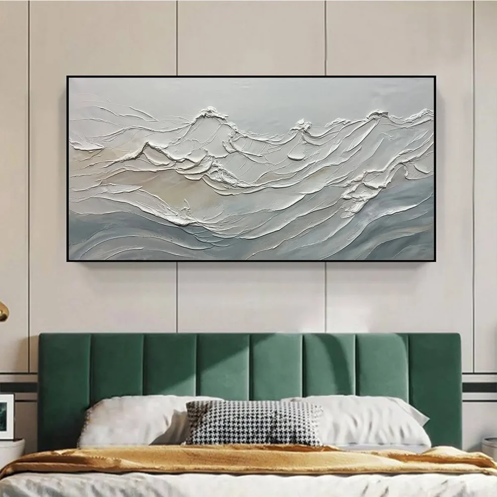
Bedroom: Texture That Stays Quiet
Textured wall art for the bedroom needs to earn its place without demanding attention. High-contrast pieces with aggressive compositions tend to work against sleep and relaxation.
Organic curves, soft gradients, and wabi-sabi-influenced compositions do the opposite. They hold the eye gently. Hang your piece centered above the headboard, leaving at least 6 to 8 inches between the frame and the top of the bed frame.
Stick to earth tones, warm whites, and grey-greens. Avoid saturated reds or electric blues in this space. ZENITH (wabi-sabi minimalist abstract) and DESERT WINDS (warm landscape impasto) both bring texture to a bedroom without visual noise.
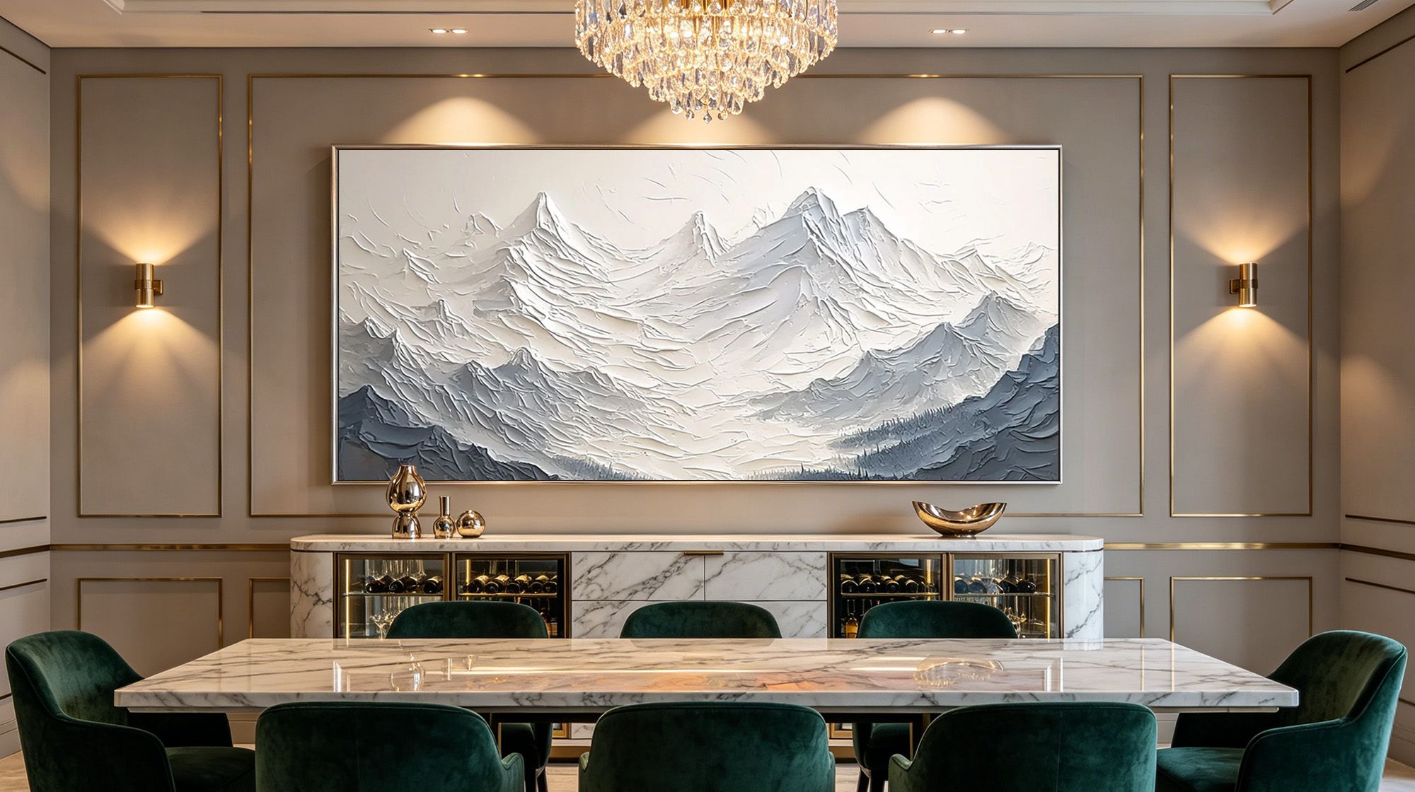
Dining Room: Close Enough to See Every Detail
People sit at a dining table for 30 to 60 minutes at a time. They look at your art up close. That proximity shifts what you need from a piece.
Choose a palette knife technique for the dining room. Palette knife work creates fine, clean relief lines that reward close viewing without overwhelming the space. Match the texture's warmth to your table material: warm amber and burnt umber tones pair naturally with wood, while cooler greens and silvers complement marble and glass.
A medium-sized textured abstract wall art piece at eye level works well on the wall facing the seating area. EMERALD MOSAIC (textured green and gold abstract) coordinates naturally with wood furniture and warm finishes.

Home Office: Order Without Noise
The home office asks for a different balance. You need visual quality, something that says "this space is considered," without anything that pulls your focus mid-meeting or mid-thought.
Choose compositions with clear structure: horizontal bands, stacked layers, or geometric rhythm. Keep saturation low.
A single panel placed on the side wall (not directly behind your monitor) gives visual relief without distraction. A wabi-sabi minimal piece or a monochromatic palette knife abstract fits this role well.

Walk-in Closet: Your Space, Your Rules
The walk-in closet is the one room in the house where purely personal taste takes over. No guests lingering, no group consensus needed. That freedom changes what works on the wall.
Vertical-format pieces echo the lines of hanging garments and make a narrow closet feel taller. Warm vanity lighting, which most closets use, casts the kind of side-angle glow that shows impasto texture at its best. Place a medium-sized piece near the mirror or on the accent wall facing the door.
Color choice here is unusually personal: pull from your actual wardrobe palette. If your place lean neutral, a mild green textured abstract oil painting adds contrast without clashing. If you dress in color, a bold organic composition lets the room hold that energy.

Children's Room: Texture and Color They Love
Children respond to texture in a way adults tend to forget. The ridges and raised strokes of a genuine 3D textured wall art piece hold a child's attention longer than a flat print, and that quality doesn't fade as they grow.
Choose organic, flowing shapes over rigid geometric patterns. Nature-inspired compositions, abstract landscapes, and soft colorfield works all age well from toddler years into early teens. Bold primary colors work for younger children; softer palettes suit older kids who want their room to feel less "young."
Hang the piece slightly above the standard eye-level recommendation (around 65 inches to center) to keep it out of reach of small hands. Prioritize varnished surfaces for easy maintenance, and avoid pieces with very fine micro-texture in areas where the paint could be vulnerable to contact.

Hallway and Entryway: First Impression, Every Day
Hallways get overlooked when decorating. They shouldn't. The entryway is the first and last thing you see every day, and it shapes how guests read your space immediately.
Vertical-format textured pieces work especially well in hallways because they echo the height of the space and pull the eye upward, making ceilings feel taller. Entryways often lack natural light, so choose pieces with slightly higher brightness or metallic accents that catch even low-level ambient light.
For a narrow hallway, a single statement piece beats a cluster. For a wider entry, a triptych across the wall creates a strong, gallery-worthy arrival. GOLDEN WHISPERS (golden tree impasto with warm metallic accents) reads well in an entry even without strong natural light.
When Textured Wall Art Doesn't Belong: Four Spaces to Skip
Textured art needs stable air, stable temperature, and distance from physical contact. These four spaces work against all three:
- Directly above a cooking stove: Grease particles settle into raised paint over time and cannot be cleaned out of impasto surfaces.
- Unventilated bathrooms: Sustained steam softens paint layers and loosens texture from the canvas.
- Walls in all-day direct sunlight: UV exposure fades hand-mixed pigments faster than it fades standard prints.
- Tight stairwells with heavy foot traffic: Regular brushing contact chips raised texture gradually, from the edges inward.

How Scale Makes or Breaks 3D Textured Wall Art
Small art in a big room reads as an afterthought. Big art in a small room feels suffocating. With 3D textured wall art, scale carries extra stakes: too small, and the texture becomes invisible; too many pieces competing, and the depth effect cancels out.
A simple rule: the art should cover 50 to 75% of the usable wall width above your primary furniture. For open walls with no furniture anchor, the bottom of the frame should sit at eye level (roughly 57 to 60 inches from the floor to the center of the piece).
How Lighting Shapes the Look of Textured Wall Art
Light is the second canvas. Control it and you control how your art reads.
- Natural side light: Catches brushstroke ridges from an angle, showing maximum depth and shadow
- Warm spotlights: Add drama, deepen shadows, and bring warmth to earth-toned pieces
- Cool white overhead light: Flattens texture and washes out dimension; avoid pointing it directly at your art
- Best setup: An adjustable directional spotlight mounted at a 45-degree angle from the canvas, about 2 to 3 feet away. This replicates gallery lighting and shows the texture at its best
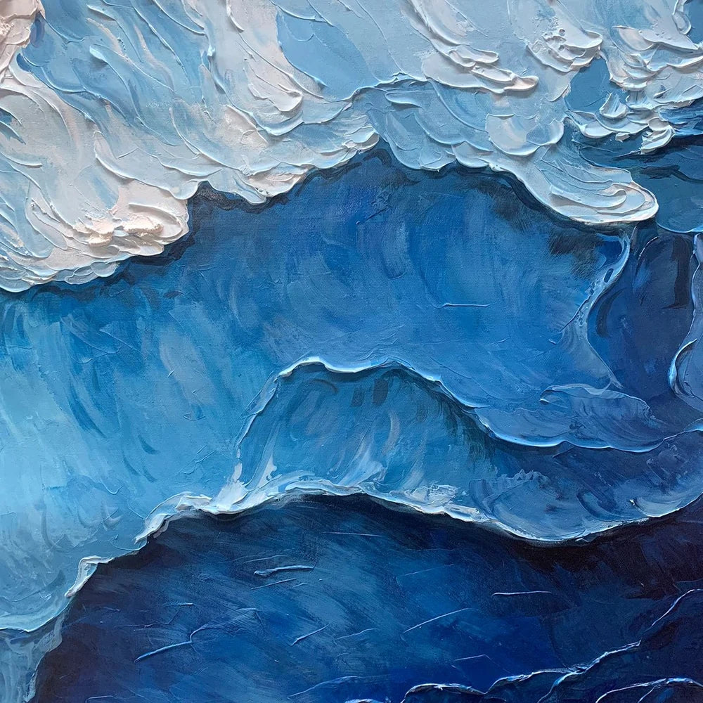
Why Handmade Texture Is Not the Same as Printed Texture
The market is full of products labeled "textured art" that are high-resolution prints of textured paintings, not original painted surfaces. The difference is physical:
- Printed texture: The surface is completely flat. Light passes across it evenly. No shadows form between strokes.
- True impasto texture: Paint is built up in layers. Each stroke has real physical height. Touch it and you feel ridges.
- Long-term value: Handmade impasto paintings develop a unique patina over time. The physical surface stays one-of-a-kind.
Every piece from Montcarta is handcrafted by professional artists using premium oil and acrylic paints. One buyer described receiving theirs: "The texture is amazing and everyone at work was in awe." That reaction doesn't come from a print.
A Home Takes Shape One Wall at a Time
Walk through your space with the light in mind, the furniture scale in sight, and a clearer sense of what each room needs to feel complete. Textured art rewards that kind of attention: the right piece doesn't announce itself, it settles in. Montcarta's Textured Wall Arts spans bold impasto statement pieces to quiet wabi-sabi minimalism, and the custom commission service is there when you have something specific in mind for a specific wall.
FAQs
Will 3D textured wall art crack or peel over time?
No, as long as you keep it away from direct sunlight and high humidity. Professional-grade oil and acrylic paints cure into a stable surface indoors.
How do you clean 3D textured wall art without damaging the surface?
1. Dust with a soft, dry brush - a makeup brush works well.
2. Never use a damp cloth; moisture seeps into raised texture.
3. For stubborn buildup, consult a professional art conservator.
Does textured wall art work in a small room?
Yes - choose bold, high-relief strokes. Fine micro-textures disappear at close range. One well-sized piece reads better than several small ones.
Can you put textured wall art in a bathroom or kitchen?
Only in well-ventilated spaces, away from steam and splatter. A varnished piece inside a glass frame offers the most protection. Never hang it directly above a stove.
What's the difference between impasto texture and palette knife texture?
| Impasto | Palette Knife | |
|---|---|---|
| Tool | Brush | Flat metal blade |
| Stroke feel | Rounded, expressive | Sharp, layered |
| Best for | Living room, bedroom | Dining room, office |
Both build real physical depth. The difference is mood: impasto is painterly, palette knife is precise.
Leave a comment
This site is protected by hCaptcha and the hCaptcha Privacy Policy and Terms of Service apply.