You bought a nature painting, loved it in the shop, and brought it home. On your wall, it suddenly looks like it belongs in a hunting lodge. The painting did not change. The context did. Nature paintings carry strong visual signals, and a handful of specific factors decide if they read as rustic or refined. Get those factors right, and the same subject that looks like farmhouse decor somewhere else becomes a strong piece of contemporary wall art.
Key Takeaways
- Rustic-looking nature paintings share four visual traits: warm earth tones, fine realistic detail, heavy subject matter, and distressed frames
- Each nature subject (forest, water, florals, sky) produces a different mood and suits different rooms
- Abstract nature wall art integrates more smoothly into modern spaces than realistic styles
- Frame choice shifts a painting's visual language dramatically, often more than the image itself
- Lighting, especially angle and color temperature, changes how a painting looks on your wall
- Original paintings carry physical presence and texture that canvas prints do not replicate
What Actually Makes a Nature Painting Look Rustic?
Four visual signals combine to create the rustic effect. No single one causes it on its own. Two or three stacked together usually do.
| Visual Signal | Rustic Version | Modern Version |
|---|---|---|
| Color palette | Warm amber, deep brown, burnt orange | Cool sage, slate blue, muted neutrals |
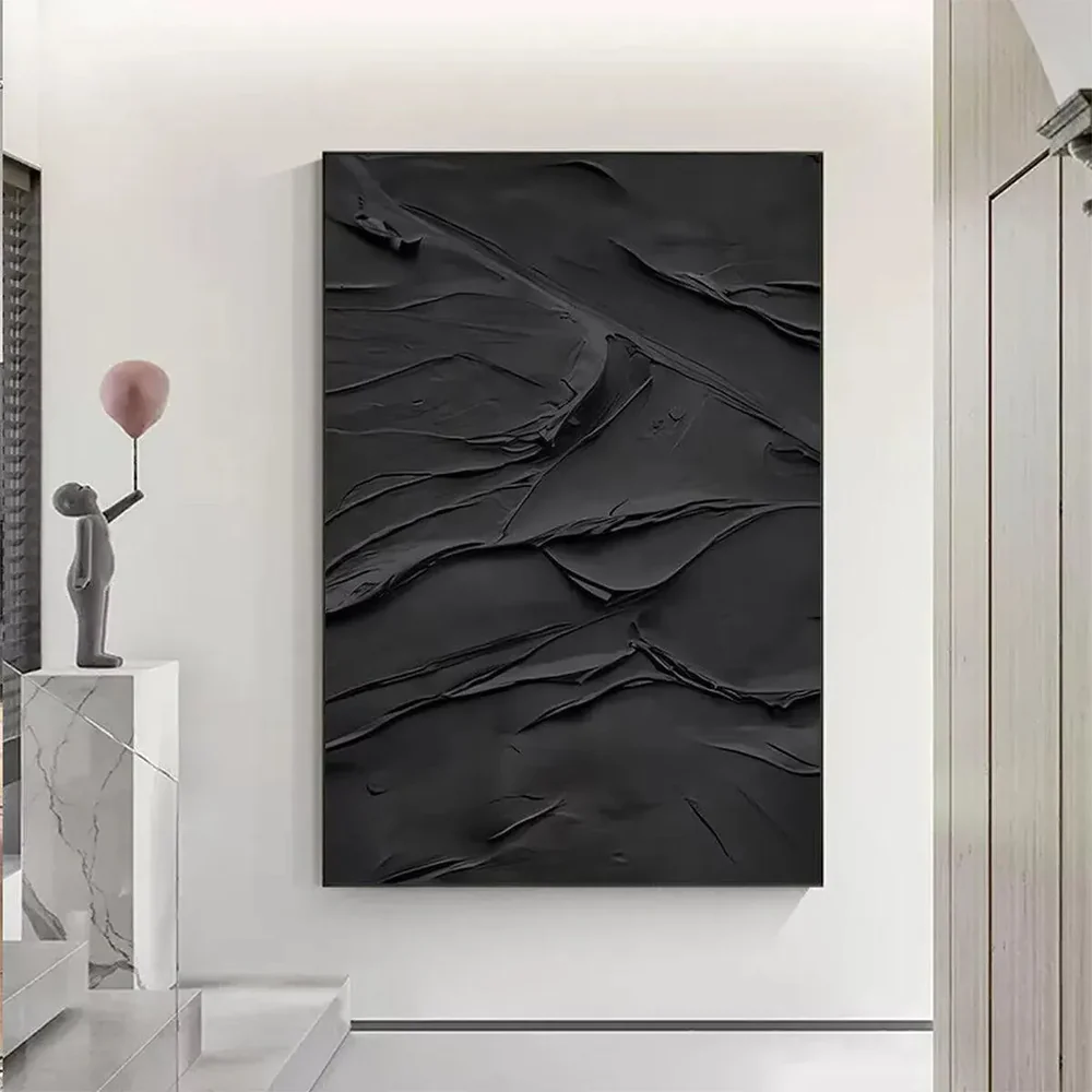
| Painting technique | Fine photorealistic detail | Loose brushwork, impasto, palette knife |
| Subject matter | Deer, barns, harvest scenes, pine cabins | Abstract tree forms, minimalist coastlines, botanical studies |
| Frame | Distressed wood, ornate gilded | Bare canvas, slim black, natural light oak |
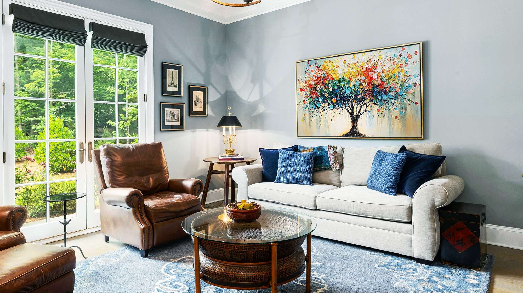
The most common trap is pairing a loose, modern painting with a distressed wood frame. The frame overrides the image. The reverse works too: a realistic deer painting in a slim black frame still reads rustic, because the subject carries too much of that association.

Which Nature Subject Creates Which Mood in a Room?
Subject choice controls how a room feels before you process color or style. Each category of nature paintings pulls the space in a different direction.
Forest and trees add depth and a sense of enclosure. They ground a room visually, which works well in living rooms and studies where that weight feels appropriate.
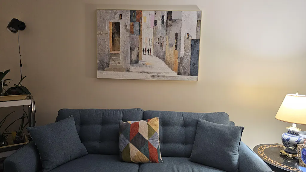
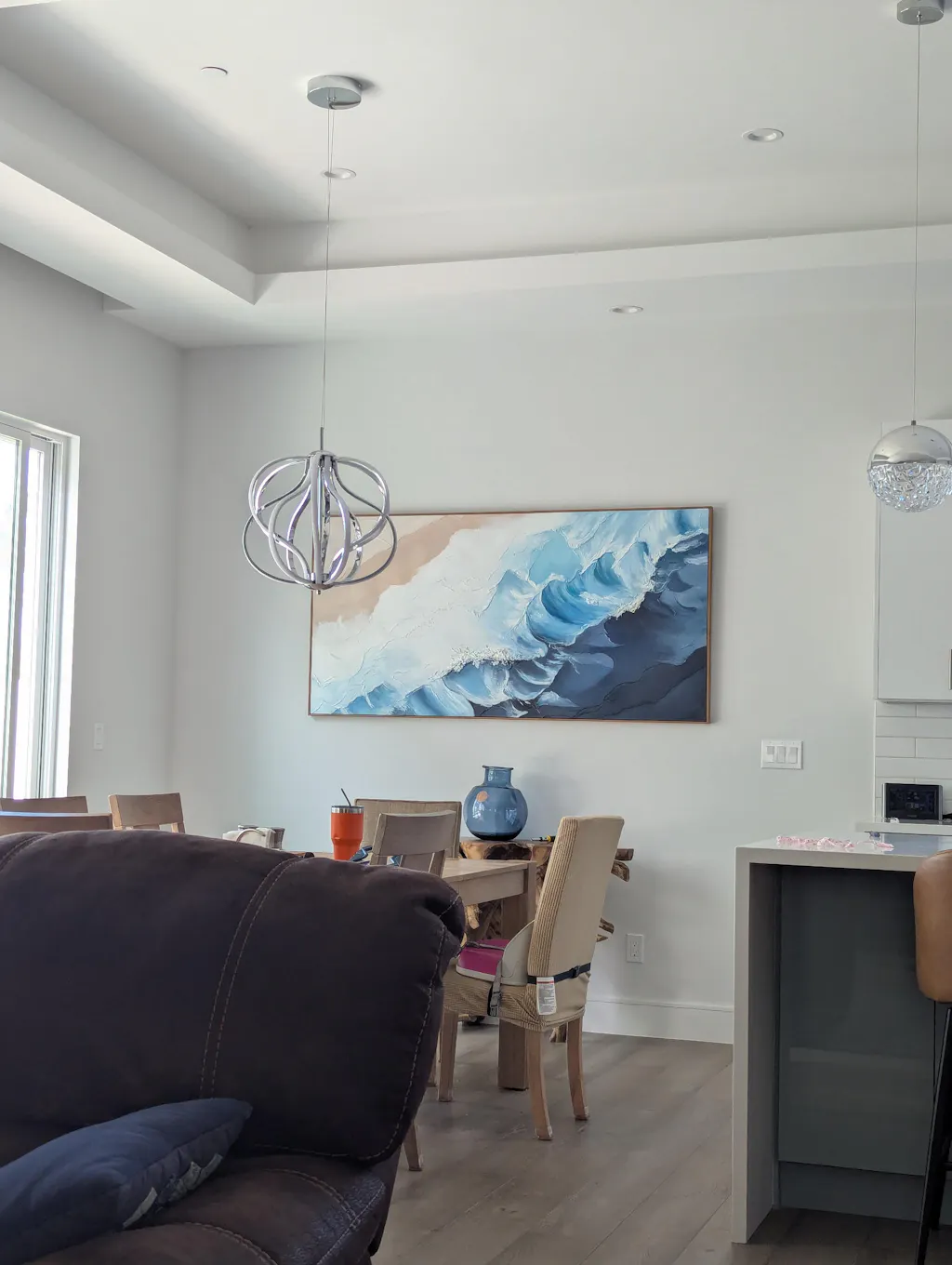
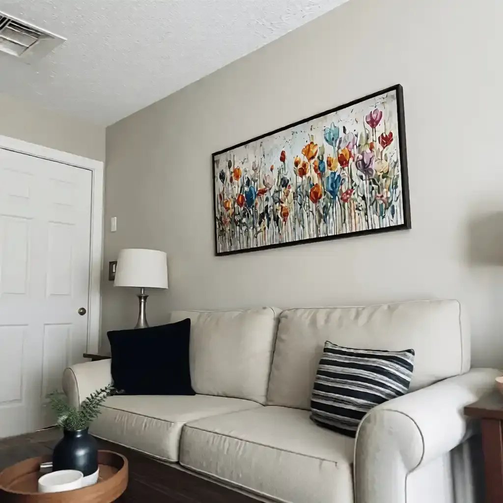
Water and coastlines open a space up. A seascape or river painting visually extends the wall. These are strong choices for nature paintings for living room use, especially in tighter spaces that need a sense of air.
Mountains and sky create scale. Large nature wall art in these subjects holds tall or wide walls that other subjects cannot fill without stacking multiple pieces.
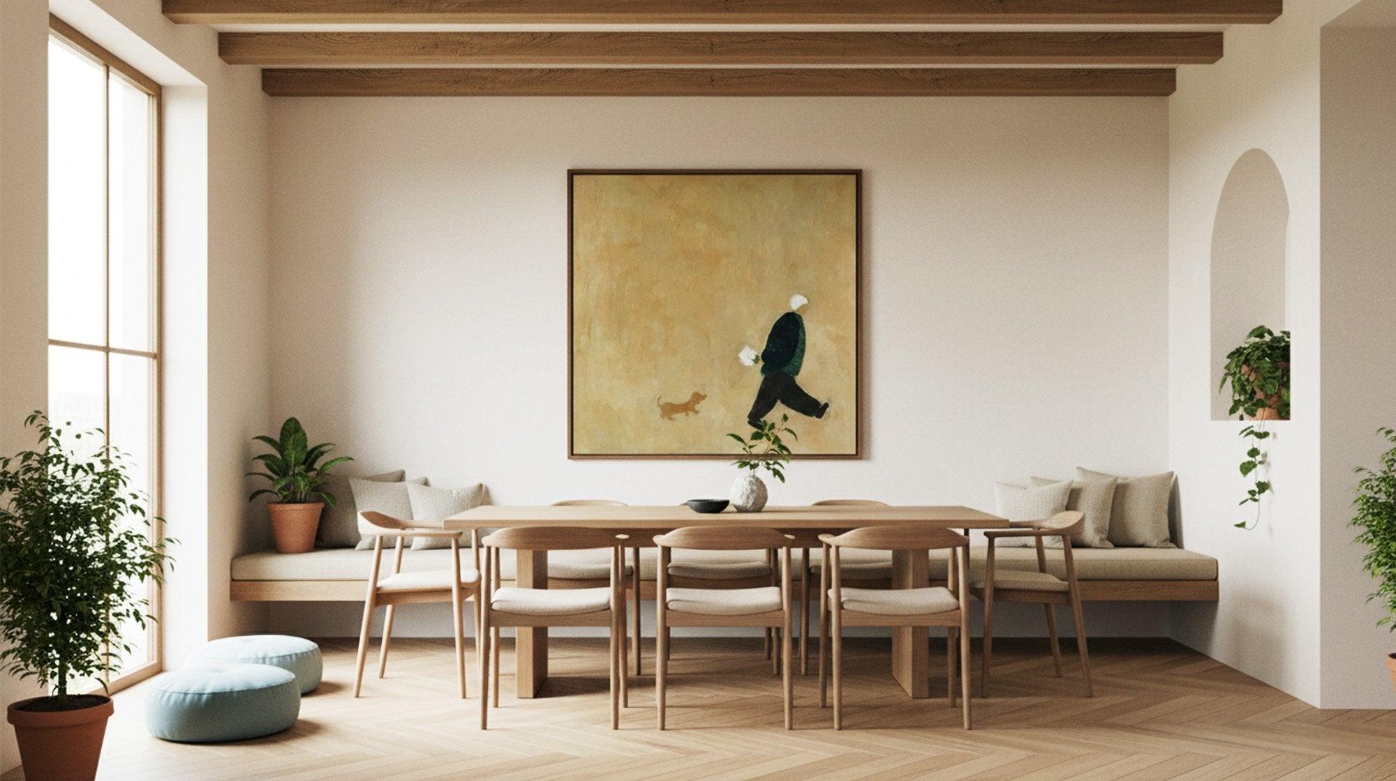
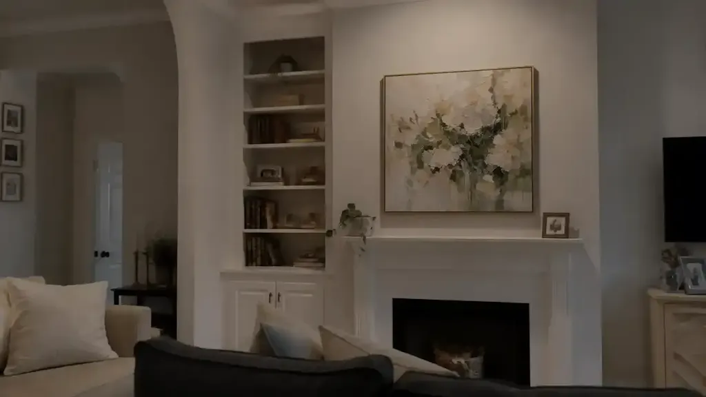
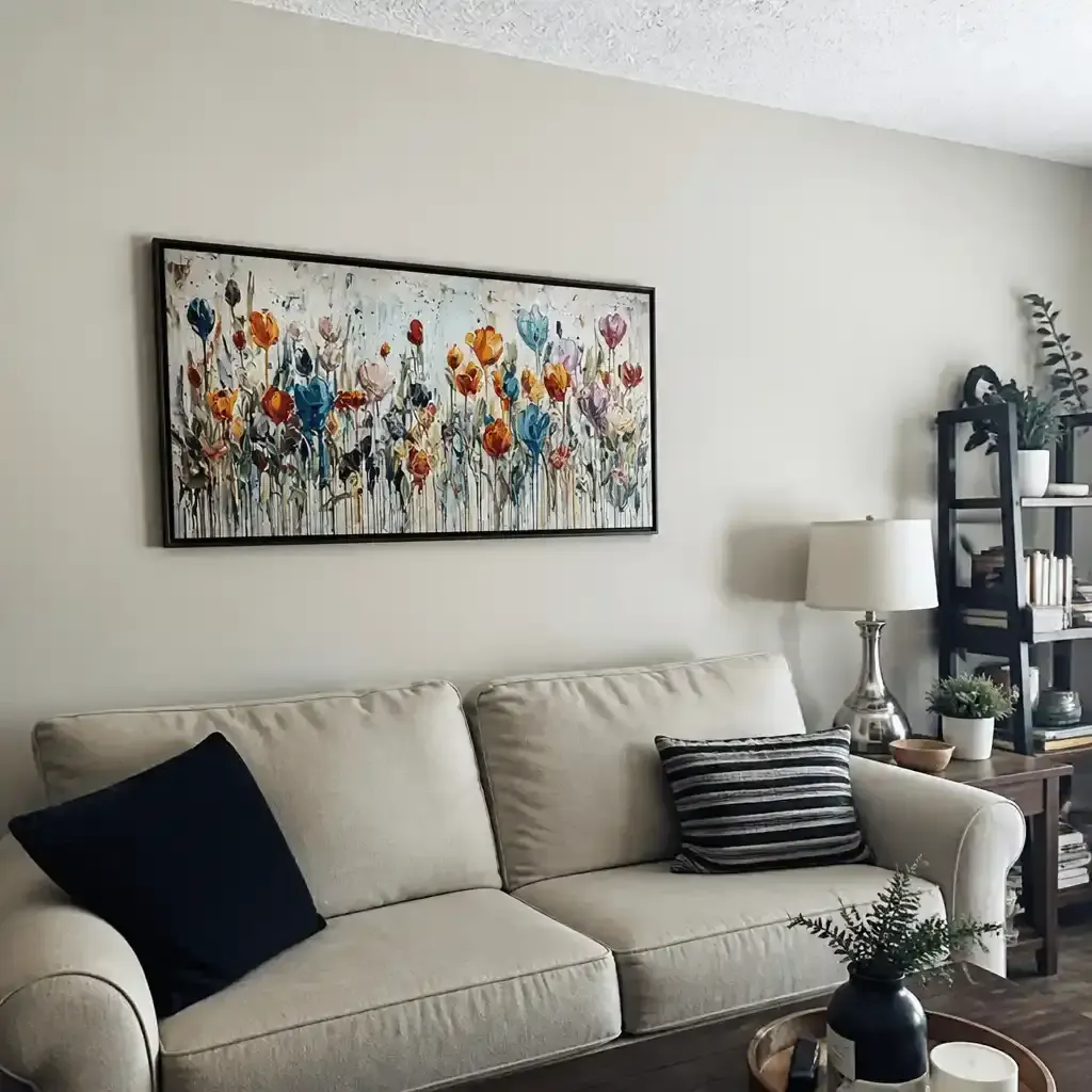
Florals and botanicals add movement without drama. They soften harder spaces like home offices and dining rooms without competing for attention. This category also carries the strongest biophilic wall art associations, since botanical forms connect naturally to plants, organic textures, and living decor.
| Subject | Room Effect | Works Best In |
|---|---|---|
| Forest / Trees | Depth, visual weight | Living room, study, library |
| Water / Coastline | Openness, calm | Bedroom, small living room |
| Mountains / Sky | Scale, dramatic presence | Large walls, open-plan spaces |
| Florals / Botanicals | Softness, movement | Dining room, home office, bedroom |
What Is the Difference Between Realistic and Abstract Nature Paintings?
Realistic nature paintings read like a window. Abstract nature wall art reads like an atmosphere.
A realistic forest painting shows the forest: identifiable trees, specific light, readable depth. That specificity can be striking, but in a contemporary interior it often competes with everything else in the room.
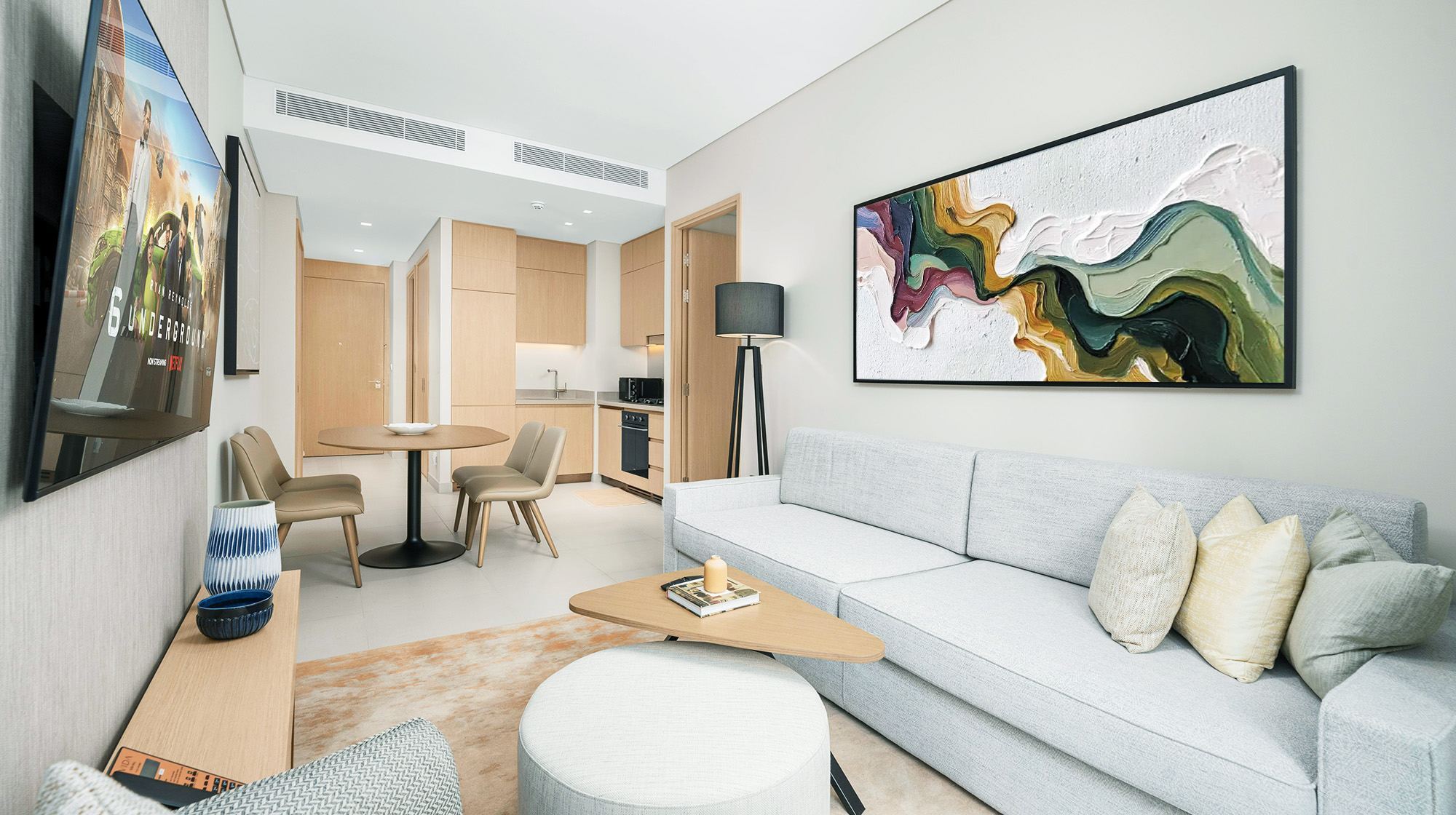
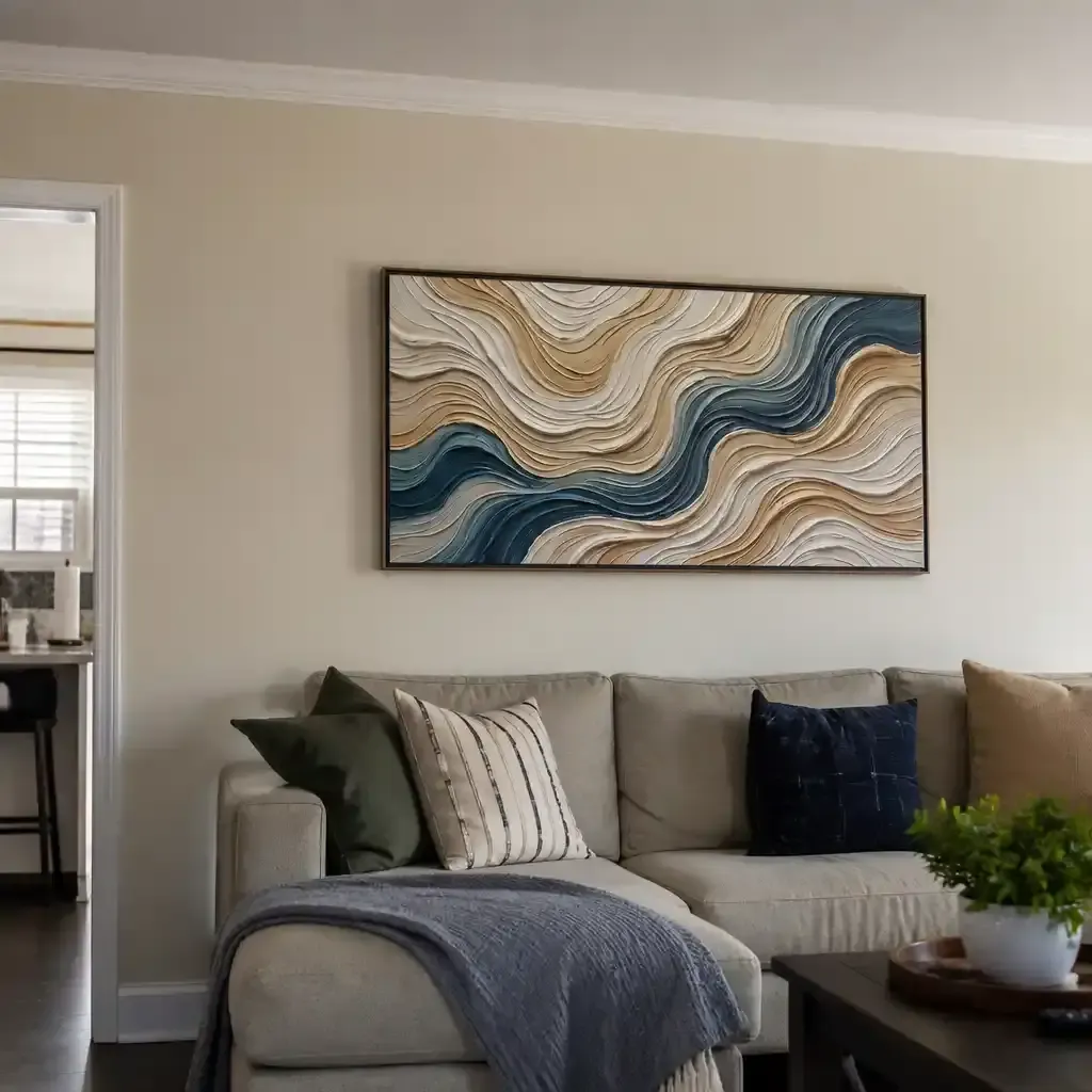
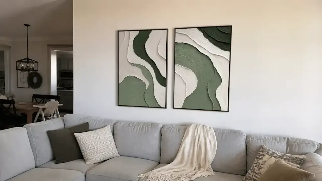
An abstract nature painting captures the feeling of the subject rather than the subject itself. Loose brushwork, simplified forms, and color fields suggest nature without reproducing it. In modern spaces, this integrates more smoothly because it does not require the same literal reading from the viewer.
The two can share a wall without conflict. A realistic botanical study and an abstract seascape work together as long as their color palettes overlap. The variation in style reads as intentional rather than mismatched.
How Do You Match a Nature Painting to Your Existing Decor?
Start from what already exists in the room, not from the painting.
If your room runs neutral (white, warm gray, beige): You have flexibility. A painting with deeper color, visible texture, or strong contrast will anchor the space without clashing.
If your room has strong color or pattern: Pull one color already present in the room and find a painting that uses it as a secondary tone, not the dominant one.
If your room uses natural materials (wood, stone, linen): Textured paintings with visible brushwork or palette knife work align with those surfaces. They add to the tactile quality of the space rather than sitting flat against it.
Color Harmony vs. Color Contrast
| Approach | When to Use It | Risk |
|---|---|---|
| Harmony (similar tones) | When the room already feels busy or layered | Can disappear into the wall |
| Contrast (opposing tones) | When the room feels flat or overly neutral | Can feel disconnected from the space |
A painting with strong contrast in a neutral room creates a clear focal point. A harmonious painting in a layered room adds depth without visual noise.

Does the Frame Change Everything?
Not everything, but more than most people expect.
The frame signals the painting's visual language before you process the image itself. A distressed wood frame on a modern floral painting pulls the whole piece toward rustic territory. A bare canvas on the same painting reads as contemporary art.
Bare canvas (no frame): Clean and contemporary. Works in minimalist and Scandinavian-influenced spaces. Lets the edges and texture of the painting speak for themselves.
Slim black or white frame: Adds structure without visual weight. Works well for realistic nature paintings where the image carries the detail.
Natural light oak or walnut frame: Modern without feeling cold. Bridges contemporary spaces and warmer interior palettes.
Distressed or ornate frame: A strong rustic signal. Use it intentionally, not by default.
If you have a painting that feels slightly too rustic for your space, changing the frame is usually the fastest fix.
Where Does a Nature Painting Have the Most Impact at Home?
Position determines if a painting anchors a room or disappears in it.
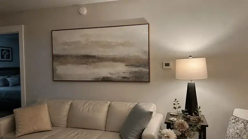
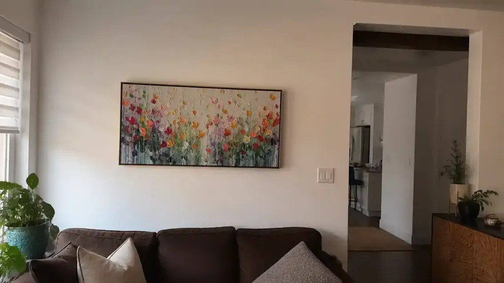
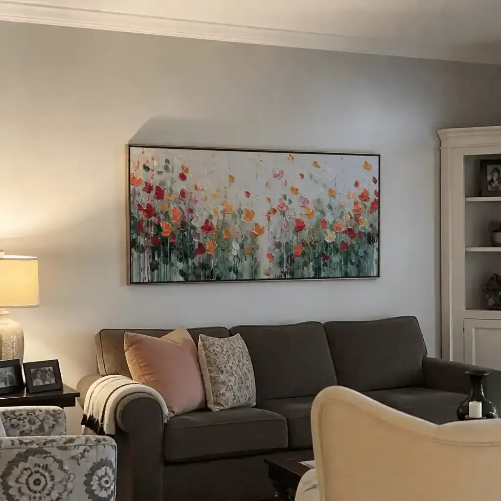
Above the sofa: The most reliable placement for nature paintings for living room walls. The painting width should reach roughly two-thirds to three-quarters of the sofa's width. Narrower than that, and the painting floats.
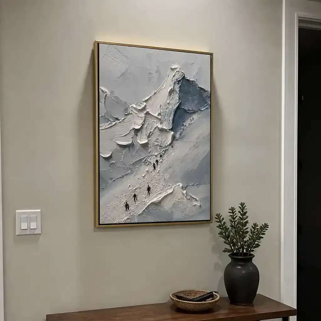
Hallway or entryway: A strong first-impression location. Large nature wall art with a vertical or square format works well here. Choose a painting with a single clear subject rather than a complex scene.
Bedroom: Keep the subject quiet. Water, soft botanicals, and muted mountain scenes support rest better than high-contrast forest paintings that hold your attention.
Pro tip: Hang at eye level while standing, placing the center of the painting at 57 to 60 inches from the floor. This applies across every room type.
How Should You Light a Nature Painting at Home?
Lighting changes the painting more than most people expect, especially for works with impasto texture or dimensional brushwork.
Color temperature matters by subject:
- Warm bulbs (2700K to 3000K) bring out earth tones, greens, and warm neutrals in forest and floral paintings
- Cooler bulbs (3500K to 4000K) sharpen the blues and grays in seascapes and sky paintings
For impasto or palette knife paintings: Use directional light at roughly a 30-degree angle from above. This catches the ridges in the paint and activates the texture. Flat frontal lighting flattens the effect entirely.
Avoid direct sunlight. UV exposure fades pigment over time, and that damage is cumulative and irreversible. Place paintings on interior walls when possible, or add UV-filtering window film if south-facing windows are unavoidable.
Should You Choose an Original Painting or a Canvas Print?
Both work well. The choice depends on what the painting needs to do in the space.
| Factor | Original Painting | Canvas Print |
|---|---|---|
| Texture | Visible brushwork, dimensional | Flat surface, even with canvas texture |
| Visual presence | Higher wall weight and presence | Lighter visual feel |
| Uniqueness | One of a kind | Reproducible |
| Price | Higher | More accessible |
| Best use | Focal wall, main statement piece | Secondary walls, multi-piece groupings |
An original painting carries physical presence a print cannot replicate. The brushstroke catches light differently at different times of day. For a single statement wall, that difference shows. For a hallway grouping or a room with several pieces, a quality canvas print holds the space well.
Montcarta offers hand-painted originals alongside gallery-quality canvas prints across its nature collections, which makes it practical to use originals for focal walls and prints for supporting areas throughout the same home.

FAQs
Q1: Is nature wall art only for rustic or farmhouse homes?
No. Nature wall art fits any interior style when the technique and palette match the room's aesthetic. Minimalist, Scandinavian, and contemporary spaces work especially well with abstract or loosely painted nature pieces. The subject alone does not determine the style. The execution does.
Q2: Can a nature painting work in a minimalist interior?
Yes. Choose a painting with a limited color palette, strong negative space, or an abstracted treatment of the subject. A single-tone botanical study or a simplified mountain horizon reads as intentional in a minimal room rather than decorative in a cluttered way.
Q3: What size nature painting works best in a living room?
For a standard sofa wall, aim for a painting 48 to 72 inches wide. Target roughly two-thirds of the sofa's width. For large nature wall art on an open wall without furniture anchoring it, a minimum of 36 by 48 inches keeps the piece from getting lost in the space.
Q4: Does nature wall art need to match the season?
No. Nature paintings with abstracted or simplified subjects stay visually neutral year-round. A loose floral painting does not read as "spring-only" the way a literal cherry blossom illustration might. For year-round versatility, lean toward abstract nature wall art or subjects like mountains, coastlines, and forests that carry no strong seasonal association.
Q5: What is the difference between nature wall art and biophilic wall art?
Nature wall art is a broad category covering any artwork depicting natural subjects. Biophilic wall art specifically refers to art chosen to support a psychological connection with nature indoors, often part of a larger biophilic design approach that includes plants, natural materials, and organic forms. In practice, many nature paintings function as biophilic wall art when paired with living plants, natural textures, and warm lighting.
Find the Right Nature Painting for Your Walls
The gap between a painting that looks rustic and one that feels refined comes down to a few controllable factors: technique, palette, frame, and light. None of these are difficult to get right once you know what to look for. Montcarta's hand-painted originals and canvas prints span minimalist, wabi-sabi, and impasto styles across a range of subjects. See the full nature collection at montcarta.com.