You don't need an ocean view to bring the feeling of the sea into a room. A seascape painting can do that, but not every seascape does it well. The market ranges from careful, light-filled originals to flat printed posters in electric blue. Knowing what separates one from the other, and where different styles belong in a home, makes the difference between a piece that fits and one that just occupies wall space.
What Makes a Painting Count as a Seascape
A seascape is a painting whose primary subject is water: open ocean, coastline, sea and sky at the horizon, or any view where water holds the composition. It falls within the broader category of landscape painting but focuses specifically on what water and atmosphere do together.
The range within this category is wide. A seascape can show a flat calm ocean with no land visible. It can show a rocky shore at low tide, a fog-covered harbor, or nothing but a horizon line at dusk. Subject matter varies, but water stays central.
One distinction worth keeping in mind when shopping: seascapes differ from beach scenes. Beach scenes focus on sand, people, activity at the shore. Seascapes focus on water and sky. This changes the visual weight of the painting and the mood it creates. Beach scenes feel active. Seascapes feel open and still.

Why Seascape Art Has This Effect on a Room
The Horizon Line Effect
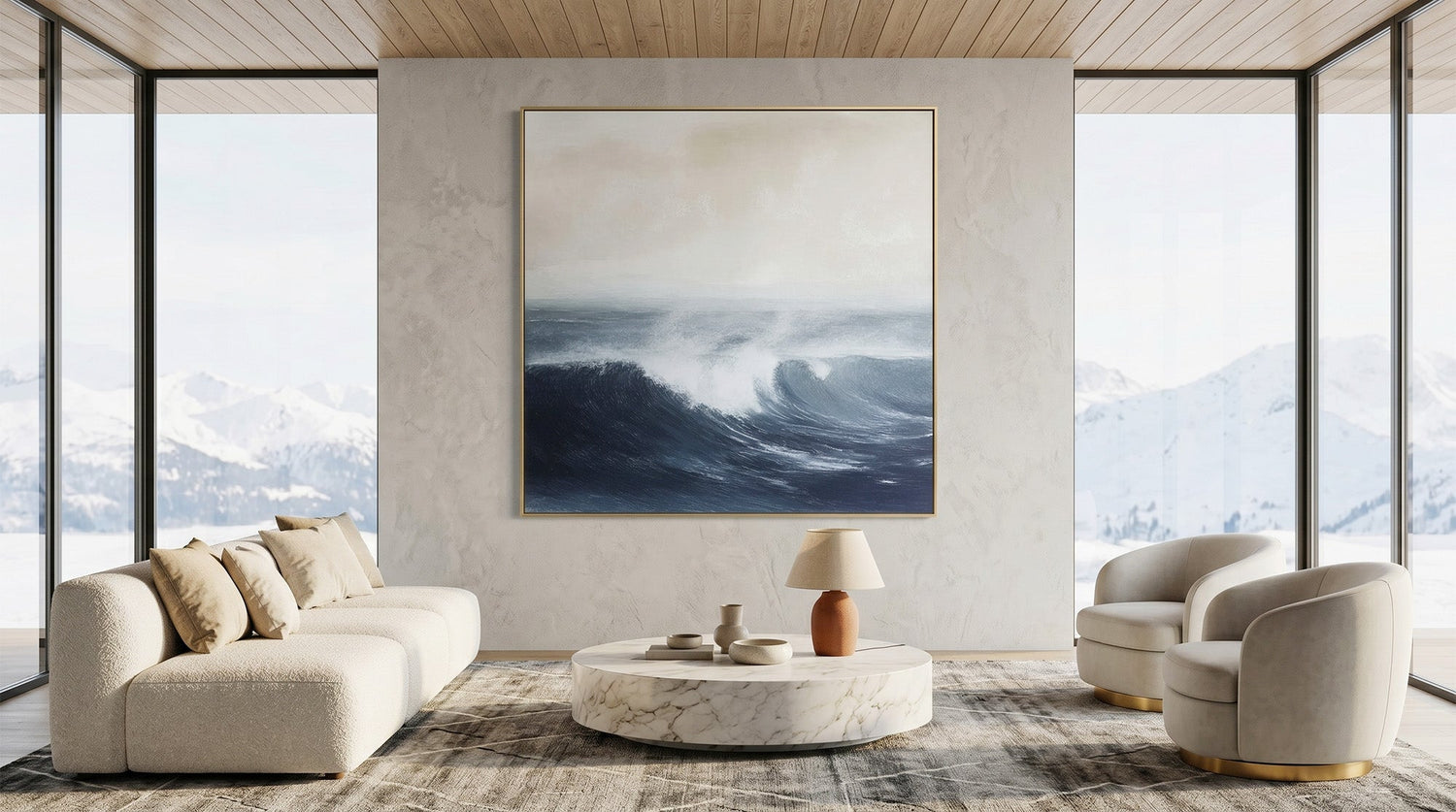
A clear sea-sky horizon sends a specific signal: open space ahead. This is why a mid-sized seascape can make a room feel larger than its physical dimensions. The eye follows the horizontal line and reads the implied distance as actual space. Rooms without windows, or with limited natural light, respond especially well to this.
Color and the Nervous System
The blue-gray palette common to seascape painting correlates with lower visual stimulation. Research suggests that cool-toned, low-saturation environments are associated with a calmer physiological state. This is not purely a style preference. It helps explain why seascape art consistently appears in bedrooms and spaces designed for rest.
Movement Without Restlessness
Wave patterns create movement in a painting, but they're predictable movement. Your eye follows the rhythm and returns to it, rather than scanning for what comes next. This keeps attention gently engaged without the stimulation that comes from geometric patterns or high-contrast color work.
Realistic vs Abstract Seascapes: Which One Is Right for You
What Realistic Seascapes Do
A realistic seascape gives you detailed light, clear water and sky, and easily recognizable forms. You can read the wave structure, the quality of light on the surface, the weight of clouds.
These paintings draw attention and reward close viewing. They work well in traditional, coastal, or nautical spaces and anchor a room visually.
The trade-off: they're harder to place in modern or minimalist interiors.
What Abstract Seascapes Do
An abstract seascape extracts the emotional quality of the ocean rather than its literal appearance. Color fields, directional brushstrokes, layered texture: these communicate the feeling of water without depicting it directly. Abstract seascapes are quieter.
They don't demand attention. They become part of a room's atmosphere rather than its focal point, which makes them easier to place across a wider range of interior styles.
A Simple Way to Decide
If you want someone walking in to notice the painting, choose realistic. If you want them to notice how the room feels without knowing exactly why, choose abstract. The difference is whether you want the art to lead the room or support it.

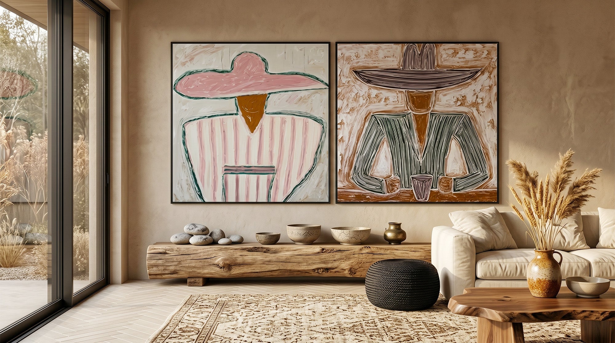
What to Watch Out for When Shopping
A large portion of what gets sold as seascape art follows a formula: the lighthouse in the lower left, the sailboat in the middle distance, the same foam-white wave at a predictable angle. Colors saturate to electric blue. The surface is smooth and uniform throughout.
Three things to check before buying:
- Light and shadow. Flat pure blue next to flat pure white is a graphic choice, not a painterly one. A painting with real light shows multiple tones within what looks like a single color area.
- The sky-to-water relationship. In a credible seascape, sky and sea share a color temperature. A warm late-afternoon sky reflects into the water. A gray overcast sky pulls the blue from the surface. When sky and sea look unrelated, the painting is likely formula work.
- Surface texture. A hand-painted original has physical variation across the canvas. A print is uniform. You can see this in photos if you look at angles and edges.
If a piece reminds you of hotel corridor decor, that's useful information.
How to Place a Seascape Painting in Your Home
Where It Works Best
Above a sofa is the most reliable placement. A wide horizontal format works best here, at least 31 inches (80 cm) wide, so the piece fills the visual space above the furniture without floating disconnected from it.
Above a bed, a seascape earns its placement through its calming quality. The horizontal composition and open palette support the visual shift from activity to rest.
In a home office, an abstract seascape works well as a background piece. It brings the attention-settling effect of looking at water without pulling focus from the work in front of you.
What to Put Around It
Take one color from the painting and let it appear in small amounts nearby, in a pillow or a ceramic piece. Repeating the dominant color across the whole room reads as theme rather than design.
Materials that sit well alongside seascape art: raw wood, linen, rattan, unglazed ceramic. High-gloss surfaces and heavy metallic objects compete with the quieter register most seascapes occupy.

Do You Need to Live Near the Ocean to Use Seascape Art?
No. A painting creates experience through what it shows, not through any geographic connection between the viewer and the subject. The visual effect of a seascape painting works in a Chicago apartment the same way it works in a Maine cottage.
There is an argument that people without access to natural water views get more from seascape art than those who can simply look out the window. In an urban space with no outdoor view, a painting that opens up a visual horizon does something the environment cannot on its own.
Japanese dry gardens (karesansui) have worked this way for centuries: raked gravel and stone simulate the presence of water without any water being there. The garden produces a similar experience to the real thing. Art has always functioned this way.
Find the Seascape That Fits Your Space
A seascape painting doesn't need to match your location or your furniture. It needs to fit the mood you want the room to hold. Realistic or abstract, quiet or textured, the choice comes down to what you want the space to feel like. Montcarta's Beach & Sea collection features hand-painted originals in both styles, from textured impasto ocean pieces to calm, open horizon paintings.
Find a piece that brings that sense of calm to your space at Montcarta.
Frequently Asked Questions
Q1: What Is the Difference Between a Seascape and a Landscape Painting?
A landscape covers any natural outdoor scene: fields, forests, mountains, rivers. A seascape focuses on ocean or coastal water as its central subject. In a seascape, water and sky hold the composition. Land elements like cliffs or shoreline appear only as framing, not as the primary focus.
Q2: Can Seascape Paintings Work in a Room That Has No Blue in It?
Yes. Many contemporary abstract seascapes use muted tones such as gray, sage, warm beige, or muted white as their dominant tones with little or no blue. Even paintings that include blue don't require the room to echo that color. The painting itself introduces the tone. Surrounding furniture doesn't need to repeat it.
Q3: How Large Should a Seascape Painting Be for a Living Room Wall?
Above a sofa, the painting's width should be roughly 60 to 75 percent of the sofa's width. A standard three-seat sofa runs about 87 inches wide, which puts the ideal painting width at 52 to 65 inches (130 to 165 cm). A painting that's too narrow for the wall beneath it will look unanchored from the furniture.
Q4: Is Seascape Art Suitable for a Bathroom?
Yes, with some precautions. A bathroom with high humidity requires a canvas painting with a protective varnish coating. Unvarnished works on paper are more susceptible to moisture damage over time. Place the painting away from the direct path of shower steam, and keep the room ventilated regularly to protect the work long-term.
Q5: What Colors Are Most Common in Seascape Paintings?
Sea-fog blue, smoke gray, sand beige, pearl white, and deep slate green appear most often. Sunset and dusk seascapes bring in rust orange and rose. Contemporary abstract seascapes increasingly favor muted, low-saturation palettes, particularly gray-green and chalk blue, rather than the high-saturation ocean blue more common in older or commercial work.

Leave a comment
This site is protected by hCaptcha and the hCaptcha Privacy Policy and Terms of Service apply.