The choice between horizontal, vertical, square, or panoramic wall art depends on your wall’s dimensions and the furniture below it. Generally, horizontal art works best over wide furniture like sofas, while vertical art creates height in narrow spaces. Square art provides symmetry for gallery grids, and panoramic pieces act as expansive statement makers for large entryways. Selecting the correct orientation ensures your framed wall art balances the room’s architecture rather than fighting it.
Quick Guide to Wall Art Orientations and Best Use Cases
Before diving into the technical calculations, it is helpful to understand the general strengths of each shape. Different orientations do more than just fill space; they influence the psychological feel of a room through the use of leading lines.
| Orientation | Ideal Wall Type | Psychological Vibe | Recommended Location |
|---|---|---|---|
| Horizontal | Wide, open walls | Calm, stability, rest | Above sofas, beds, or dining tables |
| Vertical | Narrow walls, tall ceilings | Strength, growth, dignity | Stairwells, entryways, beside fireplaces |
| Square | Small nooks, uniform spaces | Balance, modern symmetry | Bathrooms, small offices, gallery grids |
| Panoramic | Expansive blank walls | Cinematic, immersive | Above master headboards, long hallways |
Research in interior design suggests that horizontal lines mimic the horizon, promoting a sense of tranquility. Vertical lines, conversely, draw the eye upward, which can make a room feel more formal or grand. Choosing the right canvas wall art involves matching these psychological effects to the function of your space.
Mastering Horizontal Art: The 2/3 Rule Above Furniture
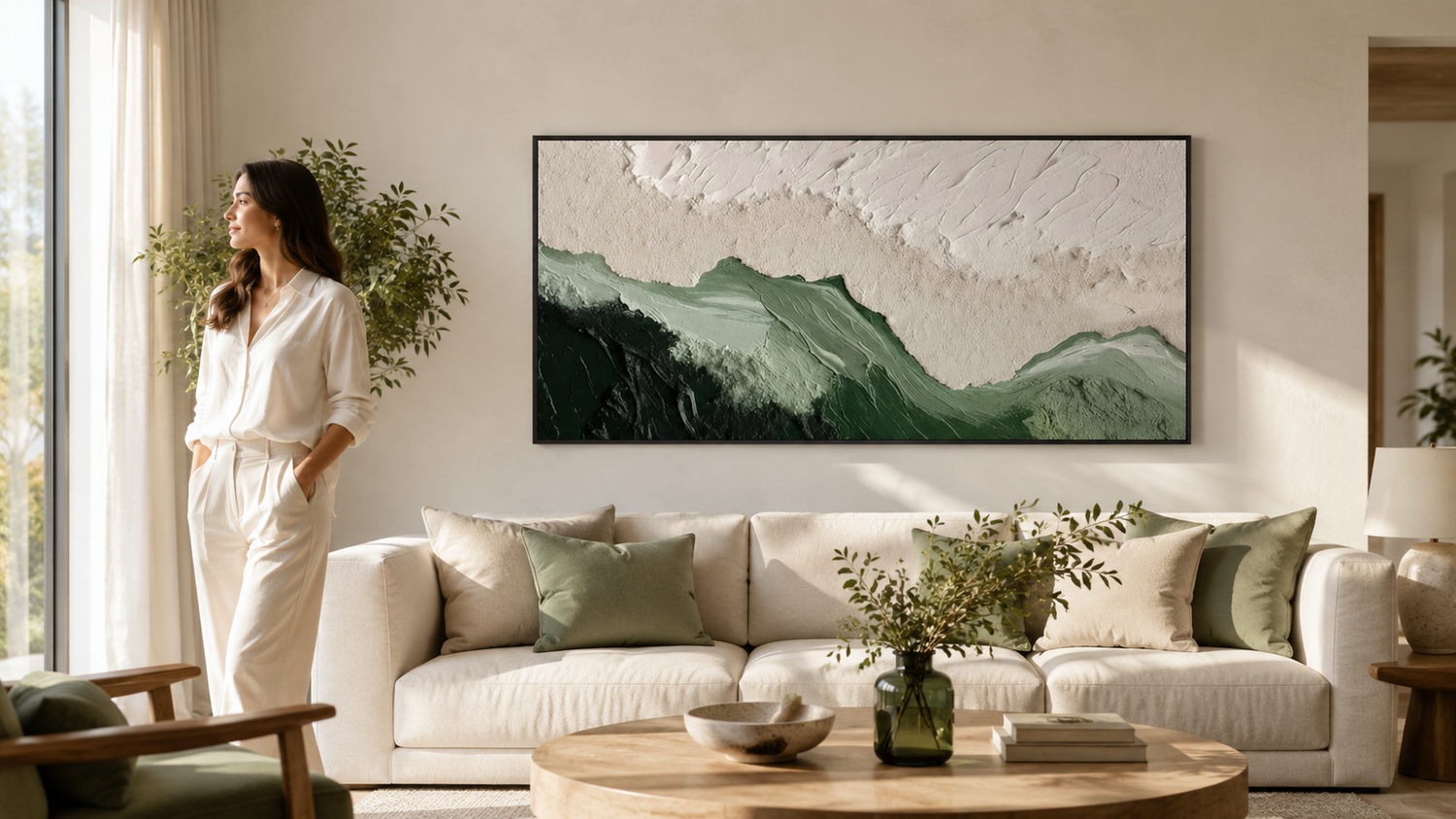
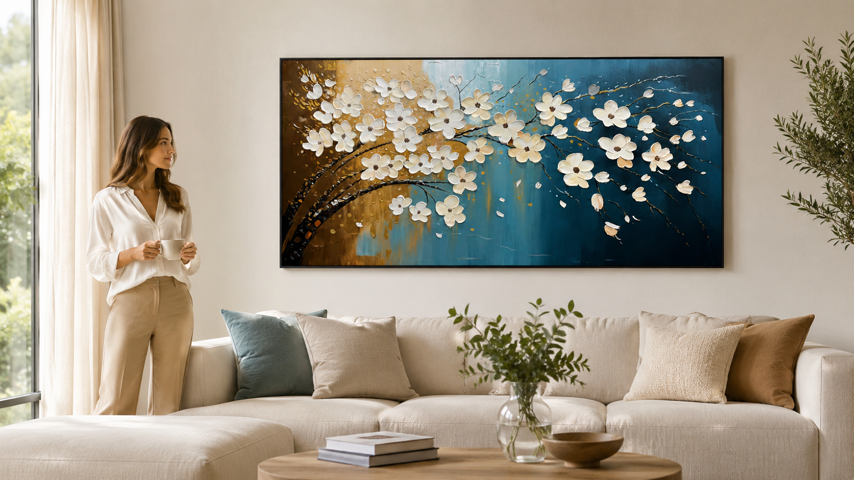
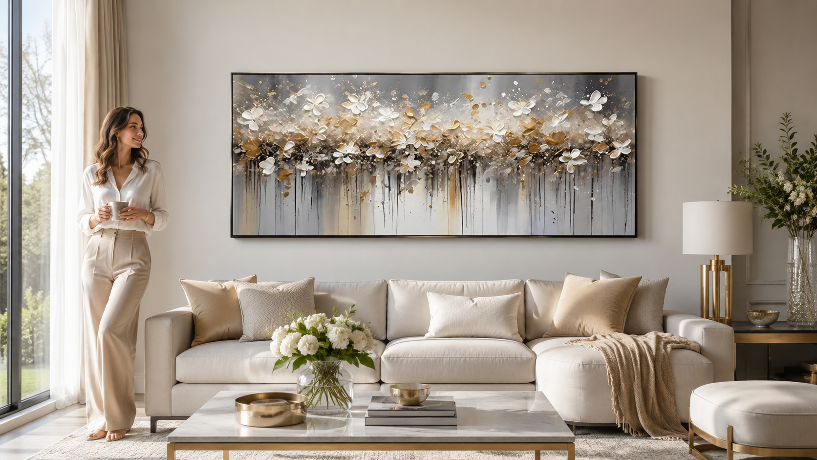
Horizontal (landscape) orientation is the most common choice for residential interiors. Because most of our furniture—sofas, sideboards, and beds—is wide rather than tall, horizontal pieces create a natural visual anchor. When you select a horizontal piece, the most critical factor is the relationship between the art and the furniture below it.
The 2/3 Rule Explained
To ensure your art doesn't look like it’s floating aimlessly or, conversely, overwhelming the room, follow the 2/3 rule. This standard dictates that the artwork (or a grouping of pieces) should cover approximately 60% to 75% of the width of the furniture it sits above. If you are hanging a piece over an 84-inch sofa, your art should ideally be between 50 and 63 inches wide.
What to do when wall art is wider than furniture: Hanging a piece that is wider than the furniture below it creates a "top-heavy" appearance. This visual instability can make the furniture look small and the room feel cramped. If you have a massive piece of large abstract wall art that exceeds your sofa width, consider moving it to a completely blank wall where it can stand alone as a floor-to-ceiling focal point.
Styling Over a Sofa
When styling over a sofa, the horizontal orientation helps bridge the gap between the seating area and the ceiling. Aim for the bottom of the frame to sit 6 to 10 inches above the top of the sofa back. This creates a cohesive unit. If the art is placed too high, the visual connection to the furniture is severed, and the art looks like it is "drifting" toward the ceiling.
Mastering the Dining Room Credenza
In dining rooms, the horizontal orientation is almost always the winner. A long credenza or buffet provides the perfect base for a wide landscape or abstract piece. Because dining rooms are often high-traffic areas, it is vital to ensure that falling damage from aged hardware is prevented by using high-quality wall anchors and checking fasteners annually. For these wide surfaces, a single large horizontal piece is often more sophisticated than several small pieces, which can look cluttered against the backdrop of table settings and glassware.

Vertical Art: Creating Drama and Perceived Height
Vertical, or portrait, orientation is a powerful tool for correcting architectural shortcomings. If you have low ceilings, vertical art can trick the brain into perceiving more height by forcing the eye to move up and down.
Best Placements for Vertical Pieces
Vertical pieces thrive in "narrow" architecture. Consider these specific areas:
- Stairwells: As you move up the stairs, your perspective changes. A tall vertical piece or a series of stacked vertical frames mimics the upward movement of the staircase.
- Flanking a Fireplace: If your fireplace mantle is narrow but the chimney breast extends to a high ceiling, a vertical piece fills that tall void perfectly.
- Structural Pillars: In modern open-concept lofts, vertical art is often the only shape that fits the face of a structural pillar or a narrow wall between two large windows.
Preventing Scale Issues on High Walls
A common mistake with vertical art is choosing a piece that is too small for a high-ceilinged room. If a single vertical piece looks dwarfed by the surrounding wall, you don't necessarily need a bigger painting. Instead, try grouping two or three vertical pieces of the same size in a row. This creates a "wall of art" that maintains the verticality but adds enough horizontal mass to feel proportional to the room. For those seeking original artwork for sale, looking for vertical diptychs (two panels) or triptychs (three panels) can be an effective way to fill these tall spaces.
Symmetry and Balance: Using Square Art in Modern Nooks
Square wall art is the bridge between horizontal and vertical. It is inherently stable and balanced, making it an excellent choice for modern, minimalist interiors. Square art is particularly useful when you are unsure about the orientation of a space, such as an entryway nook or the wall between two doors.
Checklist for a 3x3 Gallery Wall Grid
- Select Uniform Frames: Use identical frames for all nine pieces to maintain the grid's clean lines.
- Consistency in Content: Use a series, such as nine different botanical prints or nine segments of a single large abstract wall art piece.
- Precision Spacing: Keep the gap between frames small—usually 2 to 3 inches. Wider gaps can make the grid look disconnected.
- Center Point: Start by hanging the center-most frame at eye level (57 inches) and build the grid outward from there.
Square art also excels in bathrooms and small offices. These rooms often have limited wall "real estate" due to mirrors, windows, and shelving. A square piece fits into these compact, boxy areas without looking skewed.
Panoramic Views: Making a Statement in Expansive Spaces
Panoramic art is defined by its extreme width-to-height ratio, typically 2:1, 3:1, or even wider. This orientation is almost always used for modern landscape art featuring horizons, cityscapes, or sweeping natural vistas.
Where to Use Panoramic Orientations
Because panoramic art is so wide, it requires a significant amount of "white space" around it to breathe.
- Master Bedroom Headboards: A panoramic piece above a King-sized bed is often more effective than a standard horizontal piece because it can span nearly the entire width of the headboard while remaining low enough to feel intimate.
- Grand Entryways: In long hallways or foyers, a panoramic piece guides the visitor into the home, acting as a visual hallway runner for the walls.
The Importance of Floater Frames
For panoramic pieces, especially those printed on canvas, "floater frames" are the industry standard. A floater frame leaves a small gap between the edge of the canvas and the frame, making the art appear to hover. This prevents the edges of a very wide piece from looking cluttered or "heavy." Additionally, for these large-scale works, the Canadian Conservation Institute (CCI) recommends using protective backing boards to reduce exposure to dust and humidity fluctuations, which can affect the tension of a long canvas over time.

Technical Standards: The 57-Inch Hanging Rule
Regardless of which orientation you choose, the height at which you hang the art determines the success of the installation. The "57-inch rule" is the standard used by galleries and museums worldwide.
How to Calculate the Hanging Point
- Measure the height of the artwork: If the piece is 24 inches tall, the center point is 12 inches.
- Locate the wire or hook: Measure the distance from the top of the frame to the hanging wire when it is pulled taut.
- Do the math: Add 57 inches (eye level) to half the height of the art, then subtract the distance from the top of the frame to the wire.
- Mark the wall: Measure up from the floor to the calculated height. This is where your nail or screw goes.
When to Break the Rule
While 57 inches is the standard, exceptions exist. In rooms where people are almost always sitting, you may want to drop the art by 2 to 3 inches. Conversely, if you have vaulted ceilings exceeding 12 feet, you might nudge the art up to 60 inches to prevent it from looking too low. For very large or heavy panels, the Smithsonian MCI notes that canvases should be carried by two or more people to prevent structural damage during the hanging process.
Conclusion: Choosing Your Final Horizontal vs Vertical vs Square vs Panoramic Wall Art
Choosing the right shape for your wall is a blend of mathematical precision and aesthetic intuition. Horizontal art provides the foundational stability needed for living and dining areas, while vertical art offers the drama required for narrow architectural features. Square art remains the king of modern symmetry and small-space balance, and panoramic pieces provide the cinematic scale necessary for expansive, high-impact walls. By applying the 2/3 rule for width and the 57-inch rule for height, you can ensure that your selected Horizontal vs Vertical vs Square vs Panoramic Wall Art enhances your home's design rather than cluttering it.
FAQs
What is the best art shape for a small nook?
Square art is usually best for small nooks as it provides central balance and fits into compact, symmetrical spaces without overwhelming the area.
Can I hang panoramic art above a bed?
Yes, panoramic art is excellent for master headboards as it mimics the width of the bed while adding an expansive, cinematic feel to the room.
What should I do if my art is wider than my furniture?
Avoid hanging art wider than furniture as it creates a top-heavy, unstable appearance. Instead, aim for the 2/3 ratio where art covers 60-75% of the furniture's width.
Leave a comment
This site is protected by hCaptcha and the hCaptcha Privacy Policy and Terms of Service apply.