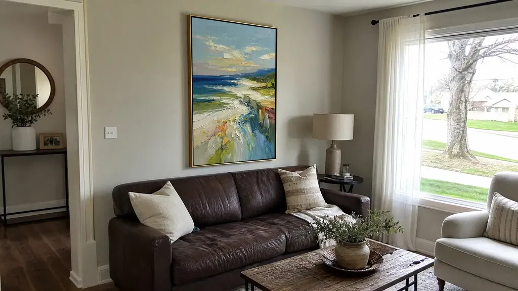
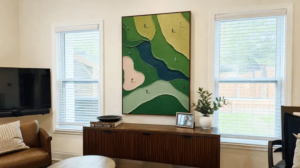
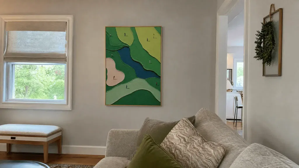
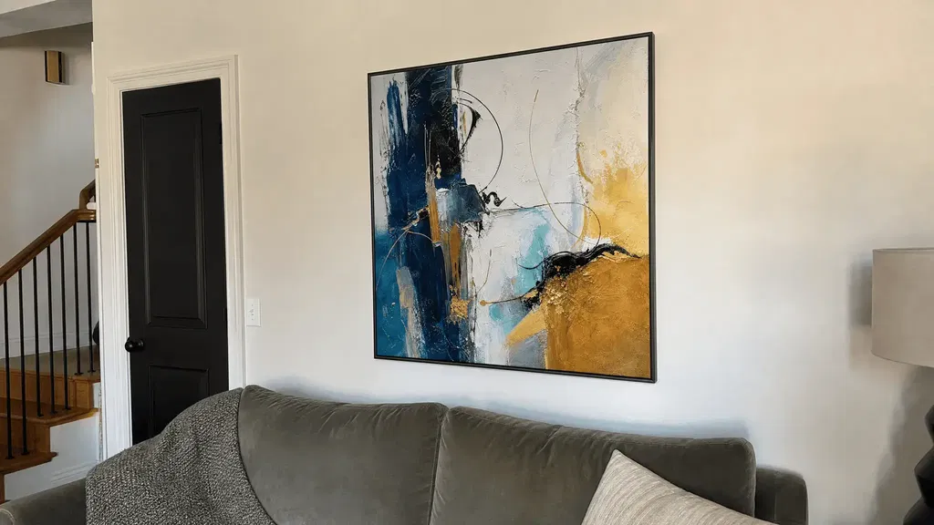
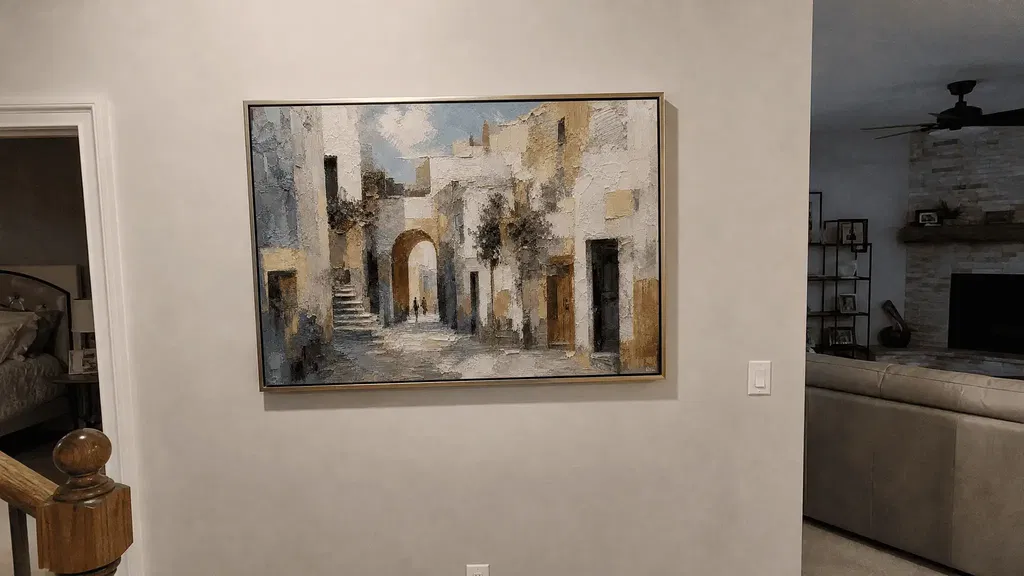
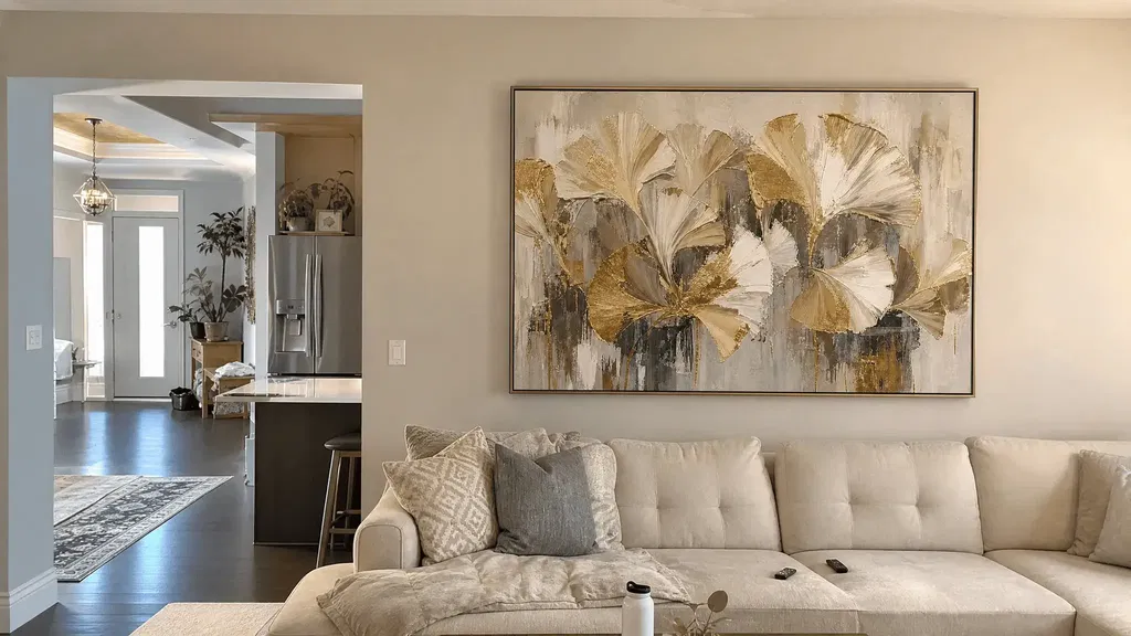
In an industrial loft, abstract city wall art works best when the raw finish stays visible and the artwork does the job of adding focus and warmth. Choose an architectural impasto cityscape when a concrete wall feels flat and needs tactile depth, and choose structured geometric art when exposed brick or block already has strong pattern that needs a calmer counterpoint. From there, match the piece's scale and palette to the furniture grouping in that specific room, and finish with a frame or presentation that echoes the metal or wood already in the space.
Key Takeaways
- Keep concrete, brick, and metal as the room's visual baseline; let the artwork, textiles, and lighting supply the contrast.
- Use tactile impasto cityscapes on quieter concrete and structured geometric art on already-patterned masonry.
- Size the artwork to the furniture grouping in each zone: living room, dining wall, entry, or office nook.
- Pull one or two colors or textures from the art into nearby furnishings instead of matching the whole room.
- Test the finished arrangement from the room's main sightline before calling the wall done.
Start With the Loft's Raw Texture—and the Art's Job
The simplest approach is to treat exposed brick, concrete, black metal, and rough wood as the backdrop, not a problem to hide. According to industrial interior design principles, rooms are typically built around these darker, neutral materials, and lighting is often what brings warmth into an otherwise raw space. Abstract city wall art gets to be the one deliberate accent in that setting.
Give the artwork a clear job: it should be the focal point the eye lands on, while sofas, rugs, wood shelving, and lamps add the softness the raw materials don't provide on their own. Before adding more decor, stand at the room's main entry or seating area and look at the wall as it already is. If it already reads as calm and organized, a single strong piece is usually enough.

Balance Impasto Cityscapes Against Concrete
Architectural impasto cityscapes work well when a concrete wall is quiet and needs a tactile layer, but they can feel heavy if the wall and the room are already busy. The right choice depends on how much texture the concrete already carries.
When Concrete Needs More Visual Warmth
A smooth or lightly finished concrete wall can look stark next to a sofa, dining table, or desk. An architectural impasto cityscape adds visible brushwork and raised paint that gives that wall depth without changing the concrete itself. Pair it with quieter upholstery, a warm wood console, or a muted rug so the artwork carries the main visual weight and the rest of the room stays calm. For readers curious about the technique itself, our guide on impasto versus palette knife painting explains how the raised texture is built up.
When Concrete Already Has Strong Variation
Some concrete walls already show stains, form lines, or patched sections that read as texture on their own. Stacking a heavily textured impasto piece on top of that can make the wall feel crowded instead of considered.
- Reduce competing texture in nearby decor, such as heavily woven throws or textured rugs, so the wall and the art aren't fighting for attention.
- Leave more open wall space around the artwork rather than surrounding it with shelving or additional frames.
- Choose a more controlled palette or a simpler frame so the cityscape stays legible against an already varied wall.
Use Geometric City Art to Organize Exposed Masonry
Structured geometric city art gives an already-patterned brick or block wall a single organizing point instead of two competing textures. The goal is to let the masonry stay visible while the artwork holds the room's attention.
Let the Masonry Stay Visible
Exposed brick can work as a textured backdrop for bold artwork, while surrounding furniture and textiles shape whether the space leans rustic or more industrial. Give the geometric piece one clear position on the wall and leave enough brick or block showing around it so the architecture still reads as part of the room, not something covered up.
Choose Order Over More Pattern
Geometric structure earns its place on masonry because it counters, rather than adds to, an already busy surface.
- Favor artwork with clean lines and defined shapes when the brick or block pattern is already strong.
- Keep the decor around the piece quieter than both the artwork and the wall, skipping dense gallery walls in this spot.
- Consider a black or wood frame when that material already appears nearby, as a visual match rather than a fixed rule.
Choose Scale, Palette, and Placement by Loft Zone
Scale and placement depend on the furniture grouping in each zone, not a fixed size formula. Use one statement piece where a single grouping needs a clear focal point, and reserve a smaller coordinated arrangement for walls with enough breathing room to support more than one visual unit.
| Loft zone | Art treatment to choose | Placement and palette check |
|---|---|---|
| Living room | One statement piece over the sofa or low console | Match the piece's width to the seating grouping, not just the sofa back |
| Dining or kitchen-adjacent wall | One controlled geometric focal point | Keep masonry visible; align with the main dining sightline |
| Entry or hallway | Compact focal piece or small grouping | Only add a grouping if there's clear breathing room and a real viewing spot |
| Home-office nook | One focused piece, restrained palette | Check the sightline from the desk chair |
Choosing the art before finalizing the room's colors makes the rest of the decorating easier, because artwork can supply starting shades and textures for nearby rugs and accessories. If your dining or living wall calls for a square geometric focal piece, our ABSTRACT CITYSCAPE is a textured geometric painting available in eight square sizes from 20 by 20 inches to 48 by 48 inches, with frame options including black, wood, white, silver, gold, frameless stretched, and rolled canvas, so it can scale to a compact office nook or a large living-room grouping. It's a fit when the wall needs one clean geometric anchor; a smaller or more colorful piece is a better match if the room is already carrying strong pattern from brick or block.
Finish the Composition With Frame, Light, and Soft Furnishings
The last step is making the presentation feel chosen, not added on. That means matching the frame to materials already in the room and giving the piece a final look under real light before calling the wall finished.
Connect the Presentation to Existing Materials
A black frame reads naturally against black metal fixtures, while a wood frame ties into existing shelving or flooring; a frameless or rolled canvas can suit a wall that's already visually busy. None of these choices makes the artwork perform better technically. They're visual decisions that keep the piece looking staged within the loft rather than pasted over its raw finish. Leave enough of the concrete or brick showing so the industrial character stays part of the room.
Run the Final Room Check
Before locking in the arrangement, work through one short sequence:
- Repeat one or two colors, textures, or patterns from the artwork in a cushion, throw, or accessory nearby.
- Stand at the room's main entry, seating area, dining chair, or desk and look at the wall from that exact sightline.
- Remove any nearby decor that pulls attention away from the artwork.
- Adjust the footprint, palette, or frame if the piece still feels undersized or out of place, then finalize the wall.
If the piece reads clearly from that sightline and nothing nearby competes with it, the staging is done. Explore how visual anchors define rooms to see how scale and negative space work together across open layouts.

FAQs
Can I use an impasto cityscape on an exposed-brick wall?
Yes, but let one surface lead. If the brick is already highly varied, keep the impasto cityscape's palette and frame simple and leave open wall space around it so the two textures do not compete. When the brick is relatively uniform and quiet, the artwork can provide the primary tactile focus. Connect the two surfaces by echoing a single accent tone or wood finish nearby, and assess the wall from the primary entrance before hanging neighboring decor.
What frame finish pairs best with exposed ductwork and dark metal fixtures?
A matte black or slim metal frame pairs naturally with dark structural conduits, iron railings, and industrial window frames. If the room already contains extensive dark metal, choosing an unfinished natural wood frame can soften the overall look by connecting with tabletops or flooring without clashing with the architecture.
Should I hang one large cityscape painting or a gallery wall in an open loft?
In open-concept industrial lofts, a single statement painting creates an immediate visual anchor that separates distinct living, dining, or working zones. Reserve multi-piece gallery walls for smooth interior partition walls or enclosed hallways where complex arrangements will not compete with raw concrete variations or masonry mortar patterns.