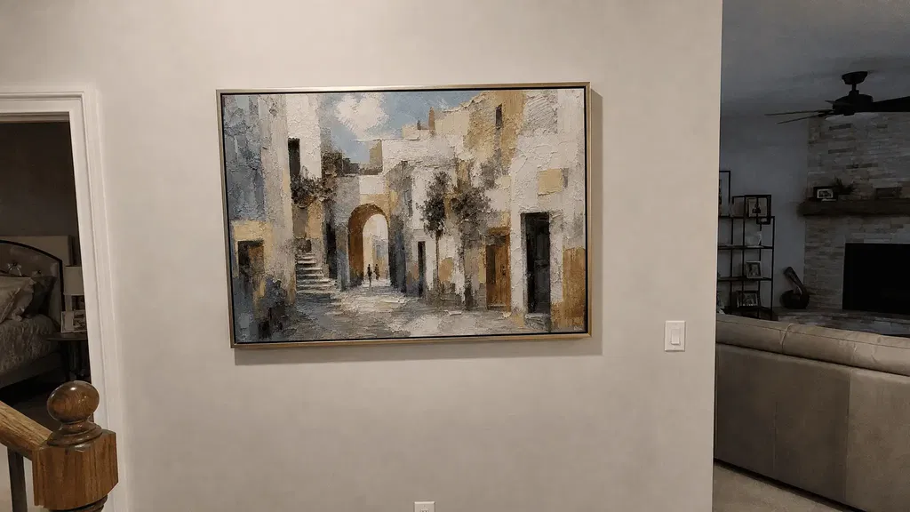
A warm street-scene painting works best in a narrow or enclosed foyer when its composition shows a readable path from front to back, not just warm colors. Choose a piece with a clear foreground, middle ground, and background so the eye has somewhere to travel, then hang it where the entry sightline keeps that path visible.
From there, matching its warm golden hues to your existing light and finishes turns the painting into a welcoming focal point instead of a flat wall covering.
Key Takeaways
- Pick a scenery painting for its visible recession, not just its warm palette; foreground, middle ground, and background should form a readable path.
- Judge the composition from the actual entry approach, since this supports perceived depth rather than a guaranteed change to the hallway's dimensions.
- Size and place the artwork against your measured, usable wall and sightlines, confirmed with a full-size mockup before hanging.
- Test warm tones under both daylight and evening light, and adjust the light source or angle before assuming the painting is a poor fit.
- Traditional foyers can carry more classic framing and repeated details, while transitional foyers usually read better with cleaner lines and fewer competing accessories.
Choose a Deep-Perspective Street Scene for a Narrow Foyer
The best candidate for a narrow foyer is a street scene with a visible path from front to back, not simply one with a warm palette or recognizable buildings. Judge that path from the spot where people actually stand when they walk through the door.
Read the Scene's Depth Cues
Art educators point to several cues worth checking before you buy, including landscape depth cues that make a scene read as spatial rather than flat.
- Look at the foreground first. It should hold your attention briefly before leading your eye further into the scene.
- Trace the middle ground for overlapping buildings, trees, or figures. Objects placed in front of one another are what create the sense of layered distance.
- Check the background. Distant areas should lose some contrast and color intensity without turning visually blank or empty.
Match the Vantage Point to the Entry View
Stand where guests actually enter the foyer and view the painting from that height and angle, not just head-on in a showroom photo. A composition whose central path stays legible from that approach is doing its job. This can support a sense of perceived depth in the space; it will not physically widen or lengthen the hallway itself.

Browsing a curated set of Impressionist landscapes can help you compare several depth-driven compositions side by side before you settle on one.
Size and Place the Painting Around the Hallway's Sightline
Scale and placement in a narrow foyer come from your actual wall and traffic pattern, not a fixed size or height rule. Confirm the fit with a full-size mockup before you commit to a spot.
Use the Wall, Sightline, and Architecture as the Scale Test
- Measure the usable wall width and height, not the full wall, if doors, trim, switches, or molding interrupt it.
- Mark every architectural interruption and any furniture that projects into the space.
- Mock the painting at its full outer dimensions using paper or painter's tape and view it from the main approach.
- Reposition or resize the piece if it dominates the passage, blocks circulation, or loses its focal path from that view.
Choose Orientation for the Corridor's Long View
Let the painting's orientation reinforce the wall you actually have and the direction people move through the space, rather than defaulting to portrait or landscape by habit. If one wall is too narrow for a single large canvas, a multi-panel format is worth considering, and our comparison of single canvas or triptych options for narrow hallways covers the trade-offs in more depth. Keep the street scene's directional movement, such as a road or row of buildings receding toward one side, aligned with the way people walk through the foyer.
Coordinate Warm Golden Hues With Layered Foyer Light
Warm golden tones read as inviting when they relate to your existing finishes and hold up under both daylight and evening light. If they start to look muddy, the light is usually the first thing to check, not the painting.
Coordinate Golden Hues With Existing Finishes
- Note any wood, brass, cream, stone, or muted neutral tones already visible near the foyer.
- Pick one or two of those tones to echo in the painting rather than trying to match every color in the room.
- Keep the painting's distant, lighter passages distinct from the wall color so the depth path stays easy to read.
Layer Ambient, Accent, and Natural Light
- Use ambient light to judge how the whole foyer functions, and add accent light only if it genuinely improves how the artwork's focal point reads.
- Check the scene in daylight if windows or glazed doors affect the entry, since natural light can shift how the warm tones look compared to evening.
- Treat warm and cool light as separate variables from color rendition, since a light source's spectrum and color accuracy can both shift how a painted surface appears.
Some Impressionist landscape painting emphasizes light and color effects as much as illusionistic space, so it is worth judging the piece under your real foyer lighting rather than a showroom photo alone. Pairing that light plan with the rest of your foyer's palette is easier with a look at palette transitions between entry art and adjoining rooms.
Control Glare Before Adding More Brightness
Inspect the painting from the doorway and from the walking path, not only straight on, since glare often depends on where the viewer stands relative to the light source. If reflections interrupt the scene, change the light's angle or intensity before adding more brightness or assuming the artwork needs to be replaced. The goal is to reduce visual distraction, not to guarantee a completely reflection-free surface in every viewing position.

Adapt the Same Street Scene to Traditional or Transitional Foyers
The same warm street scene can work in either a traditional or transitional foyer, but the framing and surrounding decor should shift with the architecture. Neither approach is better in general; the choice depends on what is already in the space.
For Traditional Foyers, Echo the Architecture Without Overloading It
In a foyer with classic molding, wood trim, or metal hardware, a more conventional frame can echo those details without competing with them. Repeat one existing finish or shape, such as a wood tone or a curved line, rather than surrounding the painting with several different ornamental pieces. Keep the frame and accessories restrained enough that the street scene's depth path stays the clear focal point.
For Transitional Foyers, Let the Scene Bridge Old and New
A transitional foyer usually reads better with a cleaner frame and fewer accessories competing for attention. Let the painting's gold, amber, stone, or muted neutral passages act as the warm connection between older architectural details and simpler, more contemporary furnishings nearby. Avoid adding a second strong pattern or focal object that pulls attention away from the painting's own recession into the distance. If you want to compare more architectural-landscape options built around this kind of depth, you can browse Impressionist art for additional street and landscape scenes.
Run One Pre-Hanging Test Before Final Installation
Before you drive a single nail, run one combined test that checks depth, scale, warmth, and glare together.
- Build a full-size mockup of the painting using paper, tape, or a digital overlay at its exact outer dimensions.
- View it from the front door, the main corridor, and any nearby room transition that faces the foyer.
- Check it again in daylight and in evening light, watching for muddy color, lost contrast, or reflections.
- Decide to proceed, reposition, or adjust the lighting based on what you saw. Only move forward once the depth path and warm tones hold up from every relevant angle and time of day.
FAQs
How should you balance multiple sightlines from an entry door and a hallway?
Mock the artwork at full scale and compare both perspectives directly. Prioritize the primary arrival view from the front door so the composition immediately presents its depth path upon entering. If the vanishing point feels misaligned from the adjacent hallway, slightly shift the hanging height or lateral position until the receding street scene remains readable from both walking angles.
What frame profile works best for a street scene in a tight entryway?
In a narrow foyer, choose a low-profile frame or a slim floating frame that keeps total wall projection under two inches. Deep, heavy molding projects forward and can obstruct side sightlines along tight traffic paths. A modest profile keeps the focal focus squarely on the receding architectural perspective without physically crowding corridor movement.
How do you prevent warm golden paint tones from appearing muddy without daylight?
When an enclosed foyer lacks exterior windows, evaluate your light fixtures for balanced color rendering rather than simply adding wattage. Excessively warm yellow lighting combined with low color rendition can flatten subtle amber and ochre gradations into a dull wash. Adjust the source angle and select a bulb with dependable color rendition so subtle street highlights stay distinct.