Palette Transitions: Harmonizing Foyer Art with Interior Colors
The entryway of a home serves as more than a mere passage; it is a visual decompression chamber that sets the narrative for the entire interior experience. In high-end residential curation, the foyer acts as a strategic "bridge," transitioning guests from the exterior world into the curated intimacy of the home. However, many homeowners struggle to harmonize foyer art with the existing color palettes of adjacent rooms, leading to a disjointed first impression.
Recent shifts in the global art market suggest a move away from purely financial art assets. According to Marketplace.org, high-end auction sales plummeted 44% in 2024, indicating that buyers are returning to real application value—focusing on custom, hand-painted pieces that provide emotional resonance and spatial cohesion rather than vanity labels. This return to "artistic authenticity" is particularly relevant in transitional spaces like foyers, where the art must function as a tool for home cohesion.

The "Sightline Test" and the 15% Hue Rule
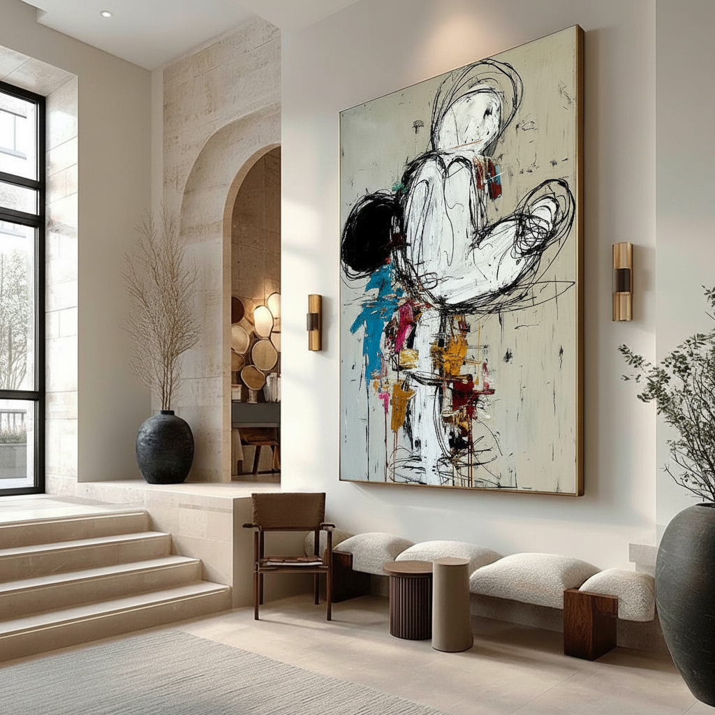
To achieve a seamless transition, we often recommend the "Sightline Test." This is a practical heuristic used by interior designers to ensure that the entryway does not exist in a visual vacuum. To perform this, stand in the center of the foyer and identify the dominant color of the most visible adjacent room—usually the living or dining area.
Our internal analysis of successful transitional designs suggests the 15% Hue Rule: the primary artwork in the foyer should contain at least 15% of that dominant adjacent hue. This creates a "visual anchor" that previews the home’s interior narrative before the guest even enters the main living quarters.
Logic Summary: The 15% Hue Model Our scenario modeling for visual anchoring assumes that the human eye seeks patterns to reduce cognitive load when moving between rooms.
Parameter Value/Range Unit Rationale Target Hue Percentage 15–20% % of Canvas Area Minimum threshold for subconscious recognition. Viewing Distance 6–10 Feet Average foyer width for optimal "Sightline" assessment. Saturation Offset +10% Saturation Level Compensates for brief guest dwell time. Vertical Alignment 60 Inches Center of canvas relative to floor (human-scale connection). Lighting Variance < 500 Kelvin Maximum allowed shift between foyer and adjacent room.
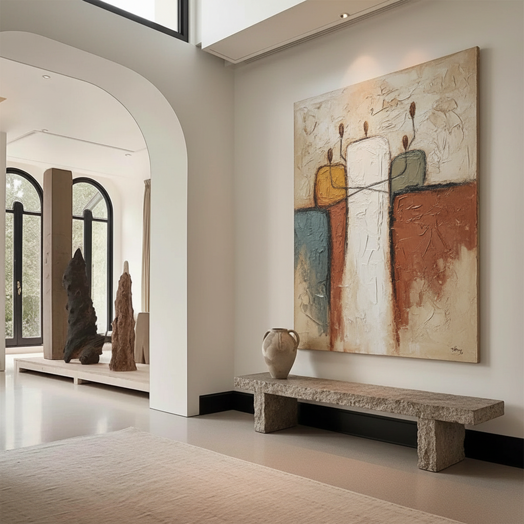
A common mistake is matching art solely to the foyer rug. While coordination is important, the art should instead "preview" the accent colors of the living area. This creates a narrative flow that guides the eye naturally through the home. For high-ceiling foyers, the "Rule of Thirds" applies vertically: the center of the canvas should sit 60 inches from the floor, regardless of wall height, to maintain a human-scale connection and avoid the "gallery void" effect.
The Lighting Pitfall: Why Colors Shift in Entryways
Lighting is the most frequent point of failure in transitional spaces. Entryways typically mix 5000K natural light from the front door with 2700K interior lamps. This spectrum clash can make cool-toned pigments look muddy or "dead."
According to Toolsweek, LED lighting with a Color Rendering Index (CRI) above 90 can reduce color shift by 60–75% compared to traditional incandescent bulbs. When selecting art for a foyer, we recommend choosing pieces with slightly higher saturation than the destination rooms. This compensates for the brief "dwell time" of guests and ensures the colors remain vibrant even under the shifting light of a transitional zone.

Furthermore, the physical properties of the paint itself play a role. The Getty Conservation Institute uses the Kubelka-Munk equation to explain that pigment reflection is dominated by absorption and scattering coefficients. In simple terms, the surface refractive index of hand-painted oil or acrylic art creates a depth that digital prints cannot replicate. This is why a hand-painted piece "holds its own" against the harsh, changing light of a foyer, whereas a flat print often looks washed out.
The Human Element: Authentic Art vs. AI Prints
In an era of mass-produced decor, the "essential identity" of an artwork has become a significant value driver. Columbia University research confirms that consumers value art labeled "AI-generated" 62% lower than authentic human-created art. This perception is rooted in what researchers at the University of Chicago call the "essential identity"—the belief that a human artist’s soul and intent are embedded in the physical brushstrokes.
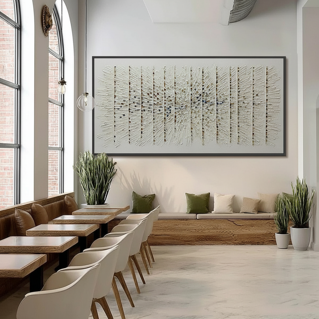
For a foyer, which serves as the "handshake" of the home, the tactile relief of hand-painted pigments is irreplaceable. MUNCH Museum tests confirm that physical relief textures exponentially stimulate intrinsic motivation and satisfaction in viewers. The microtopography of a palette knife—often referred to as impasto—creates shadows and highlights that change as a guest walks past, offering a dynamic visual experience that static digital media lacks.

Economic Impact: Art as a Property Value Catalyst
Beyond aesthetics, investing in high-quality foyer art is a sound financial decision. Research published by the Royal Society found that neighborhoods with higher "art" geo-tags had greater relative house price ranking gains. In a commercial context, the Chicago Millennium Park public art projects drove $1.4 billion in real estate growth, proving that curated art effectively elevates property revenue streams.
For the homeowner, a custom-commissioned foyer piece acts as a permanent physical billboard of the home’s value. It signals to visitors—and potential future buyers—that the property is a space of "retail certainty" and intentional design. This is particularly effective for "House Flippers" or those staging a home for sale; masking a vacant home's decay with a vibrant, hand-painted mural or large-scale canvas can justify a significant price premium.
Health, Safety, and the "Indoor Air Quality" Promise
When selecting art for a residential entryway, safety is a non-negotiable factor. Many industrial paints and cheap art supplies contain high levels of Volatile Organic Compounds (VOCs) and toxic heavy metals. The CDC's NIOSH report warns that chronic inhalation of low-level volatile compounds in certain paints can lead to central nervous system issues.
At the highest level of art curation, we prioritize materials that meet strict environmental standards.
- VOC Emissions: Research from Aalto University shows that coatings on wood with proper moisture levels emit significantly lower VOCs during curing.
- Heavy Metal Risks: The International Agency for Research on Cancer (IARC) identifies cadmium compounds—common in bright yellow and red pigments—as Group 1 carcinogens.
- The ASTM D-4236 Standard: As the EPA notes, the ASTM D-4236 label only means the warning labels comply with regulations, not that the paint is non-toxic.
For households with children or pets, we advocate for the use of water-based acrylics or oils that utilize walnut oil instead of toxic turpentine solvents. According to the Cincinnati Art Museum, walnut oil is a perfect, non-toxic replacement for traditional solvents, ensuring that the "first breath" a guest takes in your home is clean and safe.
Biophilic Design: Stress Reduction through Entryway Art
The foyer is the first point of contact after a stressful day. Integrating "Biophilic Design"—art that features natural landscapes or organic forms—can have a measurable impact on well-being. A University of Pennsylvania review found that 73% of patients reported significant mood improvements when exposed to environmental artworks.
Nature-themed murals or canvases produce the same stress-reduction effects in the brain as real outdoors. According to a systematic review in PMC, passive art viewing consistently activates the medial prefrontal cortex (mPFC) and amygdala, optimizing emotional regulation circuits. By placing a nature-based biophilic piece in the foyer, you are essentially "priming" the brain for relaxation the moment you step through the door.
Future-Proofing with 2026 Design Trends
As we look toward 2026, high-end interior design is trending toward "understated elegance" where texture is the soul of the room. Zillow search data indicates that mentions of "artisan craftsmanship" have risen 21%, while Yelp searches for "custom framing" have skyrocketed 329%.
The dominant trend for the coming years is "immersive escapism." In the NKBA 2025 Design Awards, wrapping mural-style art entirely around a small space (like a powder room or a narrow foyer) became a leading strategy for creating a "visual nest." This approach rejects the "decorate first, buy art later" mindset, instead letting the art dominate the visual nexus of the home.
Practical Checklist for Foyer Art Selection
To help you navigate your next curation project, use this pattern-recognition checklist derived from our work with hundreds of interior designers:
- The Sightline Check: Identify the most visible color in the living room. Does your foyer art contain 15% of that hue?
- The Lighting Audit: Is your entryway lit by 5000K daylight or 2700K lamps? Test your art under both conditions to avoid "muddy" pigment shifts.
- The Scale Test: For high ceilings, is the center of the canvas 60 inches from the floor?
- The Texture Verification: Can you see the physical relief of the brushstrokes? (Avoid flat prints for high-impact transitional zones).
- The Safety Scan: Does the artist use low-VOC, non-toxic pigments (e.g., walnut oil-based or heavy-metal-free acrylics)?
By treating the foyer as a strategic narrative bridge rather than a leftover wall, you create a cohesive home environment that feels both prestigious and safe. Whether you are seeking the "whimsy" of a surrealist piece or the calming influence of a biophilic landscape, the key lies in the transition.
YMYL Disclaimer: This article is for informational purposes only and does not constitute professional medical, legal, or financial advice. The chemical safety data regarding pigments and VOCs is based on general industry standards and research; individuals with specific health conditions or sensitivities should consult a qualified professional before handling art materials or installing new coatings.
Sources
- Marketplace.org - The expensive art market continues to struggle
- Columbia University - Human-Made vs. AI Art: Consumer Perception Study
- UPenn - Visual Art in the Built Environment: A Critical Review
- Royal Society - Quantifying the link between art and property prices
- EPA - Indoor Air Quality and Low-VOC Paints
- IARC - Cadmium and Cadmium Compounds
- Toolsweek - How Light Affects Paint Colors
- Getty Conservation - Color Science and Pigment Mixture
Leave a comment
This site is protected by hCaptcha and the hCaptcha Privacy Policy and Terms of Service apply.