Visual Anchors: Choosing Frame Width Based on Canvas Size
The high-end art market is undergoing a fundamental shift. Recent data indicates that sales of "vanity" auction pieces—those exceeding $10 million—plummeted by 44% year-over-year in 2024, according to Marketplace. In its place, we are seeing a return to real application value. Discerning homeowners and interior designers are moving away from speculative assets and toward authentic, hand-painted works that provide emotional resonance and visual harmony within a lived environment.
However, acquiring a masterpiece is only half the journey. The most common point of failure we observe in high-end décor isn't the art itself, but the framing. A frame that is too spindly can make a large, powerful canvas look cheap and unanchored; conversely, a frame that is too bulky can "swallow" a small, delicate piece. Choosing the right frame face width is the final, critical step in protecting your investment and ensuring the work functions as a "visual anchor" for the room.

The Neuroscience of Visual Harmony
Why does proportion matter so much? It isn't just a matter of "taste." According to a systematic review of 85 records published in PMC, passive art viewing consistently activates the medial prefrontal cortex (mPFC) and the amygdala. These areas are responsible for emotional regulation and reward processing. When the proportions of a frame and canvas are in harmony, the brain perceives a sense of "order," which optimizes these emotional regulation circuits.
When proportions are mismatched, the brain experiences a subtle cognitive dissonance. This is why a poorly framed piece often feels "off," even if the viewer cannot articulate why. By following established framing heuristics, we can ensure the art achieves its maximum psychological impact.
Logic Summary: Our framing recommendations are based on common patterns from professional installation and interior design practice (not a controlled lab study). These ratios are intended to align the visual weight of the frame with the physical scale of the canvas to prevent "visual swallowing" or "structural inadequacy."
The Framing Ratio Guide: Width vs. Canvas Size
Through years of professional practice, we have developed a set of ratio-based guidelines that serve as a baseline for most residential and commercial projects. While these are not rigid laws, they provide a risk-reduction framework to prevent costly mistakes.
| Canvas Size Category | Canvas Dimensions (Shortest Side) | Recommended Frame Width | Visual Objective |
|---|---|---|---|
| Small | Under 24" | 0.5" – 1.0" | Minimalist support; avoids overwhelming the detail. |
| Medium | 24" – 48" | 1.0" – 2.0" | Balanced anchoring; creates a distinct border from the wall. |
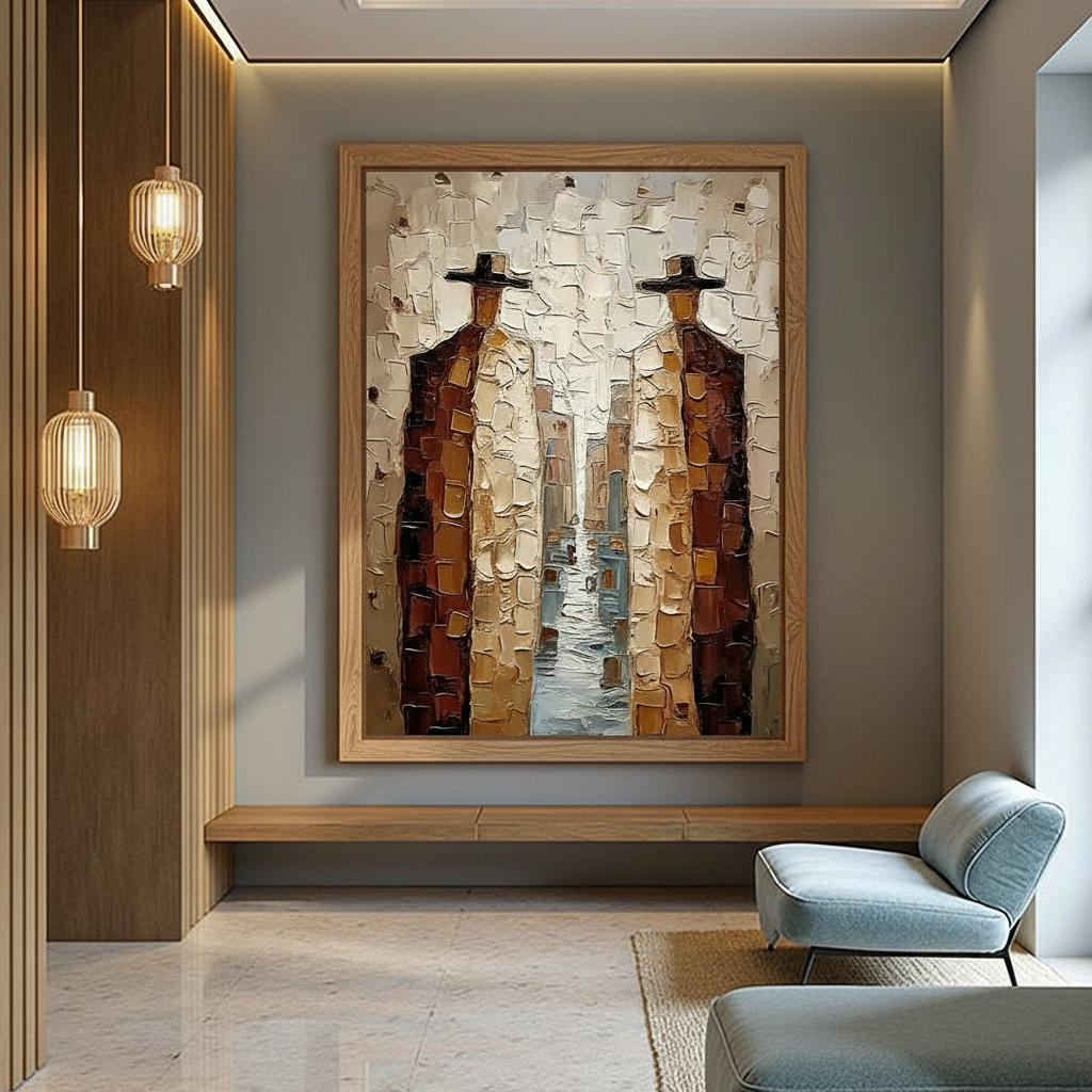
| Large | Over 48" | 2.0" – 3.0"+ | Structural presence; provides the necessary visual "heft." |
1. Small Canvases (Under 24")
For smaller works, the goal is often to let the art breathe. A frame wider than 1 inch can create a "window" effect that makes the art feel smaller than it actually is. We typically recommend a slim profile (0.5" to 0.75") to provide a clean edge without competing for attention.
2. Medium Canvases (24" to 48")
This is the most common range for living room and dining area focal points. A frame width of 1.5 inches is often the "sweet spot." It provides enough surface area to show off the material quality of the frame (such as wood grain or metallic leaf) while maintaining a 1:20 or 1:30 ratio relative to the artwork's width.
3. Large Canvases (Over 48")
Oversized art requires a substantial frame to act as a structural and visual boundary. According to The Art Basel and UBS Art Market Report 2024, the global market for large-scale works remains stable because they define the character of entire rooms. A frame that is too thin on a 60-inch canvas will look like an afterthought. In these cases, widths of 2.5 inches or more are necessary to provide adequate visual anchoring.

Modern Aesthetics: Floater Frames for Acrylics
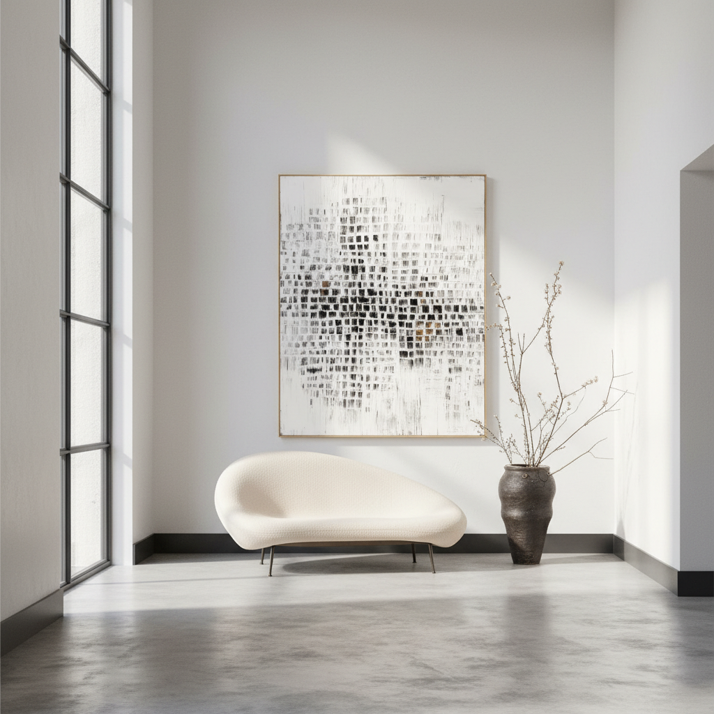
For modern acrylic art, the "floater frame" has become the industry standard. Unlike traditional frames that overlap the edge of the canvas, a floater frame is mounted from the back, leaving a small gap between the canvas edge and the frame's inner wall. This creates the illusion that the artwork is "floating" within the frame.
Calculating the Optimal Gap
The width of the "gap" is just as important as the width of the frame face.
- Too Narrow (< 0.25"): The art appears cramped. If the canvas has heavy impasto or irregular edges (common in high-quality hand-painted works), it may even touch the frame, ruining the floating effect.
- Too Wide (> 0.5"): This creates distracting, deep shadows and can make the artwork look disconnected from its border.
- The Pro-Standard: We typically recommend a 0.375" (3/8 inch) gap. This provides a clear "shadow line" that emphasizes the hand-painted edges of the canvas without creating a cavernous void.
Heuristic Labeling: This "3/8-inch rule" is a shop practical baseline for standard 1.5-inch deep gallery-wrapped canvases. It may not apply to ultra-thin panels or "deep-dish" canvases exceeding 2 inches in depth.
Technical Integrity: Why Hand-Painted Surfaces Demand Better Framing
When you invest in a hand-painted piece, you are buying more than just an image. A study by Columbia University confirmed that consumers value art labeled as "AI-generated" 62% lower than authentic human-created art. Furthermore, research from UChicago suggests that digital prints lack an "essential identity" or "soul" that only physical paint can convey.
This "soul" is physically manifested in the microtopography of the paint. According to Optical Microprofilometry research, the mm-scale texture of oil and acrylic pigments is crucial to their aesthetic value. A frame must protect this surface while allowing light to interact with the texture.
The Risk of "Support Induced Discoloration" (SID)
One technical "gotcha" that experienced framers watch for is Support Induced Discoloration. According to technical bulletins from Golden Artist Colors, water-soluble impurities in common cotton or linen canvases can be drawn into transparent acrylic layers as they dry, causing a yellow or brown tint. When choosing a frame, ensure the art was created on properly sized and primed substrates to prevent this chemical degradation from appearing years later.
Lightfastness and Longevity
If your art will be placed in a sunlit room, the frame should be paired with museum-grade UV-protective glazing or the paint itself must meet strict lightfastness standards.
| Testing Parameter | ASTM D4303 Method C (Xenon-Arc) | Rationale / Source |
|---|---|---|
| Radiant Exposure | 1260 $MJ/m^2$ | Simulates decades of indoor light. |
| Center Wavelength | 340 nm | Targets the most damaging UV spectrum. |
| Relative Humidity | $55% \pm 5%$ | Controls for moisture-induced swelling. |
| Color Equation | CIE 1976 Lab* | Quantifies precise fading (Delta E). |
Method & Assumptions: This table summarizes the parameters used by professional laboratories (like Micom Laboratories) to verify that art materials will not fade under standard gallery conditions.
Spatial Context: Viewing Distance and Room Proportion
A frame does not exist in a vacuum; it exists in a room. The perceived proportion of a frame changes based on how far away the viewer is standing.
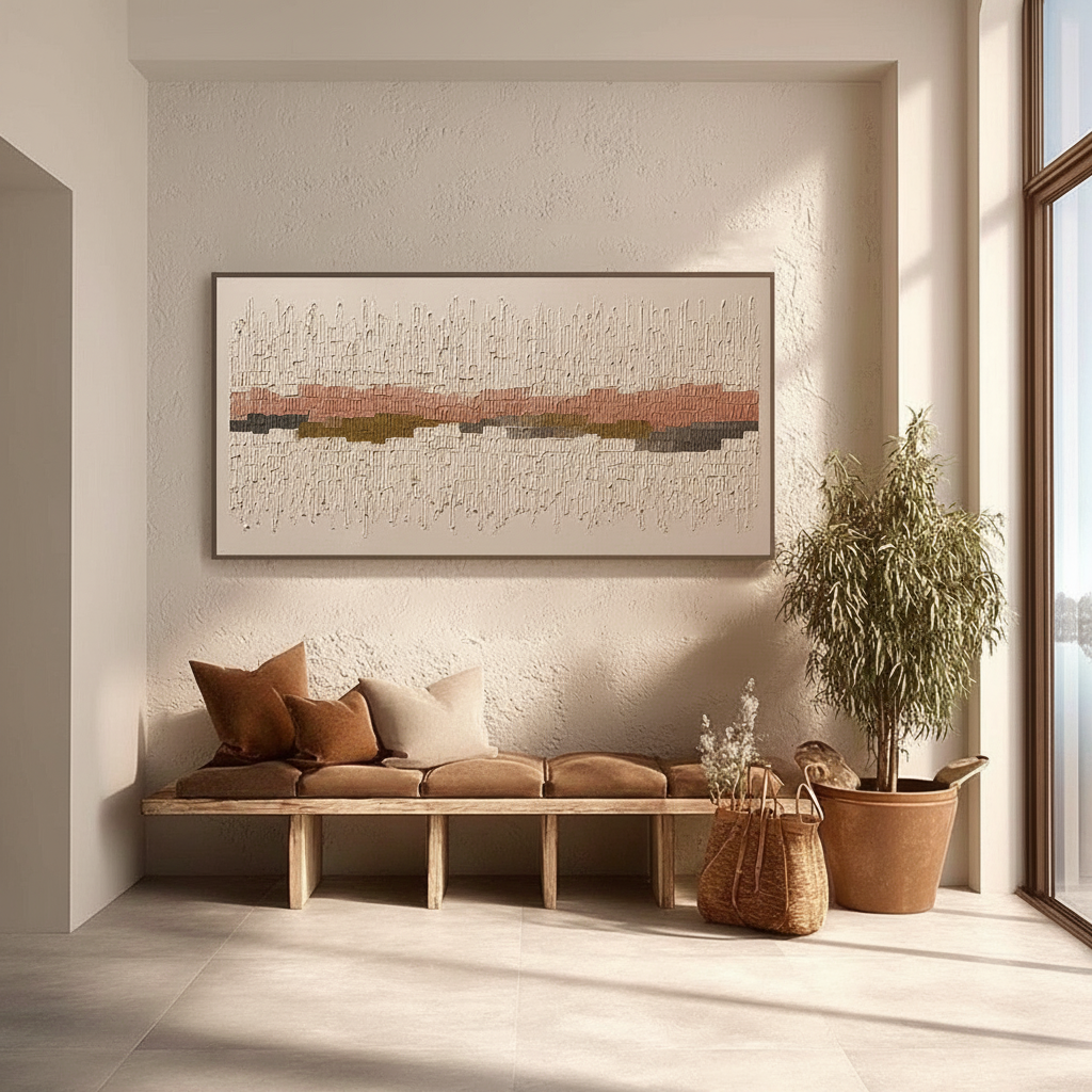
- Close Inspection (Hallways/Entryways): In narrow spaces where viewers are within 3–5 feet of the art, you can use slightly narrower frames. The detail of the frame material is more visible here.
- Distant Viewing (Great Rooms/Offices): In large rooms where the art is viewed from 15+ feet away, the frame's "silhouette" becomes more important than its detail. We recommend increasing the frame width by ~20% for these scenarios to ensure the art remains a strong visual anchor.
The "Two-Thirds" Rule for Gallery Walls
If you are grouping multiple framed pieces together, the spacing between them is just as critical as the frame width. A common heuristic for gallery walls is to maintain 3 to 4 inches of space between frames. Additionally, the entire display should occupy between two-thirds and three-quarters of the available wall space to feel intentional and balanced.

The Economic and Health ROI of Art
Investing in high-quality art and proper framing isn't just about aesthetics; it has measurable financial and wellness benefits.
- Property Value: A Royal Society CAR model analysis found that neighborhoods with higher "art" geo-tags saw greater relative house price ranking gains. In the commercial sector, the NAIOP reports that top developers use unique art installations as "marketing trump cards" to lease office space in high-vacancy markets.
- Health and Productivity: Research from UPenn found that 73% of patients reported significant mood improvements when exposed to environmental art. In office spaces, biophilic art (nature-themed) has been shown to reduce cognitive fatigue and burnout by up to 30%, according to research on Tokyo office spaces.
Safety and Ethics in Art Selection
As a premium provider, we prioritize health and environmental responsibility. Many "commodity" art supplies contain hidden hazards. For example, CDC NIOSH reports that chronic inhalation of volatile compounds in certain paints can lead to central nervous system neuropathy.
Furthermore, the International Agency for Research on Cancer (IARC) classifies cadmium compounds—often found in vibrant yellows and reds—as Group 1 carcinogens. We advocate for the use of low-VOC, non-toxic alternatives, such as walnut oil-based pigments or water-based acrylics that meet LEED certification standards for indoor air quality.
Ethically, we support the Wharton School's finding that 87% of consumers believe artists should receive fair compensation. By choosing hand-painted works from reputable studios, you ensure that the creative economy—which accounts for 3.1% of global GDP according to UNCTAD—remains sustainable.
Finalizing Your Visual Anchor
Choosing a frame width is an exercise in balancing structural necessity with visual elegance. By adhering to the 1:20 ratio for medium pieces and increasing the "heft" for larger canvases, you ensure that your art commands the room without overwhelming it.
Whether you are seeking the "whimsy" of 2026 design trends (as noted by Zillow/Yelp search data) or the understated elegance of a museum-grade floater frame, remember that the frame is the bridge between the artist's vision and your home's architecture.
Disclaimer: This article is for informational purposes only. Framing requirements may vary based on specific canvas construction, weight, and environmental conditions. Always consult with a professional framer for heavy or oversized installations. Regarding health data, please consult safety data sheets (SDS) for specific art materials to ensure compliance with local indoor air quality standards.
References
- Marketplace: The expensive art market continues to struggle
- WHO: Scoping Review on Arts and Health
- ASTM D4303: Standard Test Methods for Lightfastness
- Columbia University: Human-Made vs. AI Art Consumer Perception
- EPA: Indoor Air Quality and Low-VOC Paints
- Royal Society: Quantifying the link between art and property prices
Leave a comment
This site is protected by hCaptcha and the hCaptcha Privacy Policy and Terms of Service apply.